
This month we’re bringing you some brilliant examples of brands using interactivity within email.
And it wouldn’t be April without an Easter-based pun…so hop along and let’s eggs-plore! Yikes, sorry. No more puns, we hot-cross our hearts.
1. McDonalds
SL: Have you played yet? 🥤
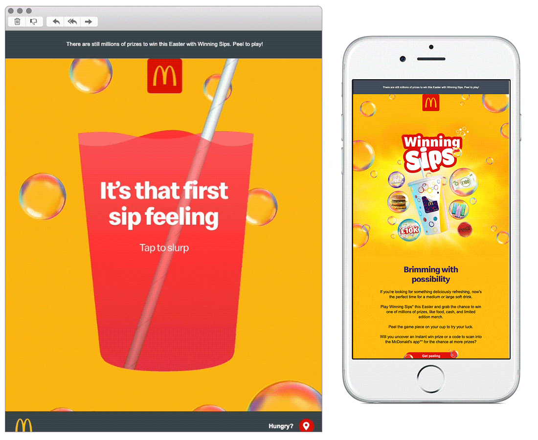
Chosen for: Interactivity
Starting strong with the ‘Tap to slurp’ CTA in the hero, continuing in every block that follows with opportunities to interact, play and win. What makes it extra fun is that the animated games in the email mirror those that you can play irl on their cups, something that’s been an element of McDonalds’ giveaways for a good 30 years or more. That combined with the unmistakable branding throughout delivers engagement, fun and a good dose of nostalgia.
2. Frank Body
SL: 💧 5 signs your skin is dehydrated.
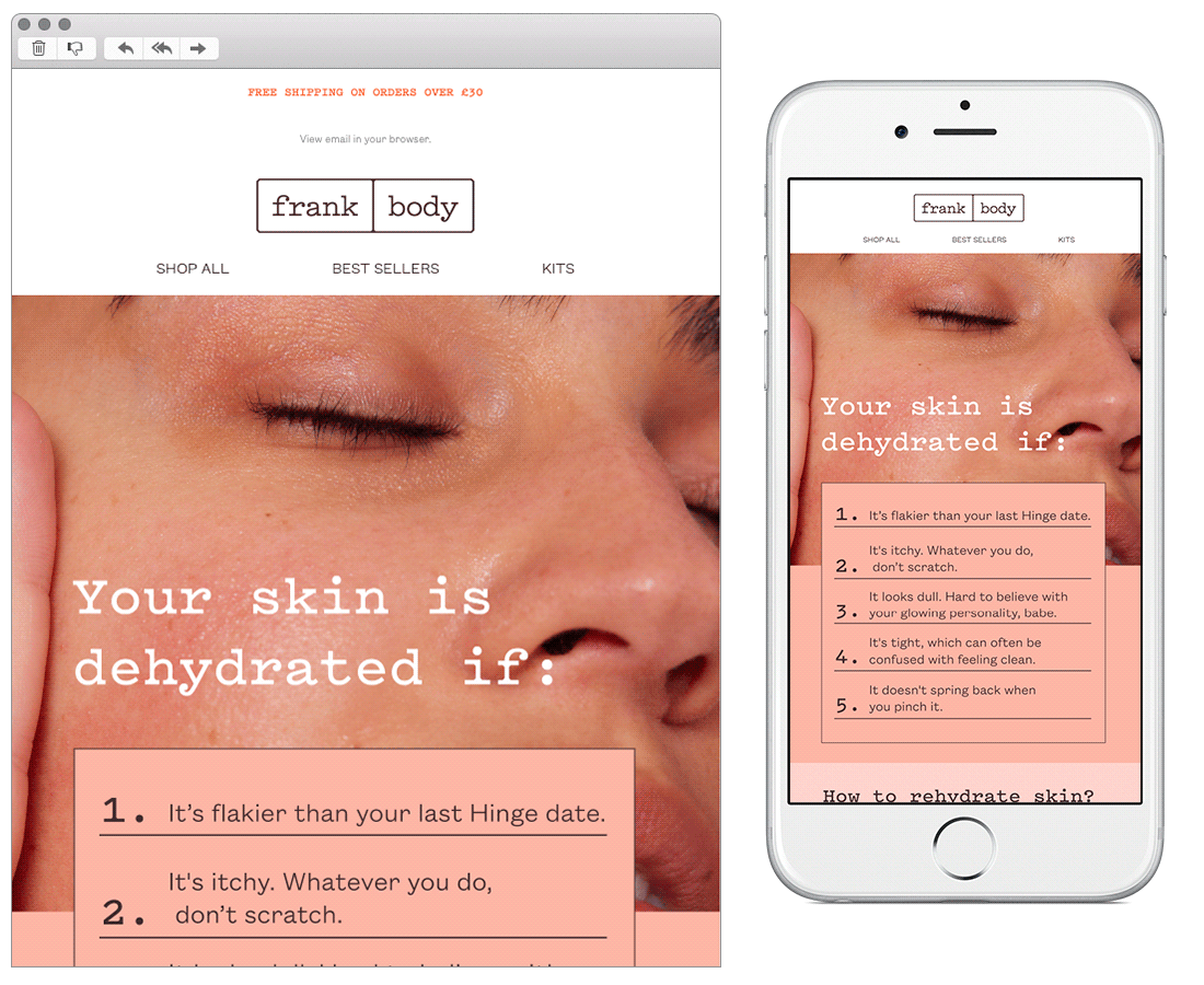
Chosen for: Copy
We love the friendly, conversational tone of this email, along with its humour. Frank Body seem to know their consumers well, speaking to them with familiarity and addressing them as ‘babe’. Describing dehydrated skin as ‘flakier than your last Hinge date’ is a reference that many-a Millennial will get and cringe at, bringing exactly the desired effect with its messaging. The how-to tips in the secondary block are written cleverly, taking the reader on a journey to feeling like they absolutely need the product it’s pushing if they have dry skin. Nicely done.
3. Email on Acid
SL: Taking it back to the early aughts
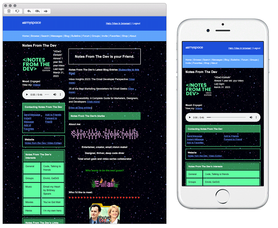
Chosen for: Innovation
Landing in our inboxes on April Fools’ Day, we opened this email to find what appeared to be the most retro version of myspace imaginable. We love how it transports us back in time with its nostalgic brilliance, with everything from the profile song that can be played to the Top 8 Friends (featuring none other than the legendary MySpace Tom as Number 1). If you need an example of how to stand out in the inbox - this is it.
4. PizzaExpress
SL: We're not fooling around 😉
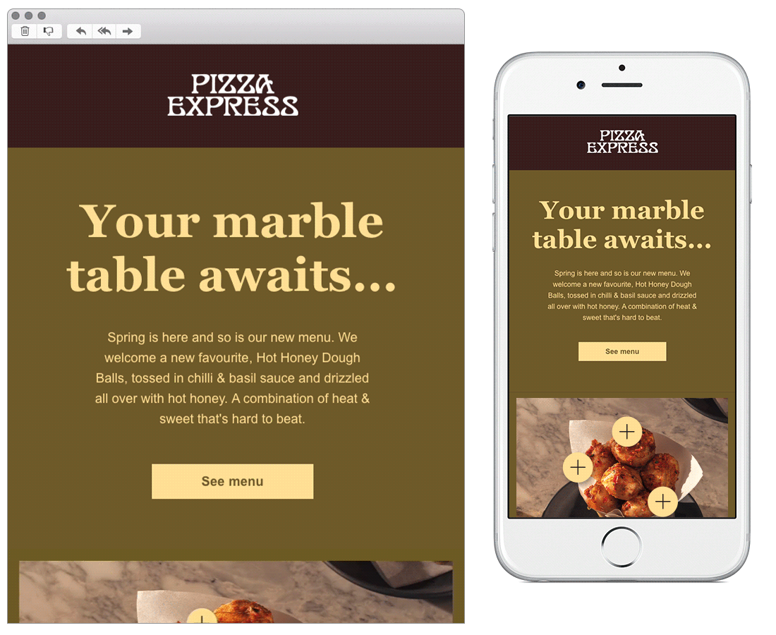
Chosen for: Interactivity
Created by our own dynamic designers, this email uses hotspot elements so the reader can explore the new dough ball dish that PizzaExpress are promoting. The appealing imagery combined with the descriptions of the food are enough to get anyone’s mouth watering and finger CTA-clicking.
5. Wolf & Moon
SL: How you've been wearing our pieces
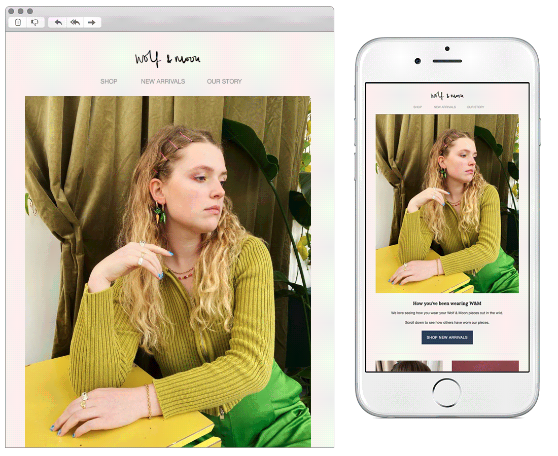
Chosen for: Design and Content
The design of this email stood out thanks to its clean, editorial style, as well as the colour palette within the blocks that complements the images beautifully. They’ve included user-generated content, displaying photos of their customers wearing pieces from their range and name-checking them. This is a great way to show that they value their customers as well as encouraging them to stay in touch, plus it’s an opportunity to promote the pieces. Winning all round!
See more posts