
This month’s round-up includes good books 📚, good ice lollies 🍭, and good tips for your emails! 📩
We’d love to know which is your favourite, or if you received any emails you think we should know about. Let us know over on our Instagram or Twitter.
1. B&Q
SL: Stay cool this weekend 😎 Top tips inside
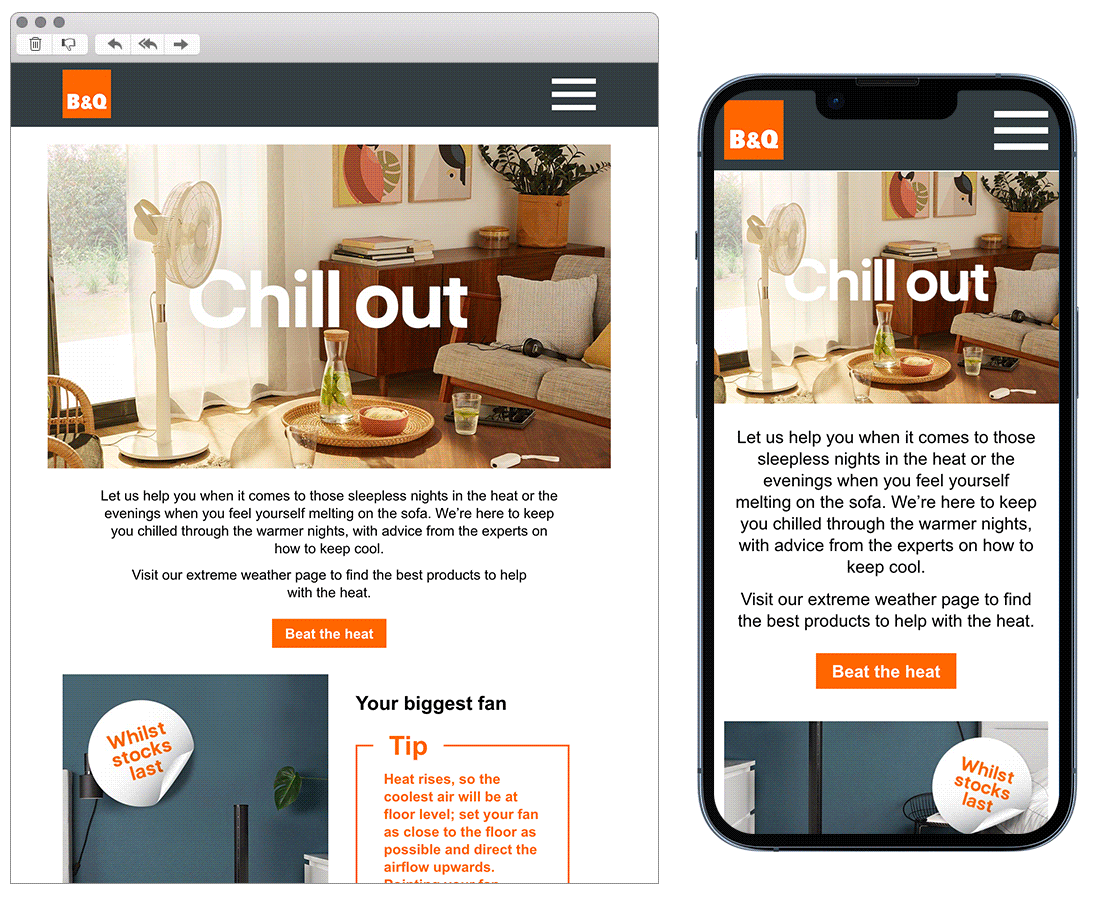
Chosen for: CONTENT
This email starts with guiding the readers eye down nicely from the image to the copy to the clear CTA. We then move into the zig zag design, which is a great way to break up heavy information. This does a great job at making each ‘tip’ stand out, and paired with the occupying CTA gives plenty of opportunity to click through to purchase.
2. Surreal
SL: We’ve made cereal ice lollies 🧊🍭
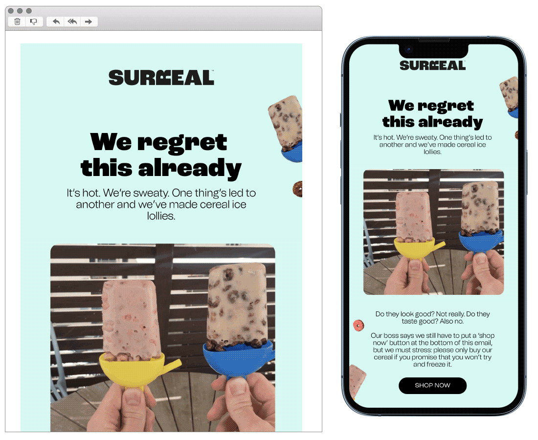
Chosen for: TONE OF VOICE
This email stood out in the inbox with its witty copy and friendly tone of voice. Reading through the email feels like you’re having a chat with a mate, and that’s what most brands aspire to be like right?
Chosen for: OPT OUT COPY
Something else which caught our eye within this email is the way they have approached opting out at the bottom of the email. Along with the usual unsubscribe they have included a secondary option to ‘snooze’ emails for a specific amount of time. This is something we love to see, giving a subscriber an alternative option to fully unsubscribing, bravo! 👏
3. Goodreads
SL: You finished You and Me on Vacation. What’s next?
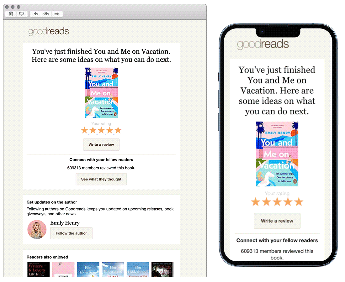
Chosen for: Content
POV: You’ve just finished a good book, and don’t know what to read next… This is a great example of how to add value to a customers experience in a simple way, through understanding where they are in their journey and recommending their next steps.
4. Grind
SL: Trust Graham.
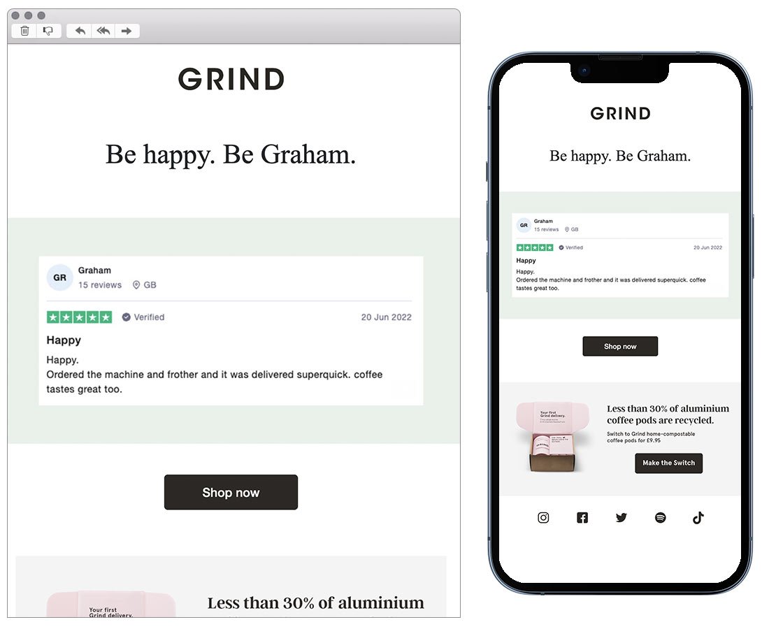
Chosen for: Content
Have you ever received a 5* customer review but have been unsure of the best way to relay it to other customers? Well, keep it simple like Grind. One review speaks volumes when it’s used as the subject line and the main piece of content. Like they say, sometimes less is more and a screenshot can speak a thousand words.
5. Musicbed
SL: Up Up, Down Down, Left Right, Left Right, B, A, Start
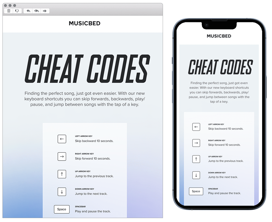
Chosen for: Content
A short, simple yet helpful email here, proving that emails don’t need to be overcomplicated and content doesn’t need to be added for the sake of it. They’ve chosen a nice visual way of showing customers information which could aid their brand experience.
See more posts