.png)

If you’re an Email Weekly subscriber, you’ll know we love an excuse to push the boundaries of what’s possible within email.
So, when AOL finally pulled the plug on dial-up internet, we couldn’t resist marking the end of an era the ActionRocket way.
We gathered our team of creative minds and developers to ask: what could we make that would feel like a trip back to those noisy modem days, but still show off what’s possible within a modern inbox?
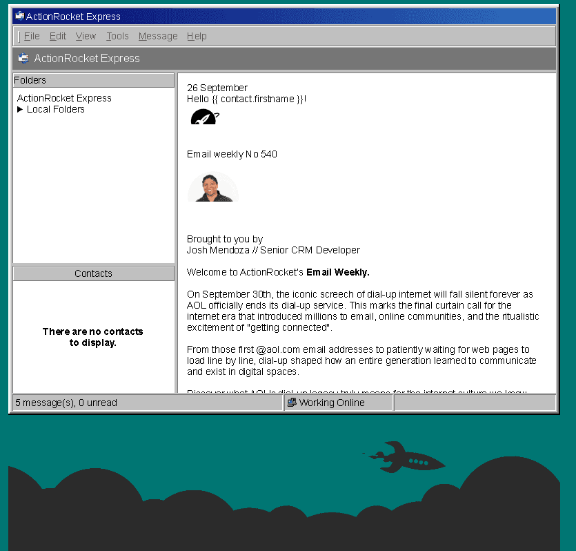
The result? A fully interactive email designed to look and behave like a classic desktop email client, complete with nostalgic details, pixel-perfect styling, and a good dose of 90s throwback energy.
Today, we sit down with Josh, one of our developers, to chat through the concept, the build, and the lessons learned behind this nostalgic little experiment.
1. What inspired you to recreate the classic email client look for this dial-up nostalgia piece?
A while back, I saw a blog post about someone creating a Windows 98 experience using CSS. It's a really cool project, and the author even breaks down the techniques he uses.
So, when Outlook Express came up in the brainstorming session, I suggested we recreate the app, as I had a clear idea of what to do.
2. How did you approach balancing nostalgia with modern design principles?
Luckily, back in 1998, the UI was simple, with no major animations, so there wasn't really much to change. However, I wasn't able to find the exact icons used in Outlook Express, so I had to take some creative liberties with this. I really wanted the email to scream retro when opened. So, besides Outlook Express' '98 themed visuals, the green background was a must.
3. What HTML/CSS techniques did you use to achieve the email client window effect?
I heavily relied on CSS Grid to handle the layout of the window and panels. It's very well suited for the CSS box shadows, and CSS grid are the real stars of this show. Both the window frame and the button effects are handled by layering CSS box-shadows, which I think is hilarious since you can't really tell just by looking at it. CSS grid took care of the window and panel layouts, which was straightforward for the most part. CSS linear-gradient function for the blue gradient in the window title. CSS :has() to make writing and reading the interactive logic a lot easier. Not an HTML/CSS technique, but caniemail.com was definitely my best friend through the duration of development.
4. Were there multiple design iterations, or did the concept come together quickly?
A chunk of my time was spent scouring the internet for visuals of Outlook Express 5/6, which proved very difficult to find. So, I ended up using screenshots from a YouTube video as design reference. After I had that in place, I got to work coding it.
5. What was the biggest technical challenge in building this email, and how did you solve it?
I think the mobile version of the Outlook email client was the biggest challenge, as that's where a lot of the CSS Grid edge cases occurred.I approached the problem thinking, I would just use grid-template-areas to change the layout. However, this ended up borking the layout in ways I'm still trying to wrap my head around. I spent a lot of time trying to figure out what was causing the layout issue on mobile. This ended up being futile, and I changed some of the CSS grids to flex-box to workaround the problem.
Besides the technical challenge, it was interesting to make the concept work for mobile. Since it was technically a desktop-first design, I had to rework some of the content and functionality. This mostly culminated in the "Back" button being added for the mobile version, and removing some of the inbox columns on mobile.
6. Did this design work naturally in dark mode, or did you need special handling?
The grey background of the window and the box shadows worked really well in dark mode. A lot of the copy and window panels went in the other direction, and I had to do quite a few spot fixes. I had hoped that, with the simple colours, it would "just work" in dark mode. However, with Sod's Law holding strong, it did not.
7. How did you ensure the email remained accessible while still pushing visual boundaries?
Nearly all of the inputs are inside a label for implicit association, as this is best practice. Inputs are positioned outside of the viewport, instead of being hidden, so they are keyboard focusable and we have access to more element states. Details summary elements for the out-of-the-box accessible accordion in the main menu. I also had to double-check the dark mode highlight box and copy that passed accessible contrast checks.
8. How did you test the build across clients and devices?
We used a mixture of the email testing tool Email on Acid, as well as live devices to ensure the email works, as intended, across all our supported email clients.
9. What did you learn from this project that you’ll apply to future builds?
I learnt that you can layer CSS box-shadows, which is really cool in my opinion. It’s lead me to look into other visual CSS properties that you can layers. I really love CSS Grid for it’s simplicity and flexibility. That being said, perhaps I need to give flex-box a chance every now and then, lest I have another CSS Grid crashout.
10. Finally, if you could bring back one thing from the early internet era (besides the modem noise), what would it be?
I might be alone on this one but, I would love to bring back physical maps when travelling. Sure there’s a higher risk of getting lost but that’s all part of the fun!
See more posts