
June delivered World Cups, Prime Day provocation, and a summer's worth of creative worth talking about. Here's what caught our eyes this month.
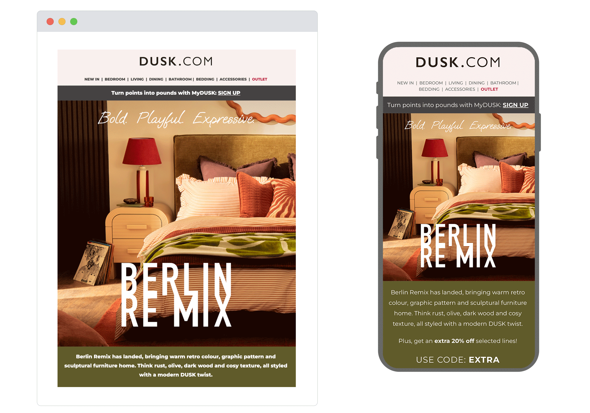
1. Dusk
Chosen for: Copy
The copy in this email is doing a lot of the heavy lifting and pulling it off. "Berlin Remix" is a strong product name in itself, and the email leans into it with a playful, almost nostalgic tone that pairs well with the retro-leaning typography and art direction. The headline and body copy feel considered rather than generic, giving the collection a personality beyond just the product specs. It's a good reminder that naming and narrative can be just as impactful as the visual, especially when the two are working together this well.
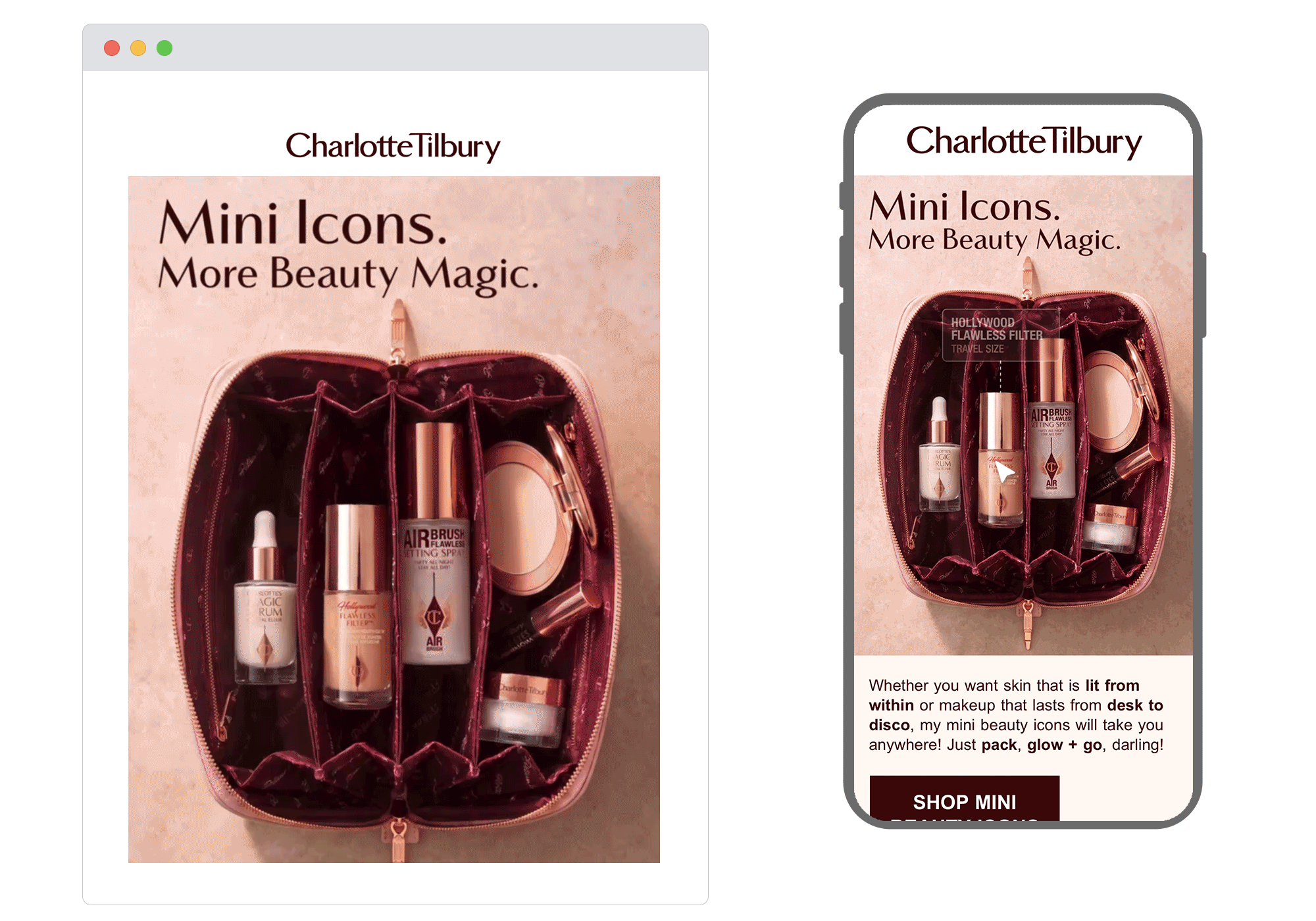
2. Charlotte Tilbury
Chosen for: Design
The hero of this email does something genuinely useful: an animated cursor moves across an open makeup bag, hovering over each mini product to reveal its name and details. It's a neat way to showcase a range within a single image without fragmenting the layout into a grid of product shots. The "Mini Icons. More Beauty Magic." headline sets the tone well, and the warm, editorial art direction velvet lining, rose gold tones, soft pink backdrop stays true to the brand. A good example of animation serving function, not just decoration.
3. Mcdonalds
Chosen for: Content
This one earns its place for the interactive element alone. The email features a toggle mechanic: flick it, and a football flies into the goal. It's simple, but that's the point: it's immediately playable, on-brand, and directly tied to the MyMcDonald's Rewards mechanic it's promoting. Tying "toggle on to score rewards" to a literal goal-scoring moment is the kind of execution that makes the interactivity feel purposeful rather than decorative. Good timing, good concept, well joined up.
.gif?width=900&height=630&name=maccas%20(1).gif)
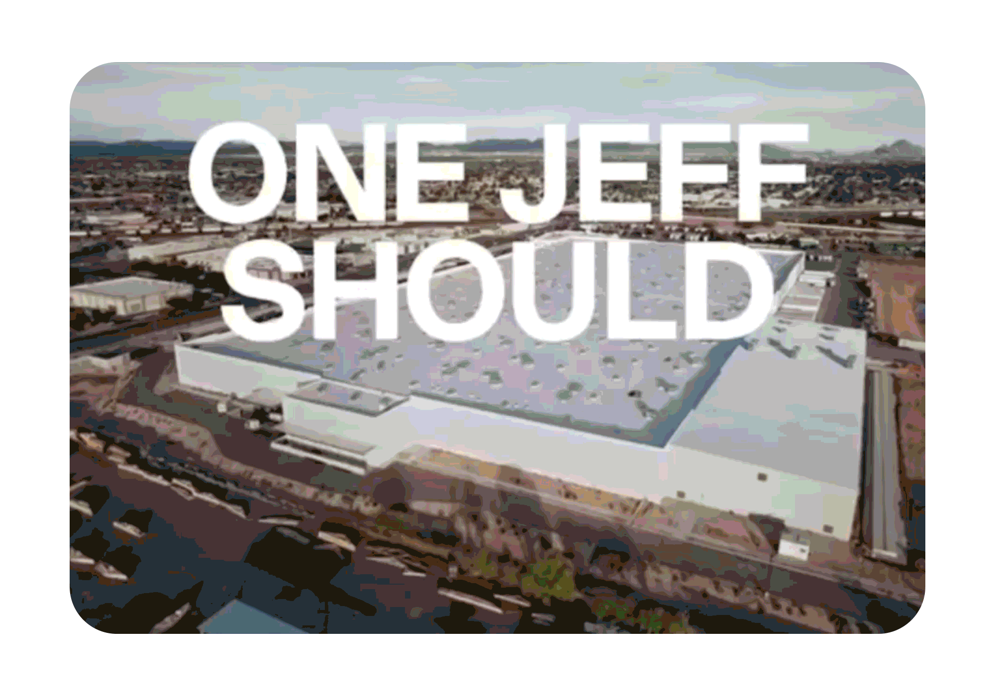
4. Etsy
Chosen for: Strategy
For Amazon Prime Day, Etsy launched a campaign spotlighting the 5,000+ sellers named Jeff on its platform as a human alternative to the world's most famous one. The concept is sharp, the timing is deliberate, and the message lands Etsy's core positioning of real people, and real products.
5. Kulfi
Chosen for: Design
The "bag check" concept products nestled among summer essentials grounds the collection in a real, relatable moment rather than a polished studio shot. The layout is structured but feels casual, which suits Kulfi's personality well. Each section has a clear purpose, moving the reader from hero concept down through product categories without feeling like a catalogue. Consistent, considered, and a good fit for the season.gif?width=900&height=630&name=kulfi%20(2).gif)
June reminded us that the most effective creative tends to be the most considered are rooted in the right moment, built around a clear idea, and executed with intention. If that's what you're looking for in your CRM, we'd love to hear from you.