

From billboards to newsletters to emails, here are five picks that caught our eye and our hearts in May.
1. Tony's Chocolonely
Chosen for: Copy
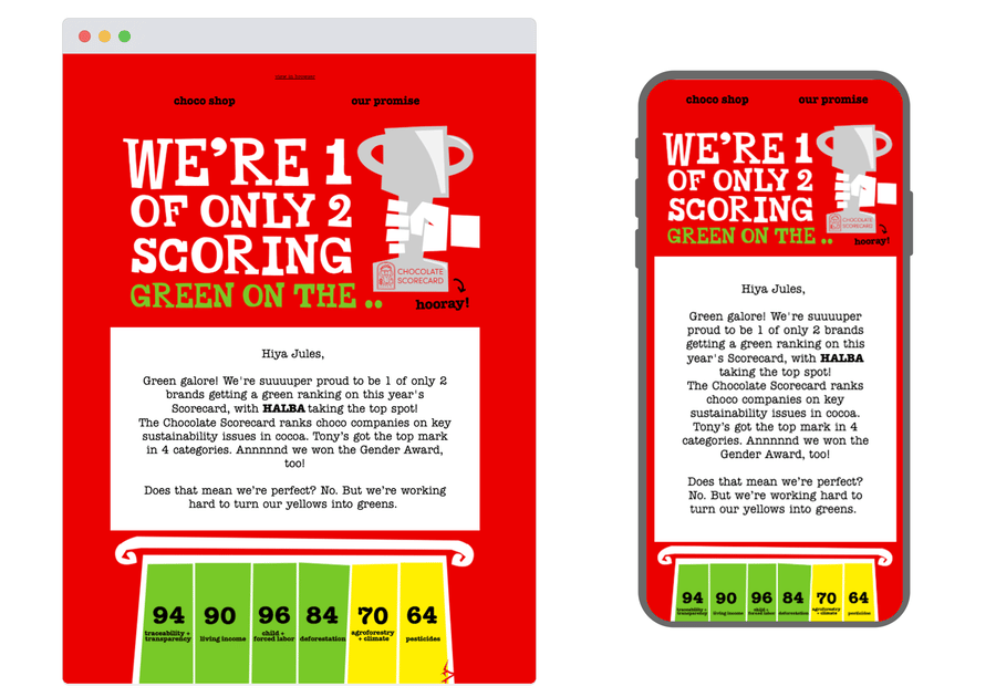
Tony's knows how to celebrate a win without losing sight of the work still to be done. This email marks their green ranking on the Chocolate Scorecard with warmth and honesty acknowledging HALBA's top spot, nodding to their own room for improvement, and keeping the focus on the bigger shared mission of ending exploitation in cocoa. It's minimal, measured, and never loses that characteristic Tony's spirit. Proof that the best copy doesn't just communicate a result; it reinforces who you are.
2. Our Place
Chosen for: Design
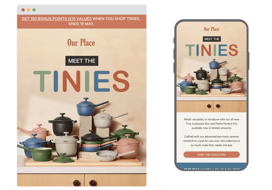
Our Place has a rare gift for making you fall in love with something you didn't know you needed. The launch email for their new Tiny Cookware range is a masterclass in product-matched design. The palette mirrors the cookware's soft, earthy tones beautifully, and the copy does something lovely too: instead of listing specs, it paints a picture of moments. Frying a single egg. Making a skillet cookie for someone's birthday. It's warm, considered, and very, very buyable.
3. Email Weekly
Chosen for: Content
We're giving this one to ourselves, just this once and specifically to Claire, our Head of Copy, who turned a blank page and a difficult brief into something genuinely moving. Faced with Mental Health Awareness Month and not knowing where to start, she did the most human thing: turned to the words of others. Five poems, carefully chosen, that sit with you long after you've closed the email. 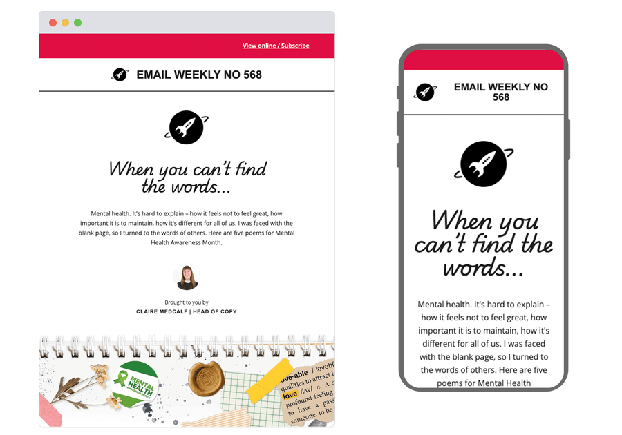
4. Air Transat
Chosen for: Concept
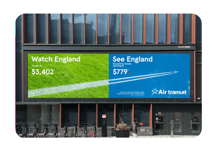
Air Transat makes the same destination feel like two entirely different choices depending on your budget. The "Watch England / See England" line lands the contrast instantly, and the price comparison does the rest of the persuasion.
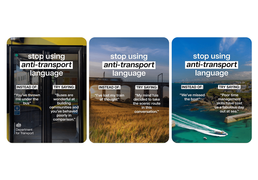
5. Department for Transport
Chosen for: Tone of voice
The Department of Transport's "stop using anti-transport language" campaign is an absolute joy. Taking everyday idioms and replacing them with delightfully unwieldy literal alternatives is a very funny way to make a serious point about how the language we use shapes how we think about public transport. The tone perfectly balances absurdist humour with genuine advocacy.
Great creativity doesn't live in one channel alone, and neither do we. Whether it's email, mobile or anything in between, we'd love to help you make something worth talking about. Get in touch.