

We have now covered a whole range of Dark Mode topics in our #Darktober themed month. From Dark Mode support , to creating logos , to setting text colours , now we want to look at images. What are the most common issues with imagery in dark mode emails? And how can you avoid them?
Product and lifestyle images
If your image is designed to blend seamlessly into the background colour, it is best to export it as a transparent PNG. Otherwise the image will be sitting inside a rectangle of colour which does not match the underlying colour in dark mode.
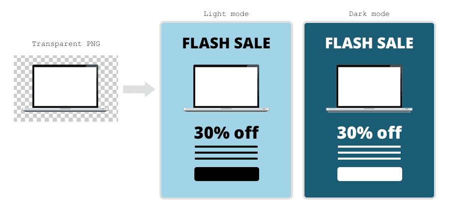
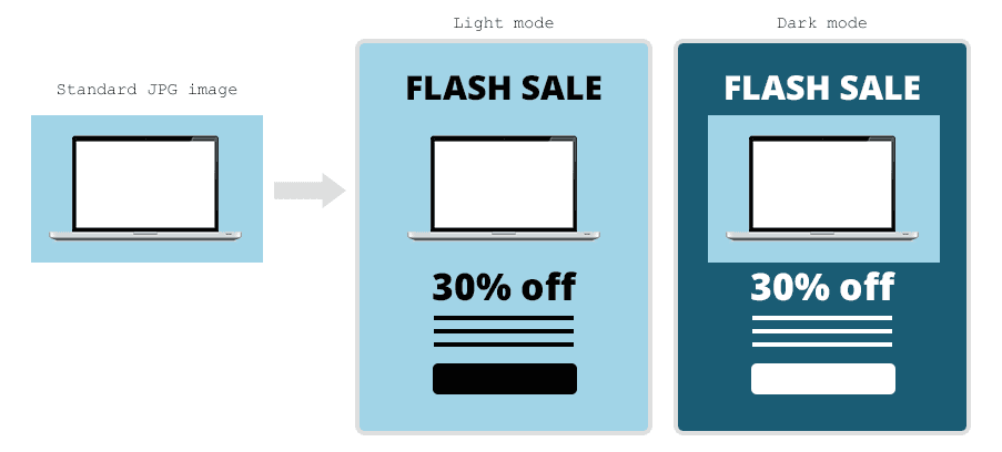
Please note, Gmail will occasionally invert the images themselves, resulting in an image that looks like a photographic negative of itself. At present there is no way to control this.
Logos and icons
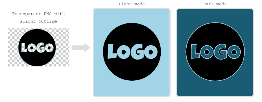
We often use transparent PNGs for logos and icons, which allow the background colour to show through. However, in Dark Mode, the background colour is likely to change while the image stays the same - potentially making the logo hard to see or even completely invisible. There are a couple of ways around this.
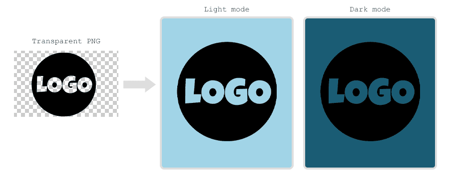
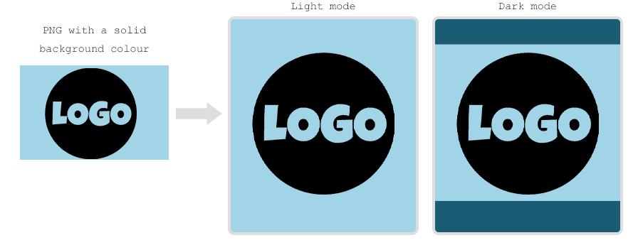
One option is to include the background colour as part of the image itself. However, this may look a little incongruous if the rest of the mailing has switched to a dark background and light foreground.
An alternative is to add a fine outline to the image that will make it stand out even if the background is the same colour. Please note that most brands have strict guidelines for how their logo should and shouldn’t appear against different backgrounds - it is best to check before altering any client logos.
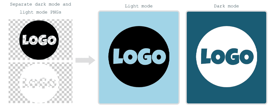
Finally, in some email clients it is possible to detect if dark mode is enabled, and use a media query to swap the image source to an alternative image for these recipients. This is not supported everywhere, and it will still be necessary to consider how the image will appear for dark mode users on platforms that do not recognise the media query. Here we explain how to swap images for dark mode, or take a look at our example below:
See the Pen Email CSS/HTML - Dark mode image swap by Jay (@emailjay) on CodePen.
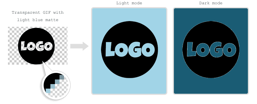
Where possible, avoid using transparent GIFs. A transparent GIF includes a small amount of the intended background colour around the edges of the image - this is called the ‘matte’ colour. If the background colour in the HTML matches the matte colour, the image looks fine. However, if the background is inverted in dark mode, the image will have a visibly jagged edge.
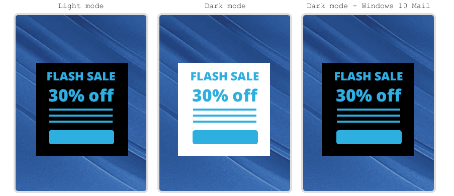
Text over background images
When text is placed over a background image, dark mode may invert the text colour but leave the image as is. Depending on the design, this could make the text illegible against the background.
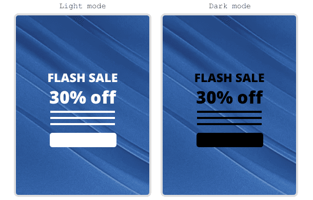
It helps to add a panel of colour behind the text. This way if the text colour is inverted, the background colour panel will likely be inverted as well, and the copy will remain legible. However, there is an exception to this: Windows 10 mail dark mode will invert the text colour, but not the background panel, if it sits over top of a VML background.
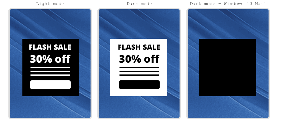
So, to ensure that your copy is visible everywhere, it is best to add a colour panel and then choose a neutral colour for the text itself. This way the copy is still legible, regardless of whether the colour behind it has been inverted or not.
How can we help?
Hopefully these examples will allow you to confidently create images that work well in dark mode for your email campaigns. Throughout Darktober and into 2021 our aim is to get every brand dark mode ready. We are helping brands review how dark mode affects them from a quick review, to in depth audits. As well as supporting updating your email design systems and bespoke templates, we have you covered. Just email hello@actionrocket.co and we will be in touch.
See more posts