

Graphic design is a key element of digital marketing. It is not just pictures and drawings or colouring in as my friends like to refer to it, but an important way of optimising brand awareness and communicating your marketing message. Design is an art of communication that requires creativity and a systematic plan to solve a problem or achieve specific objectives. It allows us to create a journey that is not just visually engaging but also structures content in a manner that makes content easy to digest, guiding customers through a message.
This is incredibly important in influencing the customer decision-making process, that in-turn will encourage prospects to become loyal customers. Here are some core design principles that will offer some guidance when approaching a marketing message through design.
Composition & Layout
The composition of your design is essentially the placement of elements on your page. For me this is one of the most important principles within a good design. The layout allows you to guide your reader down the page, allowing them to efficiently digest and absorb the message. There are a number of other principles that will help form the perfect composition which we will delve into a little later, but it is important to remember that a successful layout will not only look good but is also functional and effective.
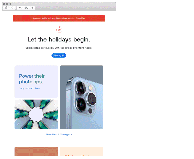
One basic rule when laying out a composition is to follow a grid system. This allows you to place elements on your page in a structured manner, essentially using invisible lines. It’s a great way of helping you give order to your design and ensure the elements within your design are not floating. This email design from Apple is a great example of a balanced composition that uses a grid system. The design looks great but is also functional at delivering a clear message.
Hierarchy
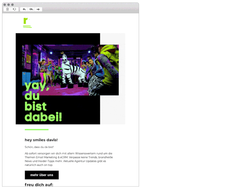
What is the first piece of information your audience needs to know? This is what you need to ask yourself. Your design has a purpose to deliver a specific piece of information, and it is therefore up to you to prioritise that information. In general your primary message should be at the top of your page and should be larger and bolder than the rest of your content. This allows the reader to distinguish between your primary and secondary messages. It also allows for a much smoother read and ease of digesting content in a descending order.
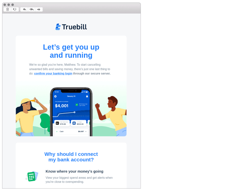
This email design from Truebill has a very clear hierarchy between their Primary and secondary message.
Balance & Alignment
Never forget that every element you place on a page has a weight, the weight can be managed through colour, size, images and typography. These elements will all equate to the balance of your design. The careful placement of text and images and considered use of the above elements will help guide the reader's eye to where you want them to look through your design. Without balance and alignment, your audience will feel as if their eye is sliding off the page.
Balance works hand in hand with alignment and they are both key elements to the composition of a well crafted design. Whilst some of your design elements might be focal points and attract your eye for hierarchical purposes, there shouldn’t be one area of the composition that draws your eye so much that you can’t focus on other areas. This is a key point to remember when creating a balance to your composition. The idea is to retain the reader's focus within the composition but to also visually guide them though your design allowing them to process each component bit by bit.
Using symmetrical design creates balance through equally weighted elements aligned on either side of a centerline. On the other hand, asymmetrical design uses opposite weights (like contrasting one large element with several smaller elements) to create a composition that is not even, but still has equilibrium.
Symmetrical designs are pleasing and safe but can sometimes appear a little boring, on the other hand Asymmetrical designs are bolder and can bring real visual interest and movement (more on that later!) to your composition. Below are two examples of well balanced website designs, one uses a symmetrical layout and another that uses an asymmetrical layout.
Asymmetrical
Symmetrical
Contrast
The contrast is what people mean when they want something to “pop” within a design. It is a buzzword that I have seen being used more and more within the marketing industry. By using contrast within our design we are able to make elements come away from the page and stick in your memory. Contrast creates space and difference between elements in your design. Colour is one way of creating a contrast within your design. To achieve this your background needs to be significantly different from the colour of your elements so they work harmoniously together and are readable.
Here is a great example from Willkommen Zum & Revenue, the vibrancy of the green text really stands out. What is also clever here is because they have used accents of the same green throughout the design, it creates more balance which doesn’t give too much focus on the headline but instead helps guide your eye down the page.
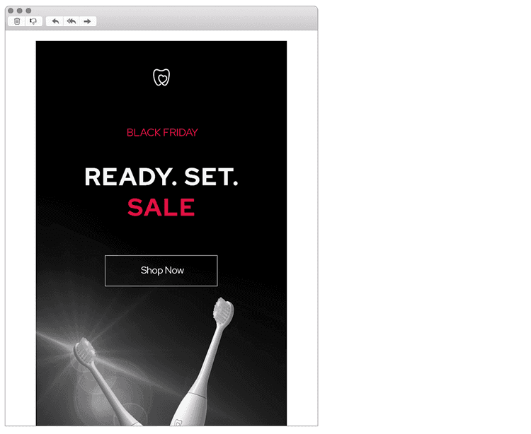
Typography is another way of creating a contrast within your design and is incredibly important to understand. If you plan to work with type, understanding contrast is essential because it means the weight and size of your type are balanced. How will your audience know what is most important if everything is in bold?
With good, effective design, you’ll notice most designs will only feature one or two typefaces. That’s because contrast can be effectively achieved with two strong fonts, or even one strong typeface in different weights. The more fonts you add then the more you dilute and confuse the purpose of your design. This email design from Spotlight Oral Care is a nice example of how one typeface can be used but by using different weights and colours it allows us to add contrast and hierarchy to the message.
Consistency
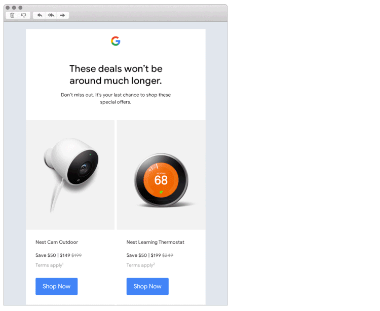
Consistency is how you create a brand identity, it is incredibly important that people recognise your brand and who is speaking to them, leading to brand awareness and loyalty. If you limit yourself to two strong typefaces or three strong colours, you’ll soon find you’ll have to repeat some things. This is absolutely fine as repetition will unify and strengthen your design. Consistency will create order into your design and will create a much smoother journey for your customer.
Here is a marketing email from Google which not only demonstrates a clean and easy to navigate design, but also is a brand who are well recognised through their consistency.
Movement
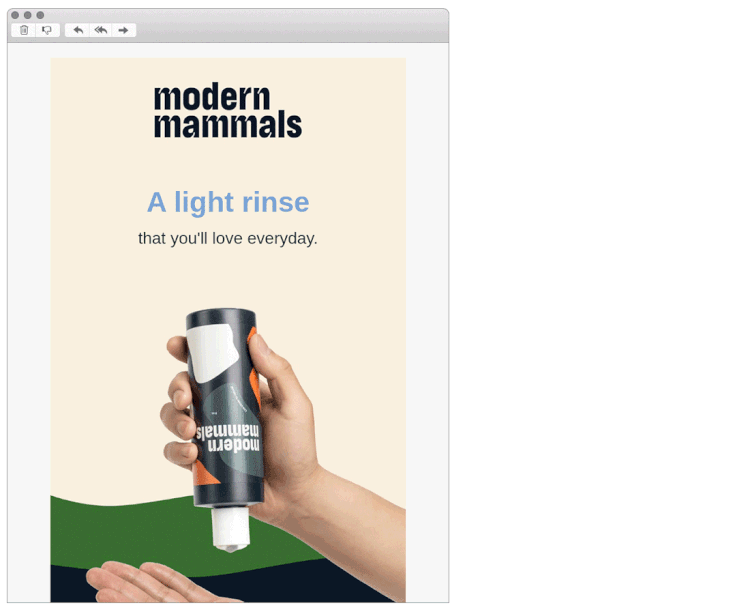
Movement is a way of controlling the elements in a composition so that the eye is led to move from one element to the next and the information is properly communicated to your audience. Movement creates the story or the narrative for your work and creates a really soft flawless journey through your design. The elements we have previously talked about, especially balance, alignment, and contrast will work towards that goal, but adding movement to your design will really bring your design to life.
This email design from Modern Mammals is a lovely example of a design that is not only very well balanced through the use of colour and typography weights but the image adds an element of movement that guides us down the page.White Space
White space or negative space as it is sometimes called is the empty space that surrounds an image or text. It gives room for the components within your design to breathe and allows your eye pauses to efficiently digest the content. A layout that has insufficient white space will feel cramped and difficult to process, it isn’t sitting there doing nothing, it’s creating hierarchy and organisation. CTAs are another important component that will benefit from white space, especially those on mobile devices. You need to ensure there’s enough room for the finger to click that button!
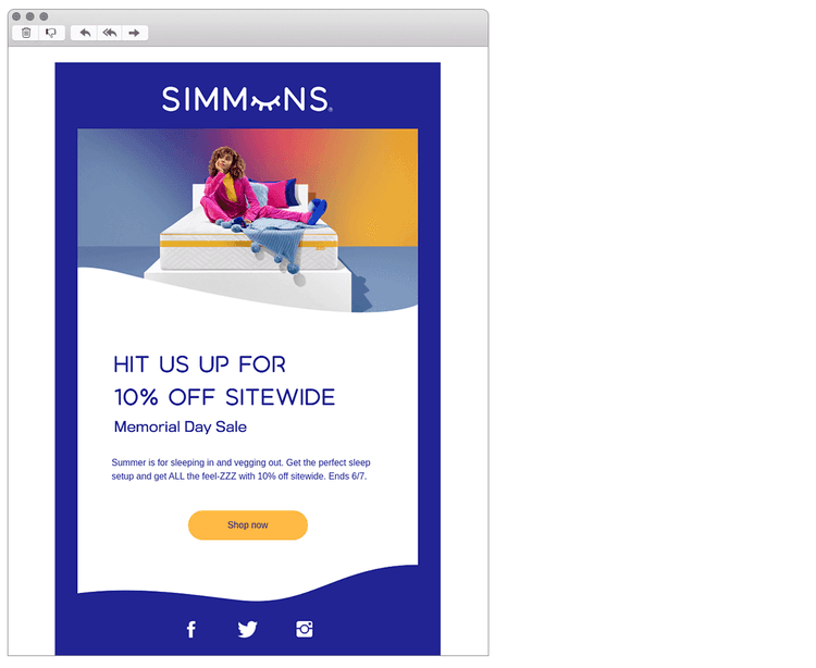
This email design from Simmuns is a lovely example of how effective white space can be. The components throughout the design are easy to digest, and follow all simply by adding white space between text and images.
White Space
White space or negative space as it is sometimes called is the empty space that surrounds an image or text. It gives room for the components within your design to breathe and allows your eye pauses to efficiently digest the content. A layout that has insufficient white space will feel cramped and difficult to process, it isn’t sitting there doing nothing, it’s creating hierarchy and organisation. CTAs are another important component that will benefit from white space, especially those on mobile devices. You need to ensure there’s enough room for the finger to click that button!
This email design from Simmuns is a lovely example of how effective white space can be. The components throughout the design are easy to digest, and follow all simply by adding white space between text and images.
Final Thoughts
I’m hoping this doesn’t seem too overwhelming! Try to remember that less is more and to keep it simple. The most important question you need to ask yourself about your design and something I will always do as a final check is “does your design clearly communicate the intended message?” Most of the principles covered should come naturally, but it is always useful to just run through the above and tick them off.
It’s also handy to get a second pair of fresh, neutral eyes just to double check that the message and composition is clear. Also remember not to take it personally if that person flags something that could be improved, you should always consider it, happy designing!
See more posts