Following on from the first post in our Darktober series where we discussed dark mode support, today we are taking a look at dark mode logos. It’s more important than ever to make sure your emails are able to adapt to dark mode gracefully, and brand logos are an integral part of that. So, let’s take a deep dive into how we have adapted our Email Weekly logo, and made it dark mode friendly!
Why do you need a dark mode logo?
When an email client formats your email for dark mode, it will attempt to invert the colours (white backgrounds will become black, black text will become white etc…) in order to make the email /easy on the eye/ when reading in a low-light environment.
In it’s current form dark mode for email is a classic case of your computer trying to be helpful, but often getting things a bit wrong in the process. Email clients will do their best to make things look great in dark mode, but also require us to do a bit of the heavy lifting in order to get things looking their best.
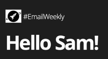
HTML/CSS formatted elements tend to re-format quite well, but any image content will look the same after formatting, which can run into some issues. Below you can see what our EmailWeekly newsletter looks like in both light and dark mode. As you can see, after the email is formatted for dark mode, the ActionRocket logo has run into a bit of trouble.
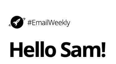
The background and copy make it through the dark mode changes just fine, but as the logo is a bitmap image element as opposed to an HTML/CSS one, it is left unchanged and we run into some problems with contrast, rendering our poor logo almost invisible.
How do you go about fixing it?
Thankfully, there are a couple of ways we can resolve this issue, with both a quick-win fix, and a more involved, better-looking CSS fix. For best results, we recommend implementing both, which will cover all basic email clients, and offer an enhanced fix for ones which are capable of more advanced CSS code.
The quick win - pure image-based fix
The image nerds among you will have noticed that our current logo is a PNG image, meaning it can support transparency. This is why when the change to dark mode occurs, the area around and behind the logo changes with the background colour. If it was a JPEG or other non-transparency supporting image, we would be left with an unsightly white square around the logo - like below…
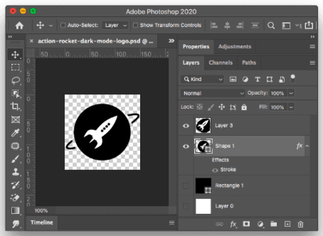
So, the first thing you need to address with your logo, is to make sure it is sitting on a transparent background. Below you can see this in Photoshop.
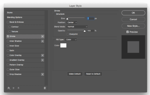
Then, we add a 2px white stroke to the “centre” of the logo. This adds a white outline to the logo, which will be invisible in /light mode/, but very prominent in /dark mode/. Note: This stroke eats into the logo in light mode ever so slightly, but is practically unnoticeable and well worth the sacrifice.
Next up, we add a white fill behind the rocket section of the logo.
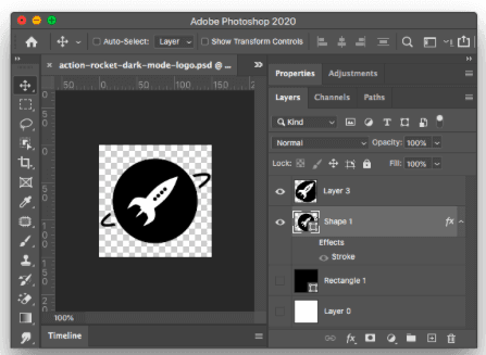
You will also notice that in the layers panel I have hidden black and white layers, so I can turn on each one turn to simulate light/dark mode and check the logo looks ok before exporting. Finally i use File > Export > Save for Web and export the image as a PNG, so the transparent background is retained.
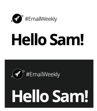
And voila! Above you can see our new logo is looking great in both light and dark more - with no tricky code edits required.
Deep dive - CSS fix
So, now we have our nice outlined logo in place, but what would be ideal would be to totally invert the logo to white, along with the rest of the copy in the email. Making a white version of our logo is easy enough, be the trickier part is using CSS to automatically swap out the outlined logo with a pure white one. This can be done using the following code snippet below:
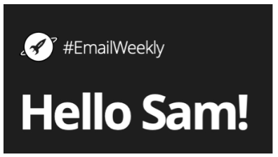
And just like that, we have the best of both worlds. For email clients that we can target with CSS we have a fully inverted white logo. And for email clients that we can’t target with CSS, we have the outlined version of the logo as a fallback - making our logo 100% dark mode friendly.
Throughout Darktober and into 2021 our aim is to get every brand dark mode ready. We are helping brands review how dark mode affects them from a quick review, to in depth audits. As well as supporting updating your email design systems and bespoke templates, we have you covered. Just email hello@actionrocket.co and we will be in touch.
See more posts

