
Email Weekly is our agency’s digital playground. Every Friday, we give you the rundown on CRM and often experiment with new concepts along the way.
Did you see our latest Valentine’s edition? If you wondered how we sprinkled our magic with the paint-by-numbers interactivity, we’re breaking it down for you. From design to code, here’s how it all came together.
Doe-eyed dreaming: concept & design
It all started with one simple wish: for you to fall in love with something completely new, right in your inbox. So, we asked ourselves, “How can we create a fresh and innovative experience while staying true to the Valentine’s message?”. After all, it has to work in harmony.
The final idea for the interactive experience came from a collaborative session between three team members from our Design, Development, and Marketing departments. We came up with plenty of ideas (some brilliant, some hilariously bad) before landing on one that used a little inside joke about designers: we’re always chasing pixel perfection.
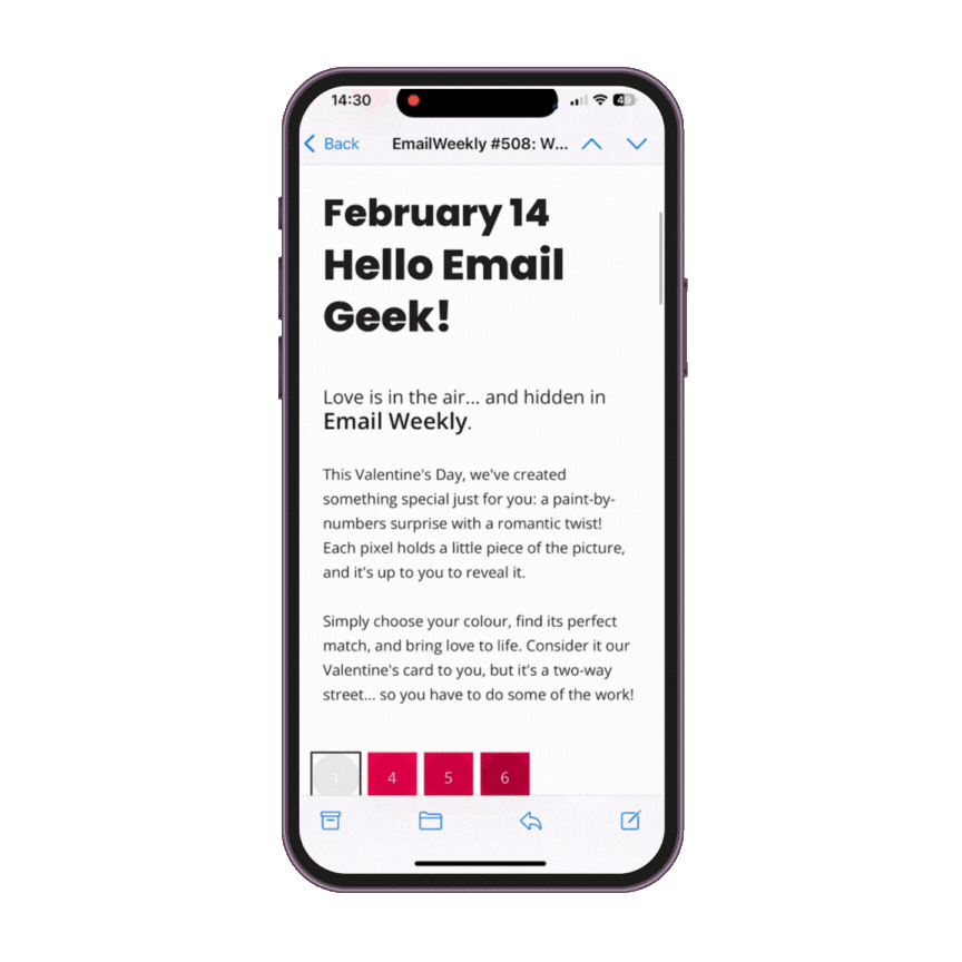
So, imagine opening your inbox to find a blank Valentine’s card, just waiting to be pieced together. With each click or tap, you fill in the squares, revealing a hidden masterpiece. The result? A simple yet delightful love-themed design. Though, behind the scenes, things weren’t quite so simple…
Bringing love to life: code from the heart
Firstly, we created a structured and visually appealing layout for the colour selection interface using CSS Grid. Then, we displayed the user’s selected options by changing their :checked state, using radio buttons and checkboxes. Adjusting the look based on user choices, using the :has() selector, helped us achieve a dynamic and interactive feel. Finally, we added custom visuals without extra HTML by using pseudo-elements (::before and ::after). The entire design was completed purely with CSS, which eliminated the need for JavaScript.
We ensured even greater accessibility by making each clickable square at least 48px, giving the user enough space to tap accurately. That meant getting creative with how we used each pixel and even designing separate layouts for desktop and mobile to make the experience seamless. Did you notice the different designs depending on the device you used or how your phone was oriented?
We took inspiration from a CodePen example, and adapted these techniques to function within the constraints of an email environment, ensuring both functionality and accessibility.
Signed, sealed, delivered
After a few iterations (and maybe a little love-hate relationship with pixels), we got there. Now it’s over to you: click, colour, and discover… because love is always worth the surprise!
At ActionRocket, we specialise in creating campaigns that combine clever strategy, striking design, and engaging copy to captivate your audience. Get in touch to see how we can push the boundaries of your emails and create something amazing together.
See more posts