

In this Q&A blog post we talk to Paul Airy, Accessibility & Usability Consultant and founder of Beyond the Envelope™. As someone who is personally affected by marketers not adopting accessible email designs, we wanted to understand the importance first hand. We discuss who’s doing it well and some quick wins that email developers can put into practice right now.
“Don’t assume people all experience your email in the way that you do.”
Hi Paul, as someone who understands the importance of email accessibility more than most, can you explain to us what it means to you?
Email accessibility. It’s about removing everything that makes it harder, and adding anything that makes it easier, for a recipient of an email to read it and interact with it. It ensures their experience is intuitive. It ensures their experience is uninterrupted. It ensures their experience is safe.
I’ve lived with epilepsy since childhood and have spent my life avoiding everything and anything that has the potential to trigger a seizure, from extreme stress to strobe lights, from flickering imagery to flashing imagery. So, when I’ve received emails containing animated GIFs that flicker or flash, I’ve deleted them – immediately! I simply can’t risk my health. It’s for people like me that the Web Content Accessibility Guidelines (WCAG) were written, and for people like me that the guideline on Seizures and Physical Reactions has been included. According to the World Health Organization, ‘Around 50 million people worldwide have epilepsy, making it one of the most common neurological diseases globally’. That’s a lot of people – the size of a country, in fact – too many people not to consider it when creating an email!
So what does email accessibility mean to me? It means I’m valued, not just as a recipient, but as a person, by the brand that’s taken me into consideration and ensured that the content of the email they’ve sent to me can be easily read and responded to.
Why do you think it’s so essential for Marketers to be adopting accessible features within their emails?
Firstly, it’s not really about adopting accessible features. It’s more about adopting an accessibility mindset. Content, creative, design and development need to be approached with this mindset. The features are simply the elements required to implement accessibility.
Secondly, marketers are marketing to people. They are more than recipients and certainly more than email addresses on a list of email addresses! As a marketer, you want to market your product or service to a person, and do so in a way that’s easy for that person to purchase it. Do you want to make it harder for them to purchase your product or service? Do you want to make it easier for them to purchase your product or service? If you want to make it easier for them, it’s essential for you to implement accessibility.
Thirdly, the implementation of accessibility is becoming more of a necessity than a nice-to-have, especially in the public sector in the United Kingdom, where websites and apps now have to meet WCAG 2.1 AA and where the Equality Act 2010 is written into law. The same public sector organisations are requiring that the emails that link to their websites and apps are also accessible. It’s only a matter of time before the private sector follows suit.
Fourthly, while the implementation of an extensive level of accessibility into your emails will require a significant investment of resource in the short-term, especially if you’re creating an accessible email design system, it will make the email creation process easier in the long-term, as you find that the accessible ways of creating emails are the efficient ways of creating emails.
What are some quick wins for email developers?
If you’re not in a position to invest in an accessible email design system, then there are some quick wins that will enable you to implement a level of accessibility into emails right now. Here are some to consider:
Do use a language attribute (e.g. )
Don’t forget to insert the region code into the region subtag (e.g. -GB) if appropriate
Do use live text
Don’t embed text within images
Do use semantic elements, especially on headings
Don’t use semantic elements inappropriately (e.g. markup two headings with a
)
Do style your text in a size that’s easy to read. 16px is a good body text size on desktops, laptops and tablets with standard definition displays, and 18px is a good body text size on mobiles with high-definition or ‘retina’ displays
Don’t style the ‘small print’ in a small size. Style it the same size as your body text, differentiating it in a way that doesn’t compromise its accessibility (e.g. using space and applying a background colour)
Do combine the use of pixels and ems, defining font-sizes with pixels, and line-heights with ems
Don’t style your line-height with less than 1.5em, as it won’t meet WCAG 2.1
Do align your text left or right, depending on the language
Don’t centre your text if it’s more than a few lines. Be mindful that a few lines of centred text on desktop, will quickly become four or more lines of centred text on mobile, which may be difficult to read
Do check the colour of your text contrasts its background sufficiently, using WebAIM’s Contrast Checker or whocanuse
Don’t assume your colour contrast is sufficient, especially on a background image which will typically have a varying amount of contrast across different areas
Do use image alt attributes, and ask your copywriter to write the alternative text to place within them
Don’t neglect using image alt attributes. All images must have one. If an images content can’t be described or dictated, use a null alt attribute (e.g. alt="")
Do insert role="presentation" into every opening
Don’t forget that it’s only versions of Microsoft Outlook that requires an email to be developed using HTML
Do use the WebAIM WAVE web accessibility evaluation tool to quickly identify the more obvious accessibility ‘issues’
Don’t rely on tools like this alone to evaluate the accessibility of your email. Emails are designed for people, and you need people to test whether they’re truly accessible or not
- .
Heading elements are arguably the most important of the semantic elements, as they help the recipient understand the structure of an emails text, and its hierarchy. So much so, that the WebAIM WAVE web accessibility evaluation tool will identify text it perceives as being a heading, and not marked up as such, as a ‘Possible heading’, to check whether it should be one or not. Consider the heading hierarchy of your email carefully, and describe each heading level with the appropriate heading element. When using multiple heading elements, be careful not to skip any either, as this can confuse the recipient. Go from
to
for example, and not
to
.
Paragraph elements are also important, as they allow recipients to jump from one paragraph to the next. As they’re block-level elements, you can manage the spacing between them too, which further enhances the accessibility of your email.
Lists elements are arguably the most neglected of all the elements. Lists are often hacked together using HTML tables in order to stylise their bullets and align their list items consistently. Unfortunately, this striving for visual perfection, sacrifices semantic understanding.
My second top tip is around styling those elements. Apply styling to the most common elements within a container, such as the
s, to the container of those elements, and apply styling to the less common elements within that container, such as
s, to the elements themselves.
Styling applied to a container, whether that be a
Ask yourself if you can understand what a piece of text is without seeing it visually. This will help you ‘describe’ it using the appropriate semantic element
Ask yourself what understanding your semantic elements bring to the pieces of text they’re wrapped around, and if there might be another more suitable semantic element
Don’t skip heading elements!
- s. The use of colour is good, with colour contrast meeting WCAG 2.1 AA. The font-size of the body text is 16px, with the size of headings increasing proportionally. The buttons are bullet-proof and fully selectable, and a bold line appears around them when they’re hovered over, to feedback their state to the recipient. Alternative text has been carefully copywritten and applied to the images. All these accessible features are retained across mobile, tablet and desktop.
Burberry - View the live email here
Once you get past the animation, which can be a little distracting, there’s some notable accessible features in the design and code of this email. The most striking of these is the use of space, and this helps you to read the text, which is all live text, and is marked up with semantic elements. The buttons are bullet-proof and fully selectable, and the text links are accessible text links.
Google Play - View the live email here
There’s good use of space in this email too, and once again the text is all live text. The visual typographic hierarchy is clear, and this is reflected in the code, where the headings and paragraphs have been marked up semantically. The colour contrast is good too, particularly on the buttons, which are bullet-proof and fully selectable.Finally, what piece of advice would you give to marketers who are thinking about making their emails more accessible?
Think about accessibility from the outset – content, creative, design and development – and when doing so:
Be open: Don’t assume people all experience your email in the way that you do – some may experience it visually, and others may experience it audibly
Be aware: Find out what can make it easier for people to read and interact with your email
Be empathetic: Have a care for the people you’re sending your emails to. Remember, they’re the ones you want to buy your product or service! Test your emails using the accessibility features on your device, to get a feel for what it’s like to read and interact with your email using them.
With this in mind:
Write your copy with accessibility in mind. The World Wide Web, Web Accessibility Initiative (W3C WAI) has tips on writing for web accessibility, which apply equally to email.
Design your email with accessibility in mind. Think about fonts. WebAim has an article on typefaces and fonts. Think about images. Write meaningful alternative text for them. Think about colour. WebAim has a Contrast Checker for checking whether the colour of your text contrasts its background enough to meet WCAG. Think about space. Space helps in the understanding of how each element in the design relates to one another as well as the readability of its text.
Develop your email with accessibility in mind. I’ve already touched on semantic elements, but also think about the structural order of content. This is addressed in the success criterion 1.3.2 Meaningful Sequence of WCAG 2.1 A. Remember, not everyone will see the email, so how they experience it will depend on how it’s been coded – the order of the content.At ActionRocket we can help you to understand more about accessibility and how it affects your email audience. Our aim is to get every brand to be creating emails with accessibility in mind. If you think your emails could be more accessible we’d love to help, get in touch with us at hello@actionrocket.co.
Semantic elements are a great place to start, what are your top tips when using them?
Semantic elements describe the piece of text they’re wrapped around within a HTML email, so a recipient can understand what the text is and its place within that email. This is particularly important when a recipient is not using, or can’t use technology that visualises an email, where this understanding is conveyed visually. Two pieces of text within a HTML email are just two pieces of text, but when one is wrapped within a pair of
My first top tip then, is to start using them, if you’re not already, starting with headlines
tags, those two pieces of text suddenly take on meaning. They have a relationship with one another. One is a heading, the other is a paragraph. This is what WCAG refers to as ‘programmatically determined’.
, headings
–
, paragraphs
and lists
| or
will be inherited by the elements it contains, which for the most part will be the
s. Styling applied to individual elements within that container, will override the inherited container styling, which you’ll typically need to do when styling a headline, heading or other element that needs to be styled differently. So, when using semantic elements: Are there any emails you receive which demonstrate good use of accessible features in their design or code?While I’ve seen an increase in the number of emails with live text implemented landing in my inbox in recent years, emails that demonstrate good use of accessible features in their design and code beyond that are rare. There are are some emails that have landed in my inbox recently, which include a few accessible features worth highlighting: 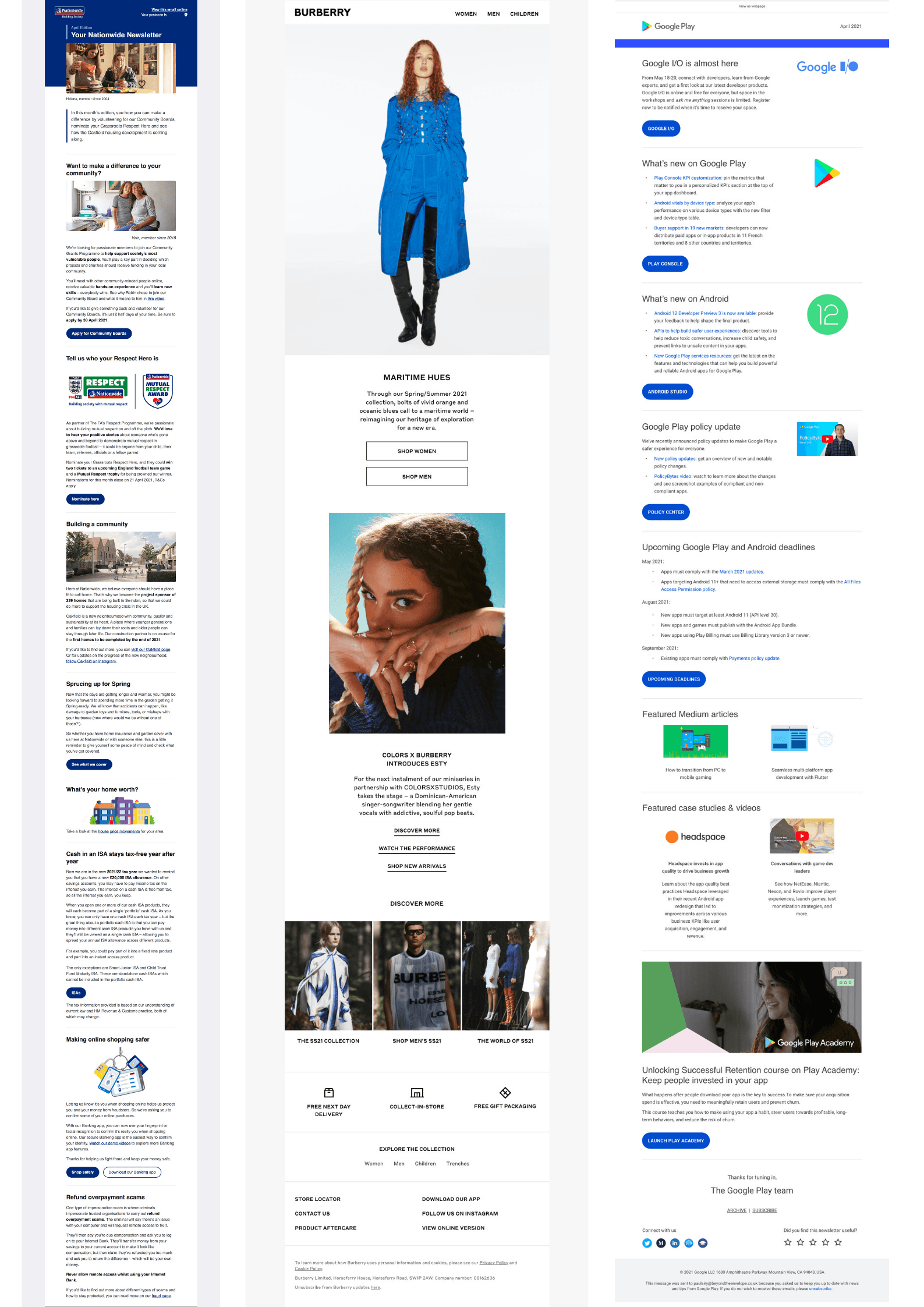
Nationwide Building Society - View the live email here This email from Nationwide Building Society, which was created with my consultation, includes a lot of accessible features, in both its design and code. The text is aligned left, and the space around that text helps you to read it. The visual hierarchy is clear, and is marked up semantically throughout, with a ,s,s,s and |