
This month we’re visiting an island in the US state of Washington and making a sweet little stop in Weddingville.
1. Selfridges
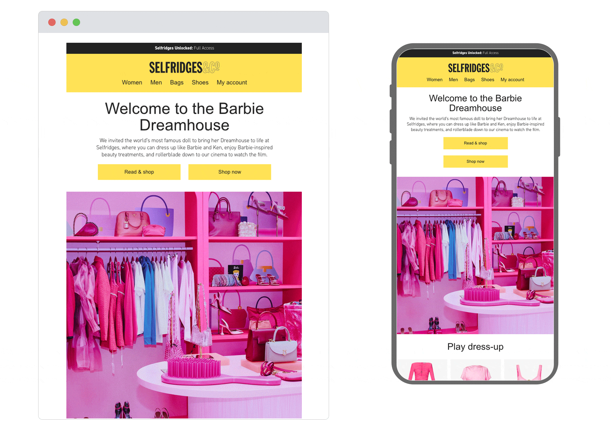
SL: Welcome to the Barbie Dreamhouse
Chosen for: Content
Selfridges have joined in the hype by fashioning a Barbie’s Dreamhouse experience in an email. It lists a substantial number of departments the reader can shop in to fulfill their Barbie fantasy, plus they’re meeting varying needs by inviting customers to engage either online or instore. They’ve also complemented the email, website and store experience with some fun Instagram posts. A great example of being top of the cross-channel marketing game, much like the movie’s own mega marketing team .
2. Captain Whidbey Hotel
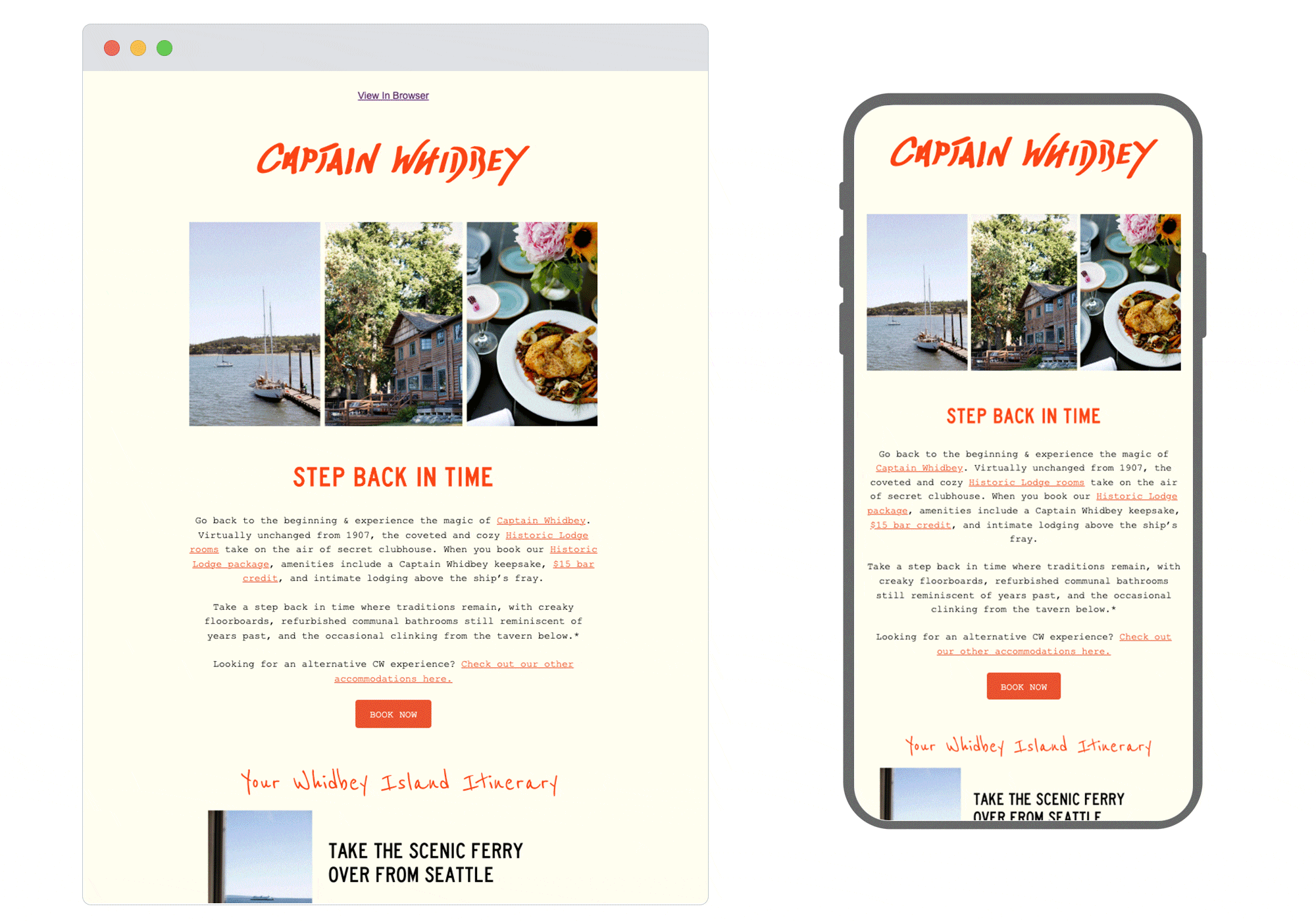
SL: Plan Your Trip to CW
Chosen for: Design
An extremely pleasing design which takes the reader on a journey, encouraging the eyes to glide down the entire email. We love the 'itinerary' section which is not only helpful for visitors but clear to understand, even for those who are completely unfamiliar with the area. The hand-drawn illustration at the bottom is a nice touch too, accentuating the sentimental ‘step back in time’ theme.
3. PizzaExpress
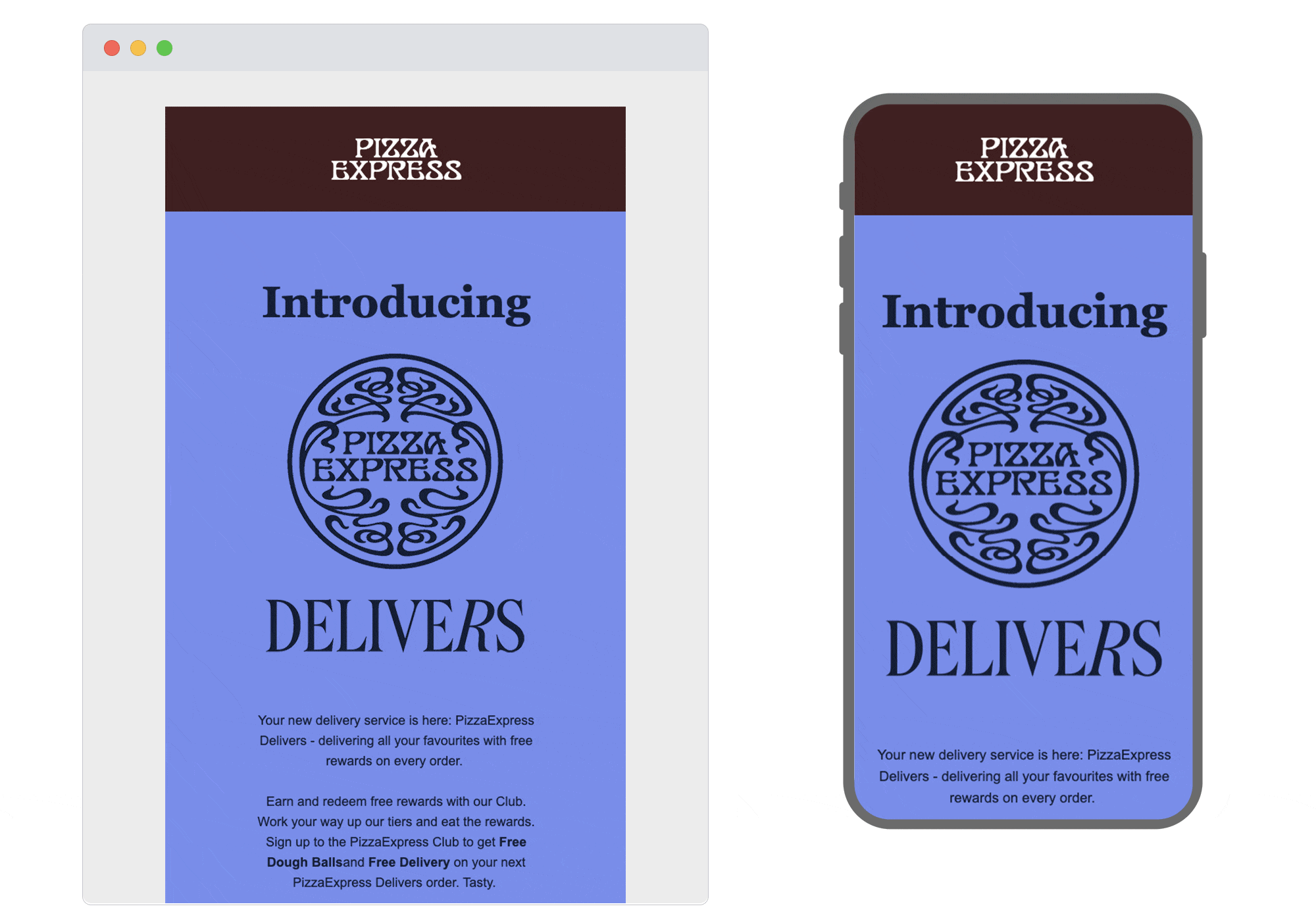
SL: Exclusive offer: Free delivery on your order
Chosen for: Design
One of our lovely clients! PizzaExpress launched their new delivery service, so they wanted a dynamic email to announce it. And we think - just like them - we’ve delivered. Some great work from our designers on the animation in the hero, which works to draw the reader in as soon as the email is opened. We're big fans of animation like this; eye-catching but simple, not taking attention away from the content and copy.
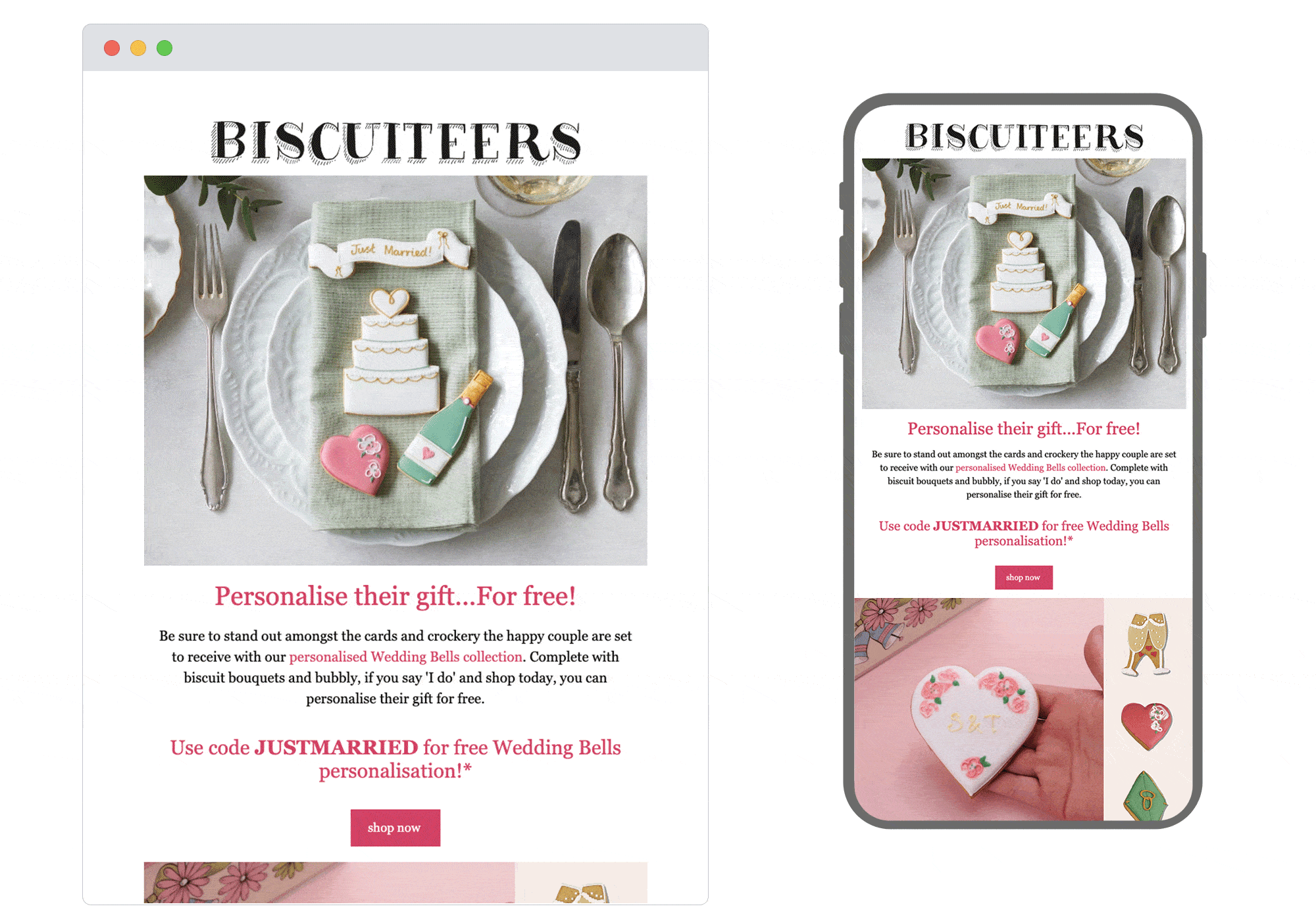
4. Biscuiteers
SL: FREE wedding personalisation when you shop today 👰
Chosen for: Content
With wedding season in full swing, Biscuiteers have chosen the perfect time to grace our inboxes with this topical and beautifully designed email. The mix and balance of their content is always great and this is no exception; with offers, merchandise and engaging how-to's, as well as the cute GIF which showcases their products but also keeps the reader scrolling. We also love the ‘hand-drawn’ social icons in the footer, giving the email a nice personal touch to sign off with.
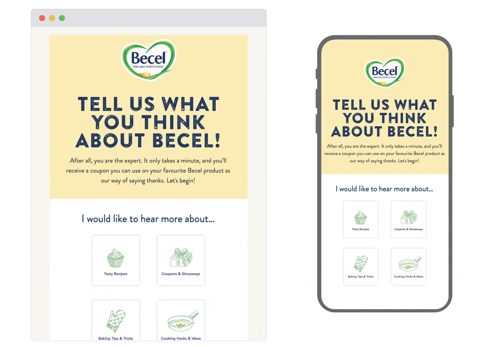
5. Becel
SL: 👋 A coupon for your thoughts?
Chosen for: User experience
Here we have a preferences/data collection email done well. The on-brand design includes plenty of white space, clear information and sketch-like images, so it’s easy to digest and holds the reader’s attention. Becel show that they value their audience by offering a coupon and even when you click through to the data capture landing page, the user experience is simple and shows consistency with the email.
 See more posts