With this month being June, the official start of summer and the midway point of the year, we thought we’d do this round-up a little differently!
So we’ve pulled some of the ActionRocket team together and chosen our favourite emails from this year so far, taking a look at the emails that have stood out to us the most. We’d love to know which is your favourite, let us know over on our Instagram or Twitter.
Take it away, team! 👇
1. January: Adidas
SL: You can still take the quiz to discover your sneaker personality

Chosen by our Head of Strategy, Holly
I love it when brands bring fun content which is aligned to their values focusing on engaging audiences not just selling to them!
This is a fun email and hero animation from Adidas, a clever way of pushing their products and drawing the eye as soon as the email is opened. The CTA takes the user to a landing page to complete the quiz of "which sneaker are you?", which reveals their ‘shoe personality’ and a product to match.
2. February: Disney
SL: You've got mail
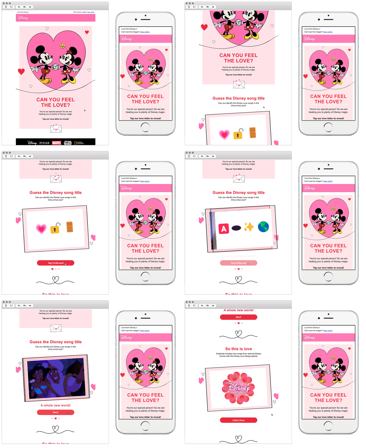
Chosen by our Design Lead, Sophie
I love the use of gamification in this one, the quiz style tap to reveal was super engaging and made me want to click through and find out if I was right or not!
Keeping the content relevant and using tap to reveal content to add value to the users email experience. We love the theme here and the design made us want to continue scrolling (and stick on a Disney film!).
3. March: Dolce Gusto
SL: [NAME], it’s your lucky St Patrick’s Day
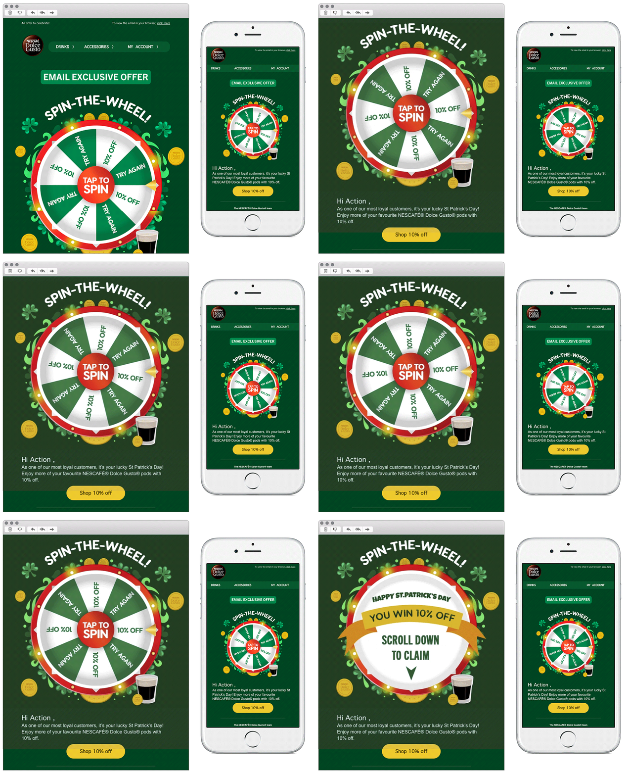
Chosen by our Senior Coder & Interactive Email Specialist, Jay
I love a bit of interactivity, and Dolce Gusto use this tap to spin to entice users to engage with the email. Having a peak under the hood, using an image sprite and CSS to add the movement on click and by using a GIF if the interactivity isn't supported everyone gets a great experience, and who doesn't love the chance to win something!
4. April: Resy LDN
SL: The Resy Lineup: What to Eat, Drink, and Do This Week
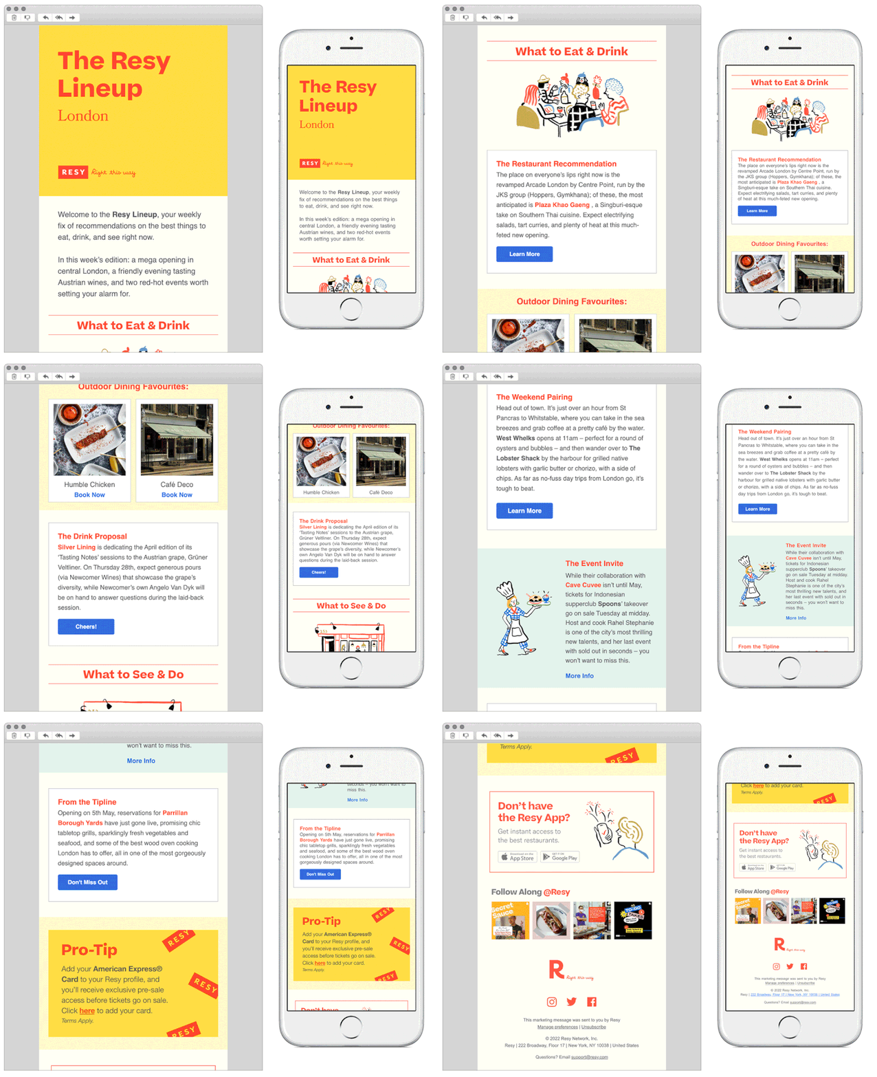
Chosen by our Head of Design, Gary
This is a great example of a brand who have used bold colour to their advantage. Using the bright yellow colour in the header allows for the content to be displayed clearly and effectively. This, paired with the fun illustrations throughout the content makes for a really clear and playful email.
5. May: MOB
SL: Your Exclusive Mob Recipe
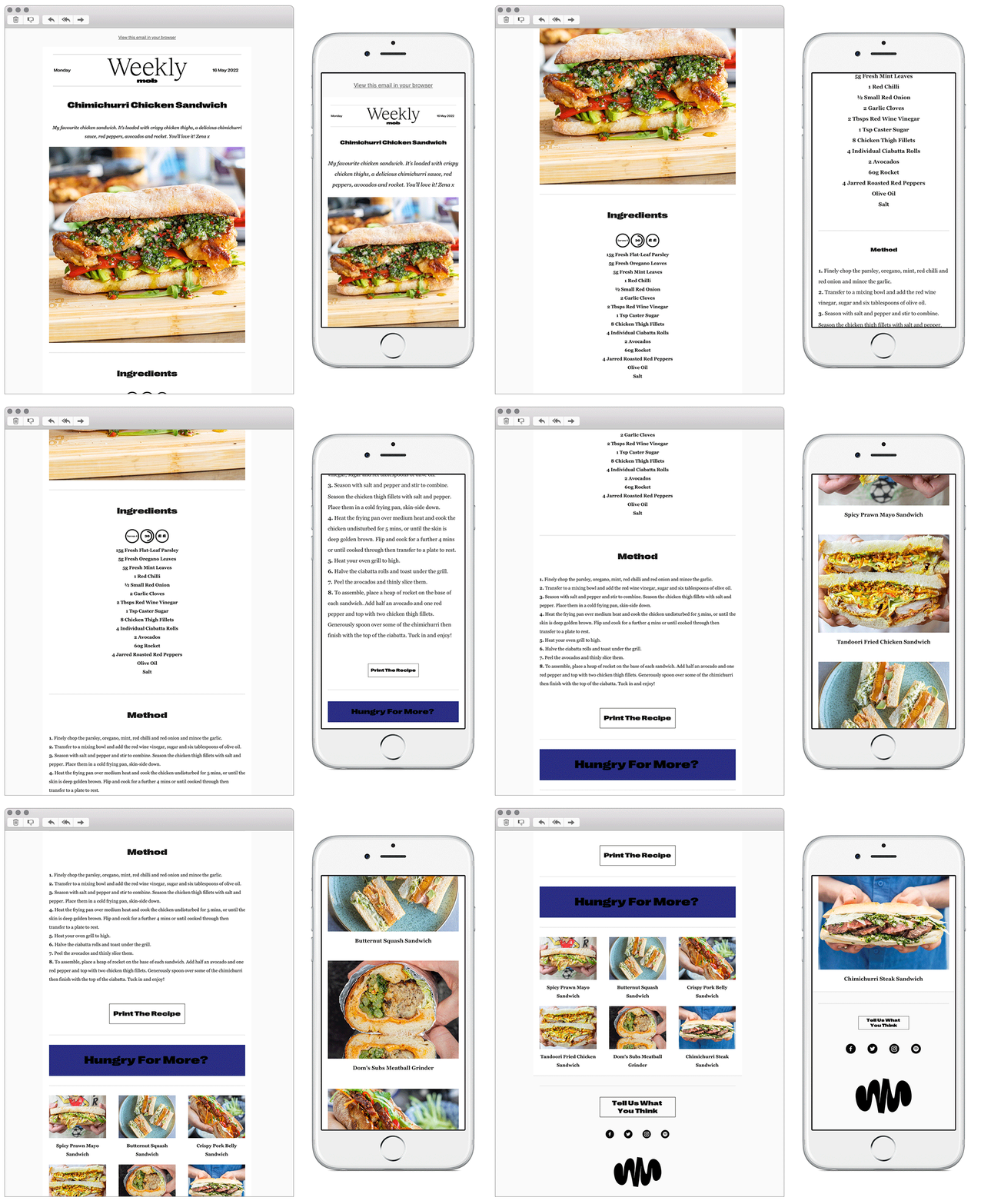
Chosen by our Copywriter, Nicole
It's one clear message that takes you from a stand-out image of what you are potentially interested in, through to how to get it, through to other similar recipes. Good imagery, well supported with the right copy.
See more posts
