We have a great mix of wonderful emails to share with you this month.
From gamification, to editorial design, to how to nail a rewards email. We have it all, lots of tips and tricks for you to take on board for your own campaigns, so your customers can benefit too!
1. Disney
SL: Time to play together
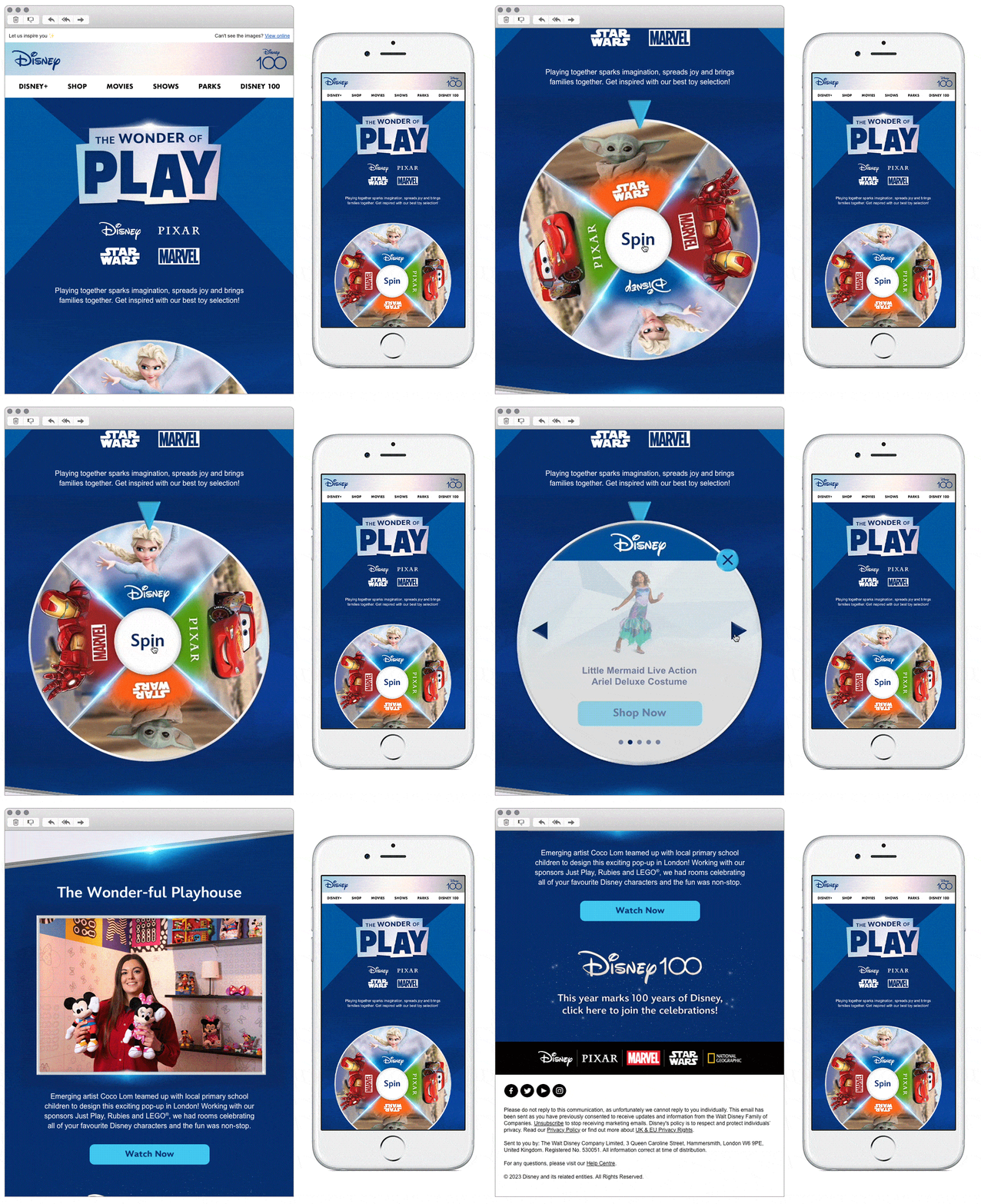
Chosen for: Gamification
Disney are a firm staple in the world of interactive email designs. Having really stepped up their game recently with the various ways to encourage engagement with their readers. A very sleek design and the ‘click to spin’ wheel reveals products related to whichever brand the wheel falls on.
2. Soho Home
SL: Bring the house home
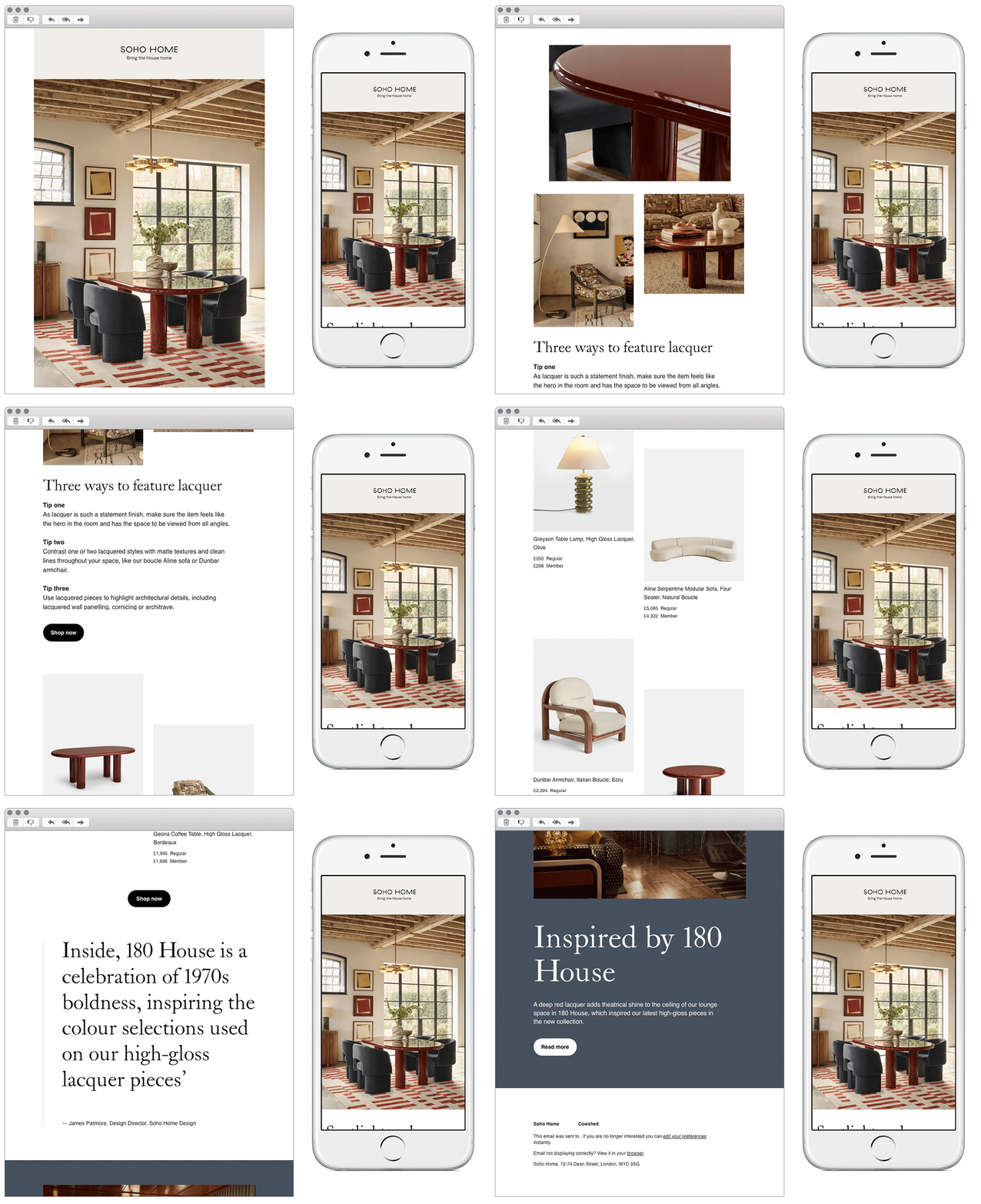
Chosen for: Design
A beautiful editorial style email from Soho Home, sharing their home-wear and furniture products available to purchase. We love the use of product photography, choice of fonts, and the left alignment. Keeping the copy short and sweet, and using clear actionable CTA’s make the email easy to navigate and engage with.
3. Subway
SL: You're inches away from free food
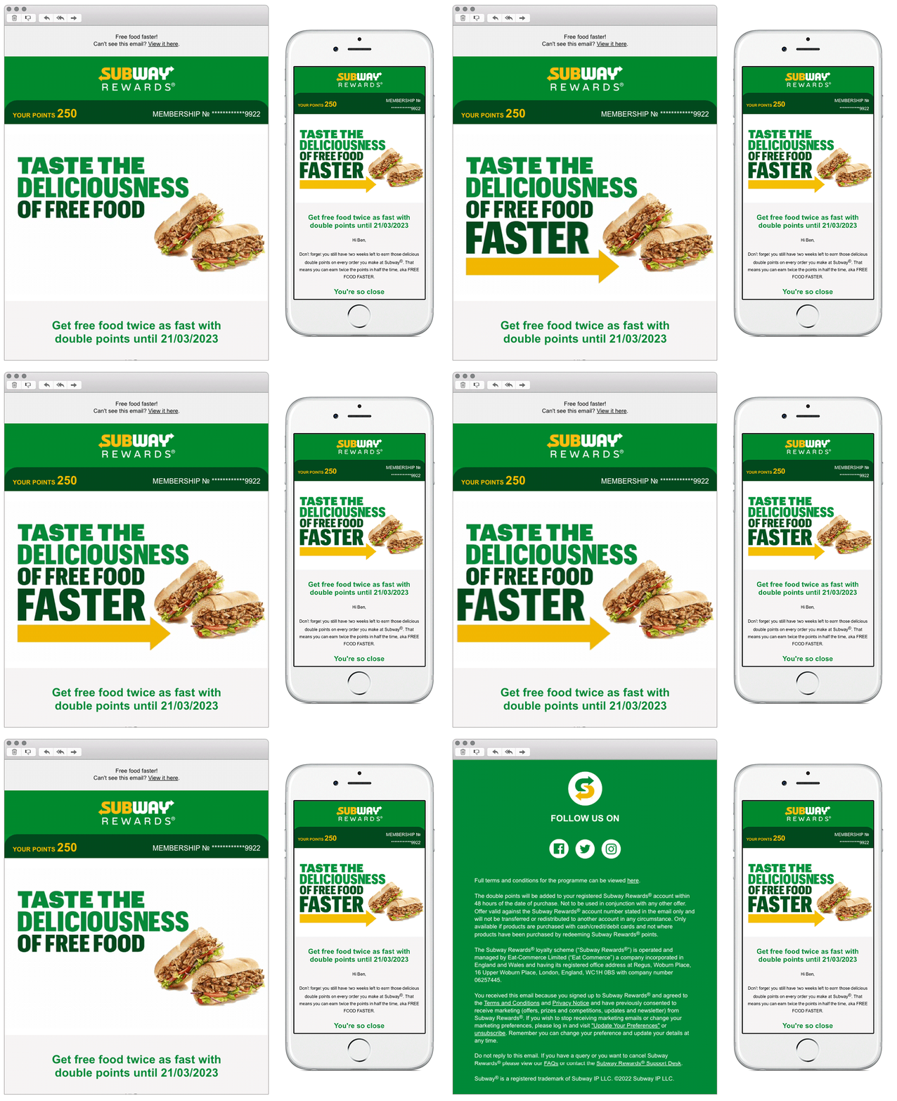
Chosen for: Design
Reward emails are a great way to reinforce loyalty with customers, but can sometimes be difficult to master. It’s important to keep them as actionable as possible, what are you telling the customer that they don’t already know and what are you offering to them of value?
This is a good example from Subway, adding personalisation is a nice way to lead into the email. Pulling in the customers membership number, brand points, and outlining what those points actually mean. Keeping it simple and making it clear how they can redeem the points in store.
4. All Trails
SL: Introducing: Trail Previews – a new way to view the route
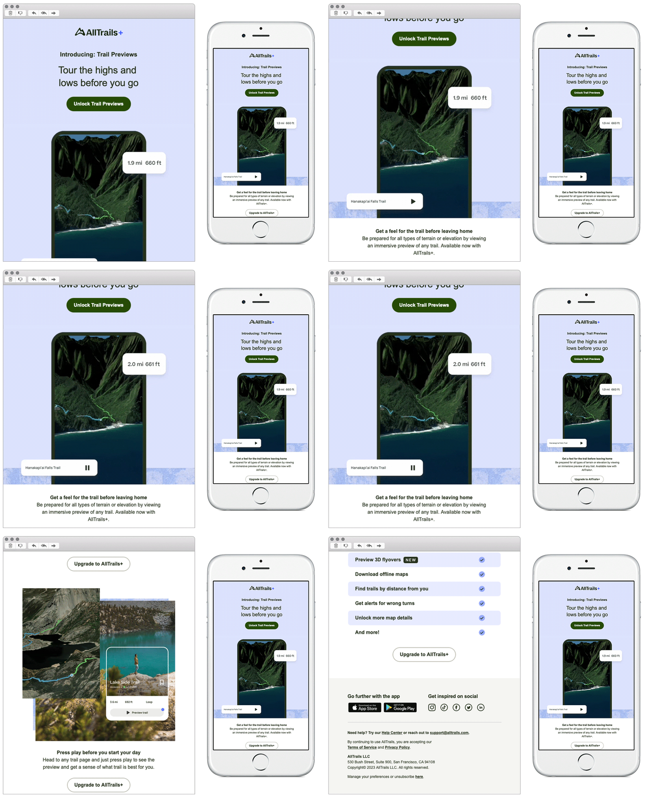
Chosen for: Design
A great example of how you can use educational GIF’s to include more information in a simple way. All Trails have multiple benefits for users using their app on the go, but this is a nice way to push them to use the app for pre-trip planning too.
We also like how they have outlined the clear differences of customers upgrading to a plus account. A simple check list of the benefits makes it easy to know what you get with a basic and plus account and whether it’s worth upgrading.
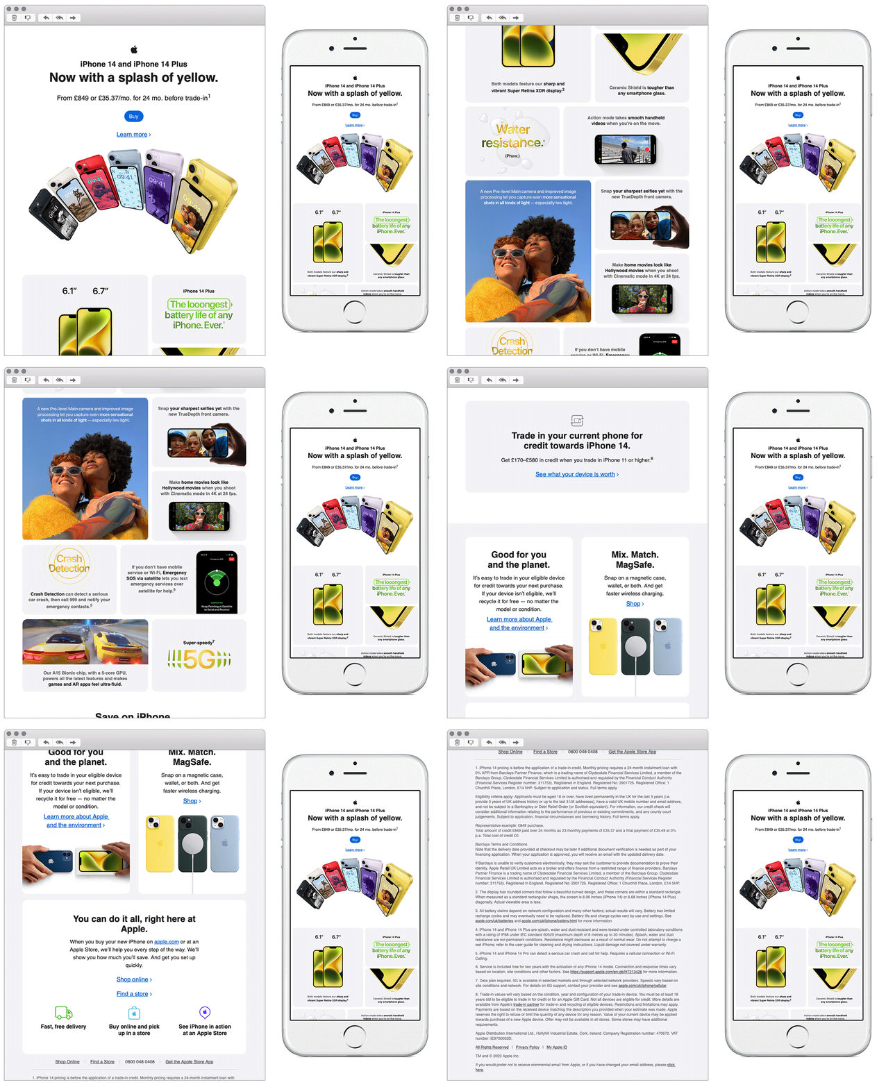
5. Apple
SL: iPhone 14. Now in six spectacular colours.
Chosen for: Design
A favourite brand of ours, Apple rarely disappoints with its emails. We enjoyed this one due to its nice gallery style layout in the hero module. Setting the scene upon open, and showing the reader the multiple coloured products available in a very simple way.
The clear outlining of module information boxes are a nice touch throughout the email too. Keeping the content clear, concise and scannable.
See more posts
