
Oh yes, it’s that time of the year! The month of the King’s Coronation and the month of May the 4th Be With You.
1. McDonalds
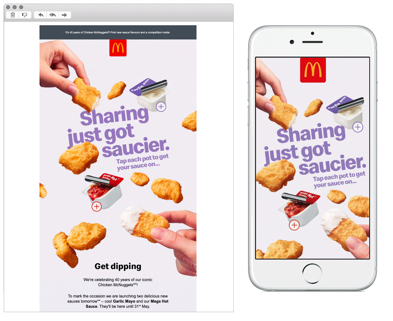
SL: Incoming tomorrow: NEW SAUCES! 🤩
Chosen for: Interactivity and Copy
The interactive design invites us to tap on the pots and find out more about McDonalds’ new sauces. It’s effective, simple and certainly makes us want to have a dip! The copy has a fun, celebratory tone which raises excitement for their big occasion: 40 years of Chicken McNuggets.
We also like the tertiary content, with the 'Set a reminder' and ‘Remind me!’ CTAs pushing the reader to add the event to their phone’s calendar - a nice way to keep the campaign front of mind.
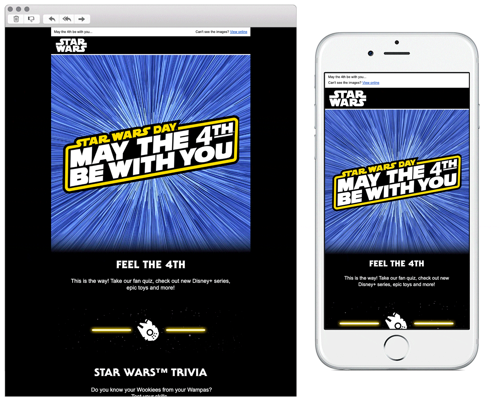
2. Disney
SL: Happy Star Wars™️ Day!
Chosen for: Design and Interactivity
Star Wars fan or not, pretty much everyone knows the relevance of the infamous pun, May the 4th Be With You. What a joy to see Disney optimising this golden opportunity to promote their brand and products in such a fun and engaging way! The imagery and design immediately immerse you into the galaxy far, far away. Once you’re there the quiz is enough to keep any fan clicking, but with the added feature of the lightsaber progress bar it’s almost impossible for anyone to resist. Obsessed, we are.
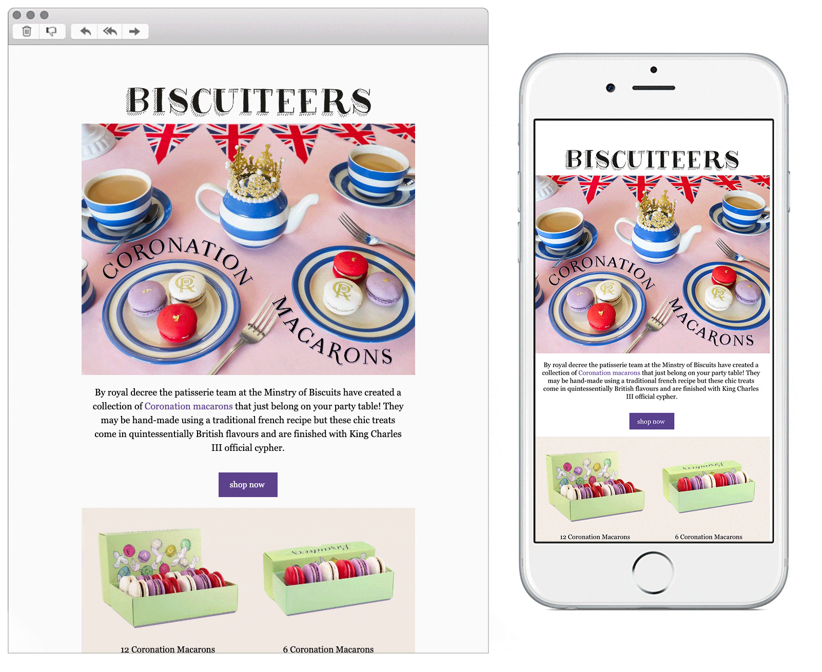
3. Biscuiteers
SL: NEW IN | Coronation Macarons 🤩
Chosen for: Content and Design
Biscuiteers are doing a regal job of promoting their delectable-looking Coronation themed macarons this month. The gorgeous product photography in the hero succeeds to make the reader feel inspired for their tea party table to look as beautiful as the image. The animation in the secondary module displays the designs of the macarons perfectly and in an eye-catching way, plus the van traveling along the email’s footer is very cute.
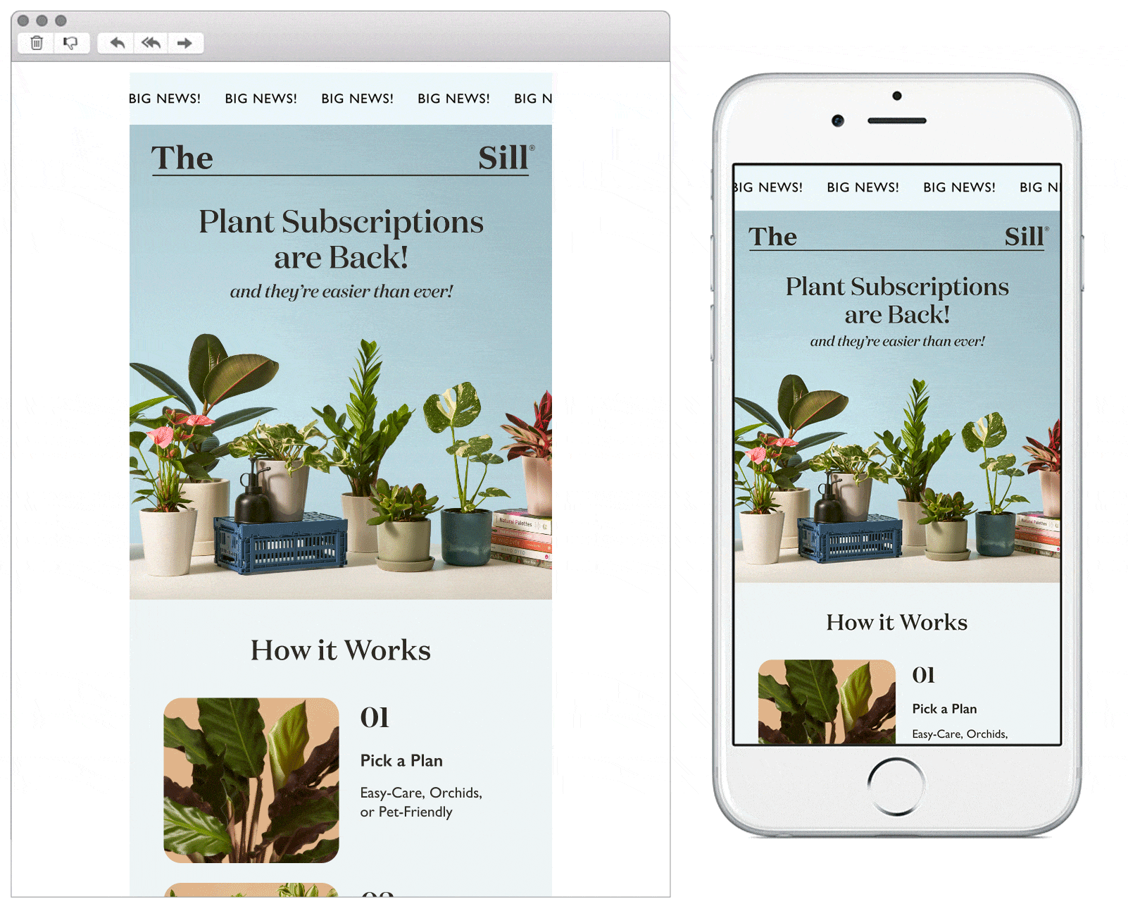
4. The Sill
SL: 🎉 BIG NEWS! Plant Subscriptions are Back!
Chosen for: Design and Content
The eye is instantly drawn to the animated banner, a very effective hook without being too overbearing. Then follows pleasing images of plants as you scroll down, their details being shown beautifully through high quality photography and the clean, striking design. Once you’re interested in the products, it’s great that the step-by-step ‘How it Works’ module is so simple and inviting. A bloomin’ enjoyable email experience, on the whole.
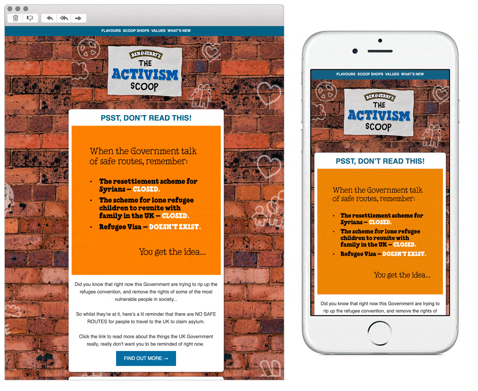
5. Ben & Jerry's
SL: [Name], join us and take action!
Chosen for: Content
How refreshing (bad ice cream pun intended) to open a brand’s newsletter that’s dedicated only to raising awareness and calling for action about an important and timely topic. It’s impressive that Ben & Jerry’s don’t push their product once in the email, but not only that; the content is also brave. Not all of their audience will agree with their stance on this often contentious issue, so they risk losing a portion of their consumer base. Despite this, they’re using their position to influence change and in providing an easy way to take action it invites the reader to become more involved in the cause. Bravo Ben, bravo Jerry.
 See more posts