
Expect a fair amount of ghoulish gifs and terrifying taglines in October’s round-up. It would be rude not to in the month of Halloween, right?
1. Magic Spoon
SL: Get $10 off this spooky season!
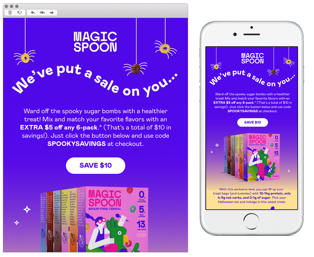
Chosen for:
Design - This design screams ‘Halloween!’ whilst sticking closely to their TOV, so it’s still immediately recognisable to the brand.
Copy - Again, fun seasonal copy that doesn’t stray far from how they usually communicate.
2. Quip
SL: 👻 Don’t ghost your oral care: 20% off bundles!
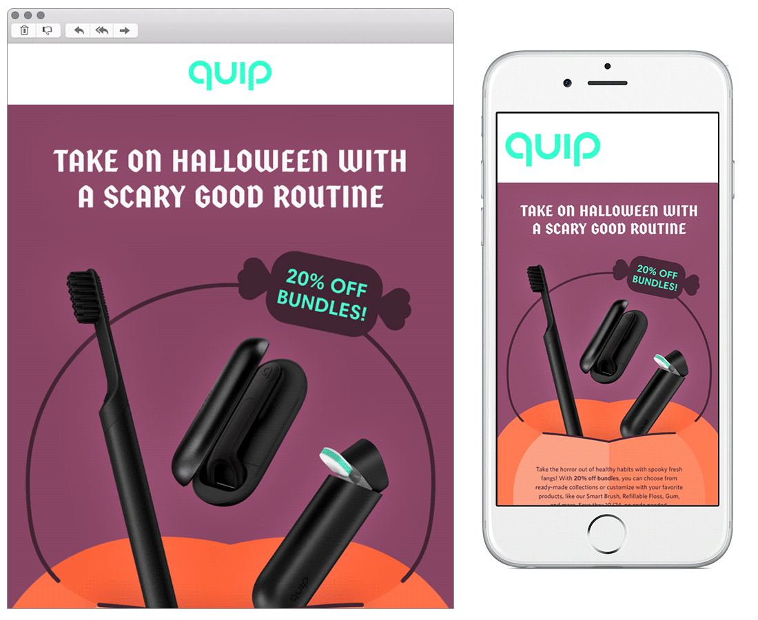
Chosen for:
Design - An eye-catching email that’s instantly relatable to Halloween.
They have even replaced their usual brand font in the hero to align more with the spooky subject matter - a fun, dynamic3 move, which we’re all for!
3. Jib Jab
SL: Send Spooky, Scary, Skele-TONS of Fun! 💀
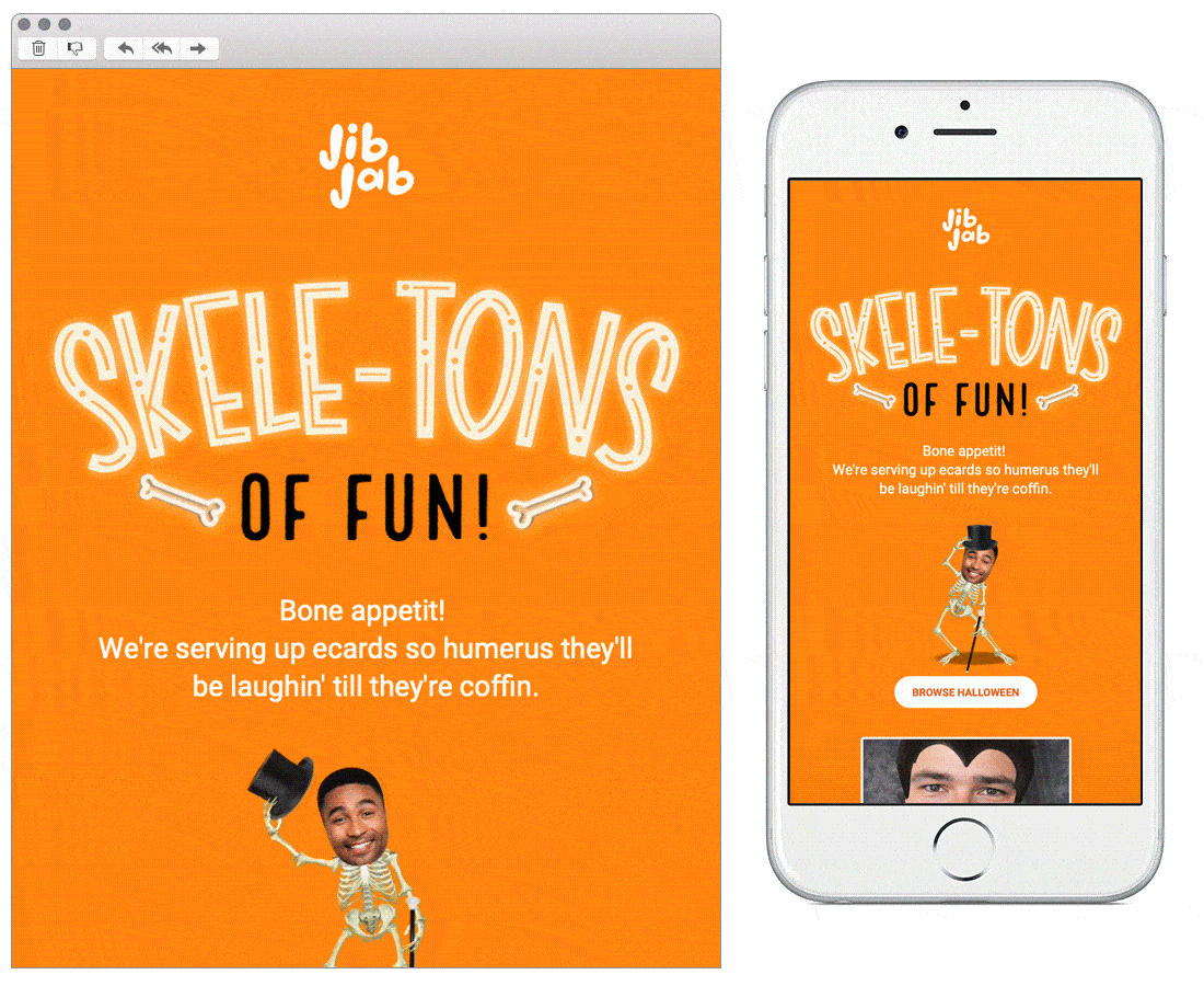
Chosen for:
Personalisation - We’ve used Jib Jab in the past to create some team animations, so they now tailor their emails to us using the faces of ActionRocket! This month stars our very own Elliot as the vampire 🧛 An impressive example of funny, memorable personalisation.
Copy - Countless spooktacular puns integrated cleverly as punchy one-liners. Spell-endid!
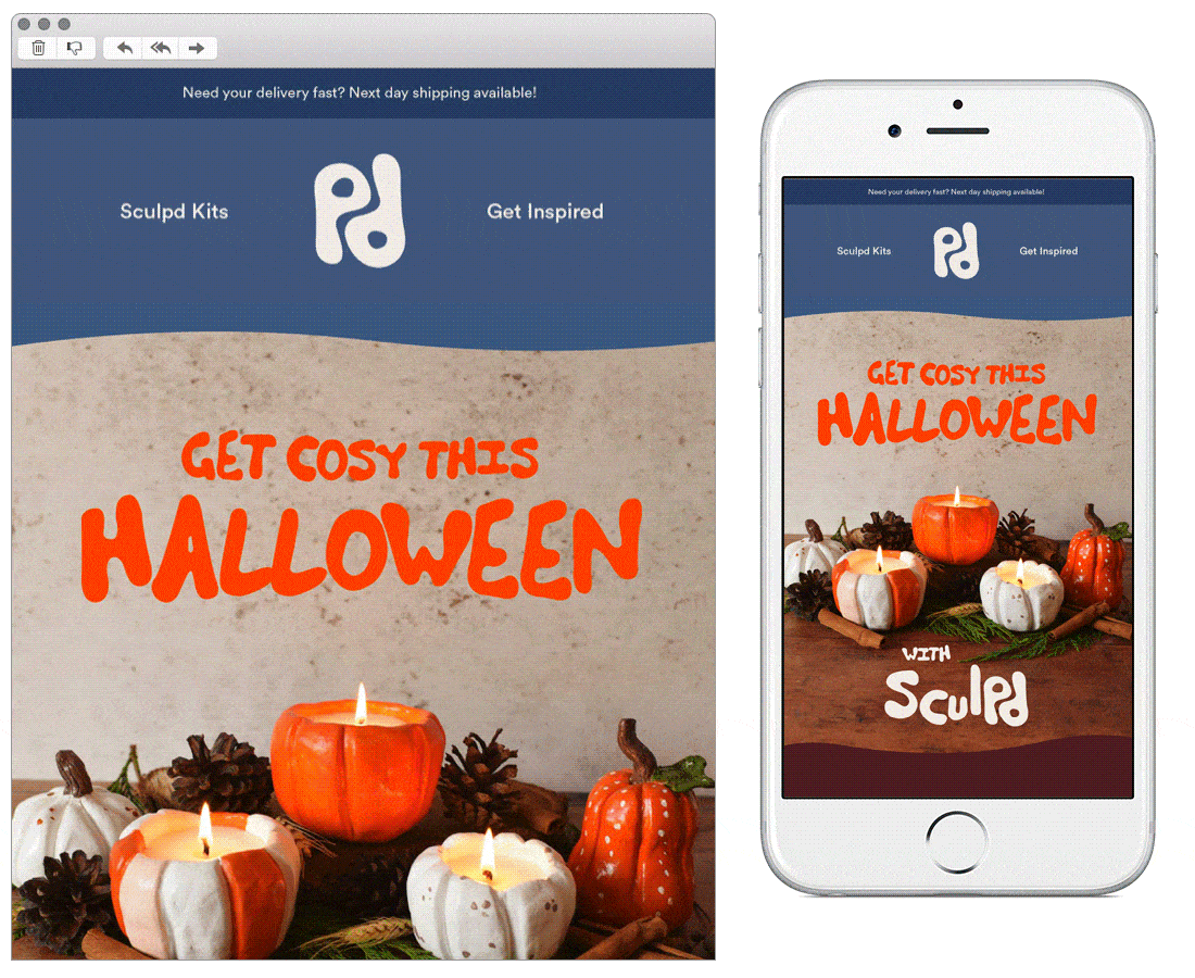
4. Sculpd
SL: New Halloween Pumpkin Candle Kit Has Launched 🎃
Chosen for:
Design - The wavy lines that separate the modules are a lovely touch, complementing their logo and the overall appearance of the email perfectly.
Imagery - The use of gorgeous high-res photography brings a real depth to the email’s aesthetic. And the call-out featuring user-generated Instagram content brings in even more beautiful images. Definitely inspiring to their creative audience.
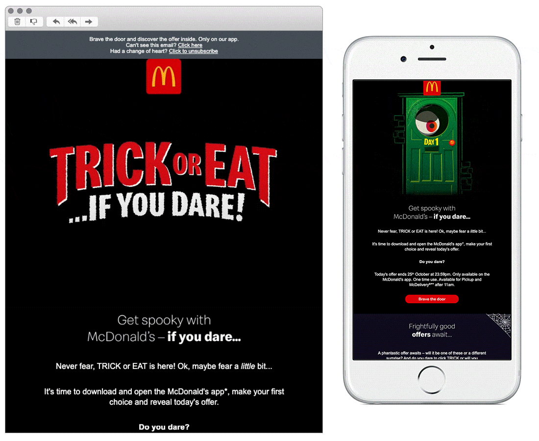
5. McDonalds
SL: Fancy a treat? TRICK or EAT!️
Chosen for:
Design - This email covers a lot of content, but it doesn’t feel overwhelming. Leading with a hero animation is intriguing, leaving the reader to want to know more. There’s nice and clear CTA’s throughout, and the use of a carousel is a great way of space saving.
Content - The premise of the email is pushing customers to download and use the McDonalds app. What the reader has to do is made clear through the step by step process outlined at the bottom of the email.
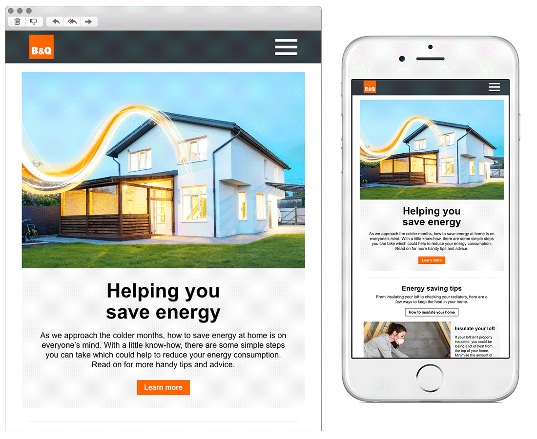
6. B&Q
SL: Energy saving tips for autumn ⚡
Chosen for:
Timely content - It’s right that a brand like B&Q should address the cost of living crisis. This email refers indirectly to the issue without being too obvious or making it seem stressful. Offering tips for their customers on how to live more economically helps to build trust, making them reliable and cosy - just how you’d want your home to be.
See more posts