
We have lots of beautifully designed, image-led emails featured this month.
Many brands are smashing the brief when it comes to design and animation, and we love to feature them! Whilst we’ve fallen for these emails in a big way, we’d be even more into them if the web text was on point. It’s an absolute must to keep accessibility in mind when creating fully image-based emails, such as what happens when consumers open it with poor signal or if the images aren’t loading. Just a little something to bear in mind while we’re making our stunning visuals, Email Geeks! Now, let’s meet our October finalists…
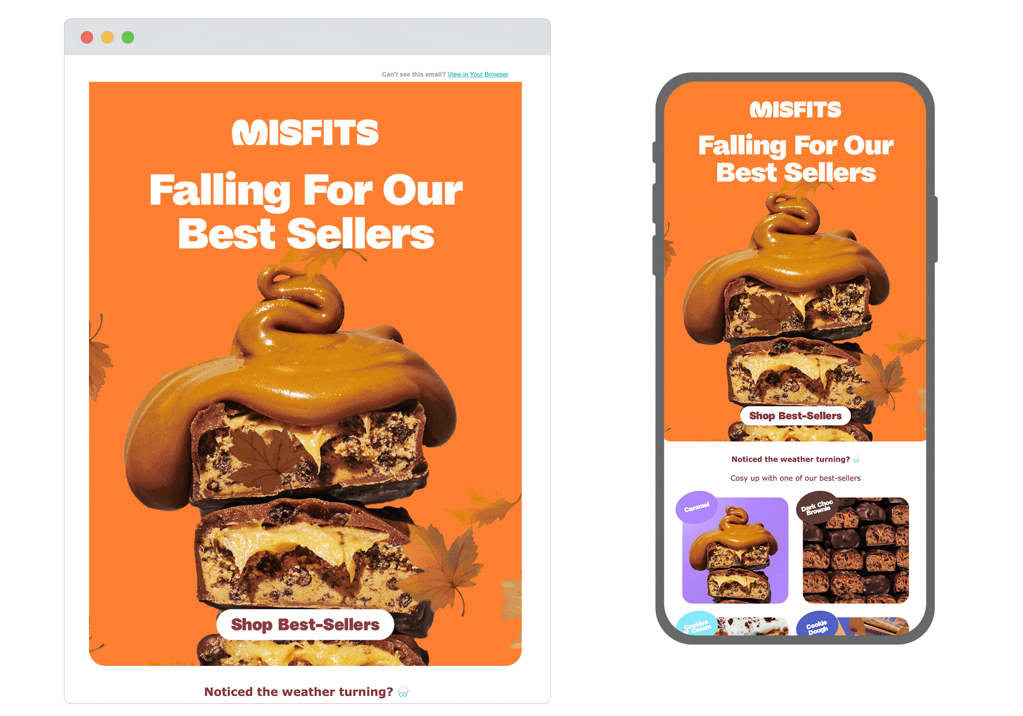
1. Misfits
SL: This Autumn, stay cosy with our bestsellers 🍁🍫
Chosen for: Design
We love how each element of this email complements the others. Starting with the subject line, through to the Autumn-themed design featuring falling leaf animation and rich hues, to the impressive product photography that screams ‘comfort food this way’.
With barely any copy, Misfits have managed to tie in the turn of the season with a necessity to cosy up with their products asap. Nicely done.
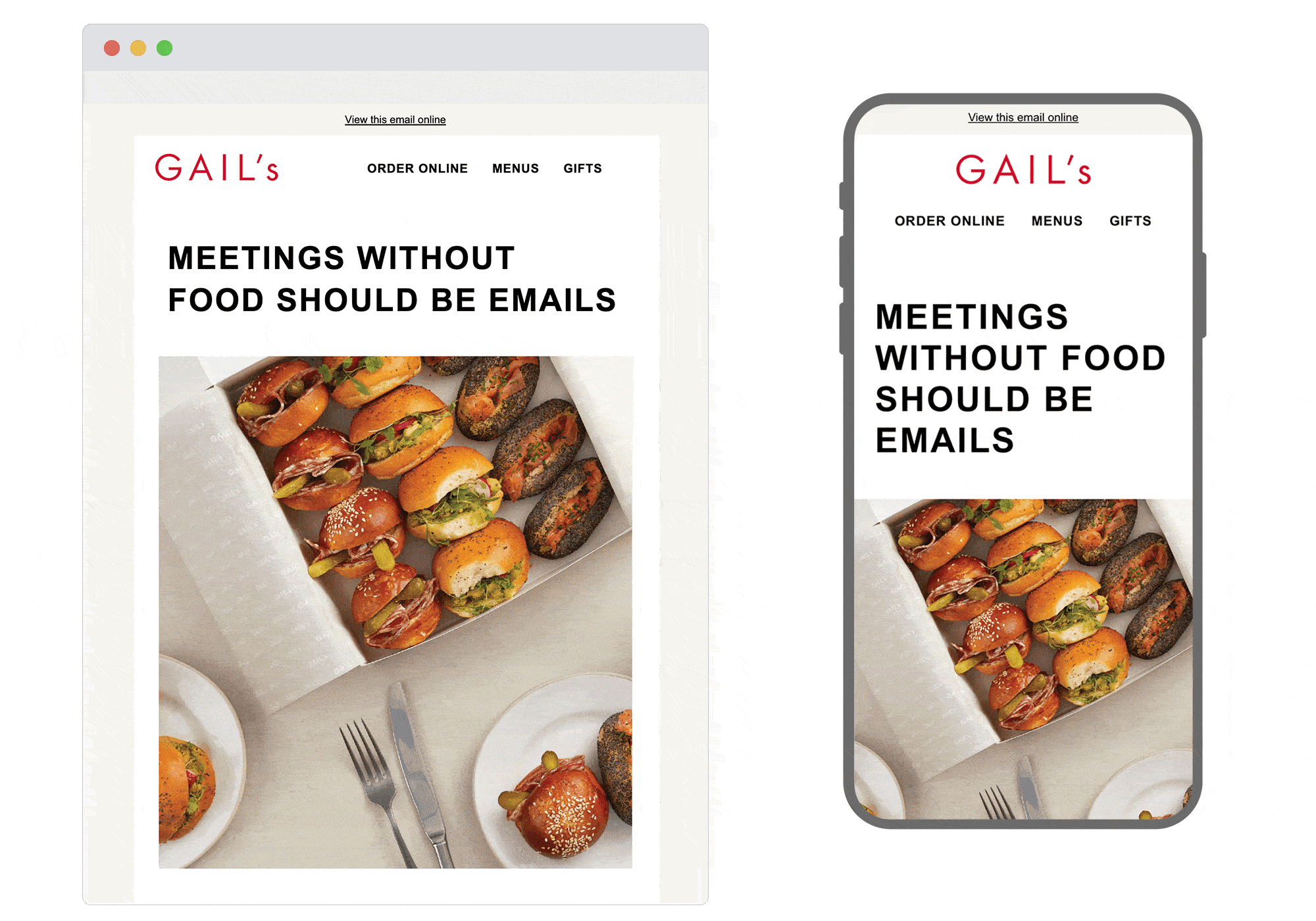
2. Gail’s
SL: Putting The ‘Lunch’ In Lunchtime Meetings
Chosen for: Copy
Gail’s knows their B2B audience. The person who skims marketing emails in their work inbox is usually the person in charge of catering arrangements for meetings, after all. And this email’s copy speaks to them clearly and humorously, starting with its strong headline. The alliteration in the body copy is clever but silly (yes to silly!), and we like the not-so-subtle connection of business success to good food.
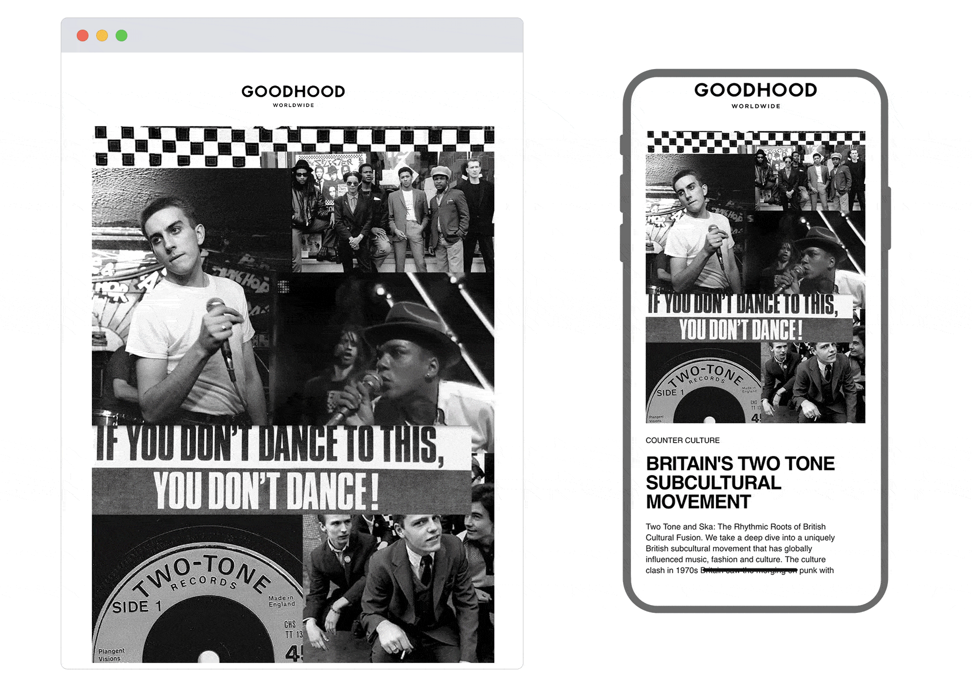
3. Goodhood
SL: We deep-dive into Britain's unique Two Tone subcultural movement
Chosen for: Design
Sometimes it’s good to keep things clean and simple. Which is exactly what Goodhood have done with this email. The layout complements the black and white design in the hero block, making it even more eye-catching. We also love the unique style of navigation in the footer. It’s big, bold and straightforward which seems pretty on-brand in general.
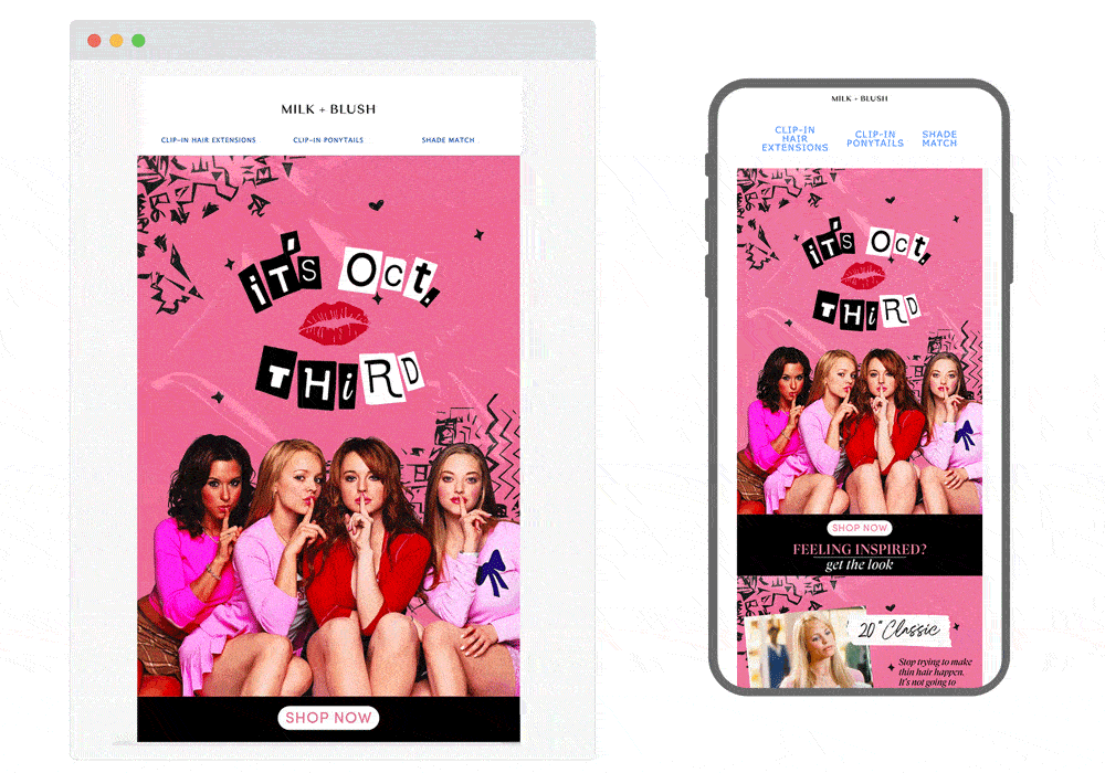
4. Milk + Blush
SL: That's why her hair is so big...👀
Chosen for: Content
The theme might be niche, but it’s pretty topical and on-trend for Milk + Blush’s audience (if you know the movie Mean Girls, you’ll get the October 3rd reference). They’ve fitted quotes and scenes from the movie in with their product range in a fun, relatable way, and having it drop into our inboxes on 3 October is their excuse to promote them. Get in loser - we’re going shopping (at Milk + Blush).
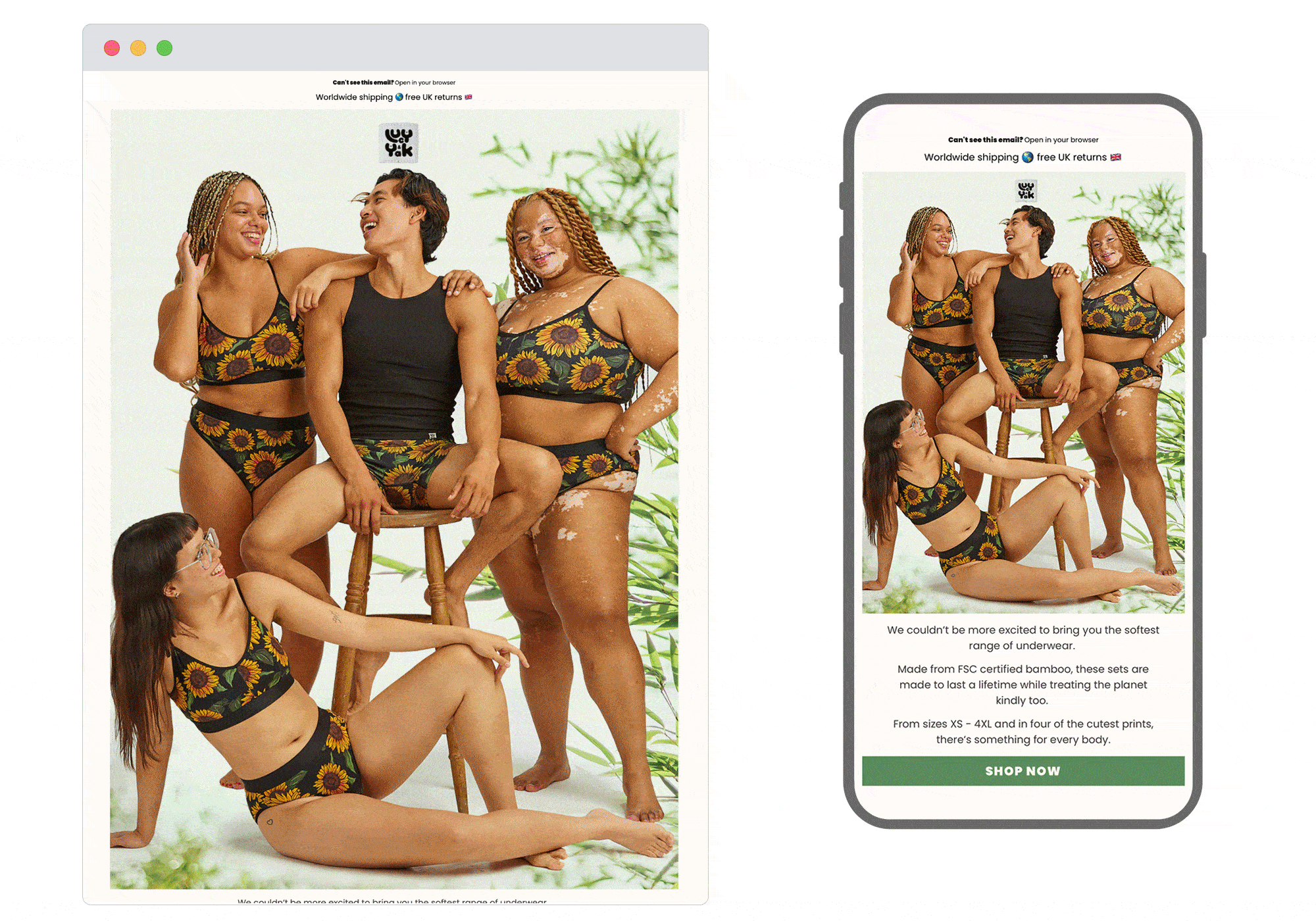
5. Lucy & Yak
SL: Underwear is back
Chosen for: Design and Content
This email grabbed our attention for all the right reasons. Its layout is simple but holds the eye, thanks to the lovely product photography which includes realness that makes your heart glad. We love the unique ways Lucy & Yak have promoted their USPs, especially the bamboo/pant visual which gets across an important point that may be missed if just relying on copy.
 See more posts