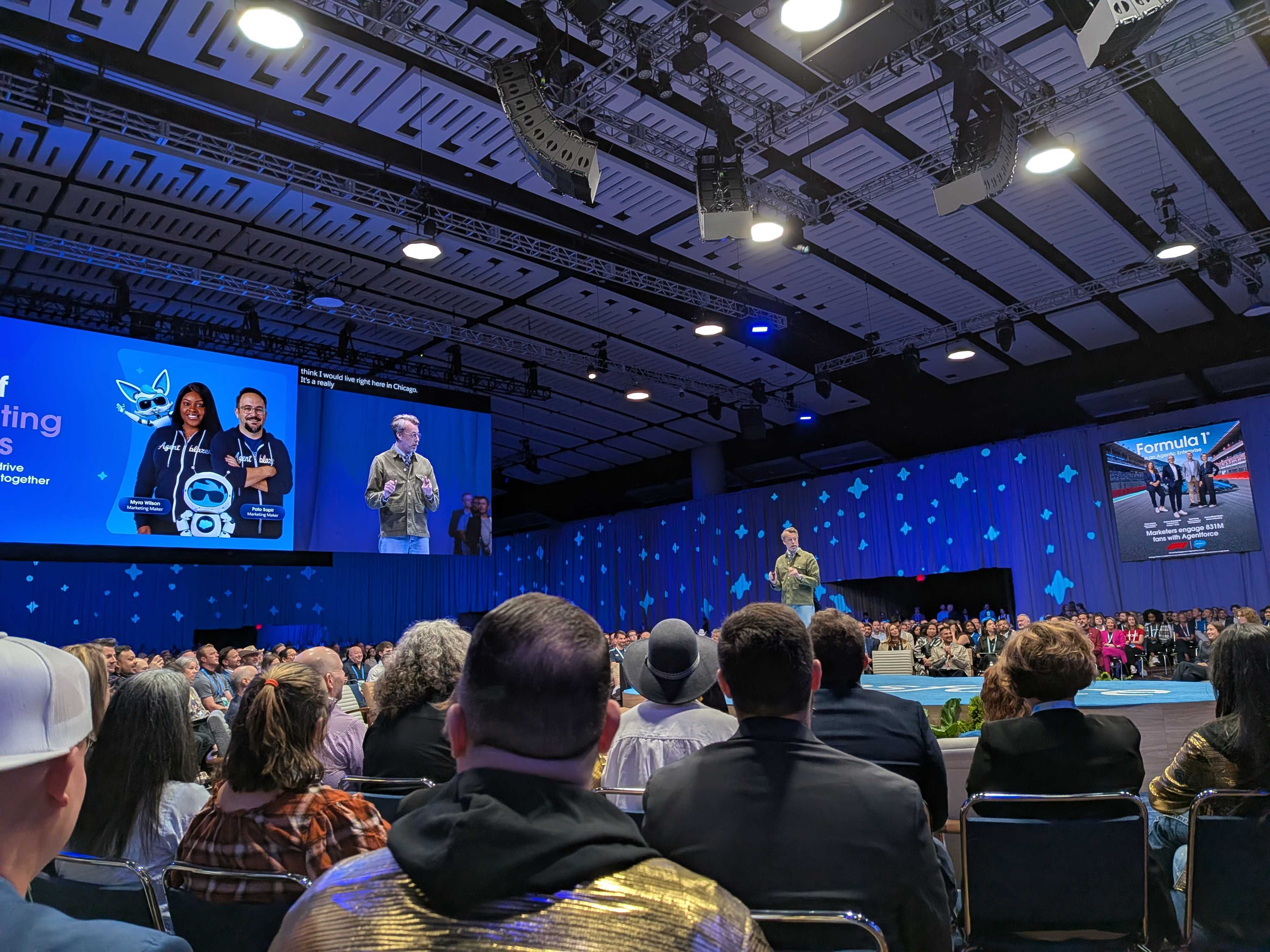
It’s been a couple of weeks since I got the chance to go to Salesforce Connections in Chicago. I’m a bit of a thinker and definitely more of an introvert than extrovert, so conferences are a lot for me to take in and digest!
First thing I would say is, this conference is so friendly and inviting, I’m not sure what I was stressing about. I’m lucky enough to be a Salesforce Marketing Champion and member of the email geeks community, and Connections brought the two together in such a nice way.
Yes you can go and see the latest from Salesforce and Agentforce — the opening keynote was a look into the not so distant future of how marketers will work in the Salesforce ecosystem and a lot of the product focused talks (including the amazing ‘Make Digital Channels Conversational with Agentforce Voice’ with Elliot Weed and Tiffany Flynn) were so in depth and showcased what is possible. I particularly enjoyed the community hub and Theatre 4, where marketing champions and email peeps were talking about all kinds of topics.
I delivered a talk about accessible design, you can find the slides here: Accessible by Design: Email for Every Inbox, Everyone — I’ll create a recording and add it here when it is ready. But here’s what I took away from the two days.
Accessibility
A number of talks I attended focused on accessibility, the first was from Karmel James and Najee Henderson.Their talk kicked off with some American Sign Language. I've been learning British Sign Language for years — so it was cool to be able to make out what they were saying (I guessed a lot!!). But they opened with an interesting take. Karmel started counting the number of visibly impaired people in the audience — which turned out to be all of us wearing glasses, a good 50% of the audience, continuing to then explain how without our glasses, how would we feel?? A great way to introduce the importance of accessibility.
Najee then broke down some ways as a developer you can make your emails more accessible — far too many to list here — but the biggest takeaway was how she thought about alt attributes. All the text books, best practices and online guides say — “If an image is just descriptive, you can leave the alt text blank” — But Najee looks at this differently, by choosing not to describe an image, even if decorative, we are choosing what a person gets to see in our emails. Is that fair and inclusive?
The second talk about accessibility was from an email geek buddy of mine — Ro Santander. Great content, but also beautifully designed slides! One huge takeaway was how to write calls to actions or button text. We’ve always shared that ‘Read more’ or ‘Click here’ don’t meet accessibility best practices and are not descriptive enough, but Ro shared a great framework for creating better buttons:
"Action verb + object
I was then lucky enough to join a ‘Circle of Success’ to collaborate with the Salesforce Accessibility team. Kurt Iobst and Jen Mavis facilitated some great conversations and took feedback from a whole bunch of salesforce users. Including some feedback I gave on the content builder, plus let them know adding an alt attribute to the tracking pixel would make it accessible. I would definitely praise the team who put this together, the table facilitators and Salesforce for being so open about constantly improving accessibility across their tools.
Email Geek shenanigans
It wasn’t all accessibility, Anne Tomlin gave an awesome talk - ‘Yes you can do that in email!’. Shutting down myths that have been floating around the industry for years. Love these:
- Emails must be 600px wide
- Fallback fonts ruin branding

We also had a great discussion after about one myth “above the fold” — A myth Anne shared was that ‘Call to actions need to be above the fold’. Between a few emailgeeks just chatting in the conference hallway, we shared opinions and what we had found, from above the fold being an important factor for some brands, after testing, some performed better, some had no difference. At ActionRocket we tested it with EmailWeekly and found that ‘the fold’ was hard to define when we asked our audience, the fold changed dramatically — since then as I mentioned in my talk — Wearables have also become more popular, AI summaries are much more prevalent and in both cases content near the top of your email is either summarised better, or shown on a watch. Whatever the answer, you need a face to face discussion at a conference to get everyone’s view and to keep learning.
Next up was one of my favourite humans, Logan Sandrock Baird, representing Really Good Emails showcased not only the email trends they were seeing after reviewing thousands of submissions — but breaking them down into actionable chunks. During the session Logan explained white space or as he put it, there is enough white spaces, let’s call it ‘Negative space’ — in a way that made so much more sense to me than any designer has managed before:
“Having negative space gives your brain a chance to pause and relax, rounded corners are also friendlier than sharp pointy ones. Plus they force your text to have enough negative space around them to accommodate the curve”
The below slide is direct from Logan's talk - thanks so much for sharing!

Email Geeks meet up
Anne Tomlin, myself and Logan Sandrock Baird were asked by Guilda Hilaire to organise and facilitate an email geeks meet up at the Community Hub, we gladly obliged. Logan and Anne did an amazing job putting together ‘Email bingo’ as talking starter points to kick off discussions and brought 20+ participants to join together and connect. A new tradition that hopefully can continue at future Connections.

Live Email Optimisation
The final time I got up on stage at the Connections event was to give live feedback on emails submitted by conference attendees, not only on design and accessibility, but we also reviewed the code of the emails in Parcel live. Sharing tips on hierarchy, call to action copy and of course little snippets of code knowledge.

See more posts