We’ve been busy this June rifling through the digital post to pick out our hottest scroll-stoppers.
And these five? They didn’t just show up, they showed off! From sharp copy to smooth design and bags of brand personality, each one nailed the brief in its own way, proving there’s more than one way to do it right.
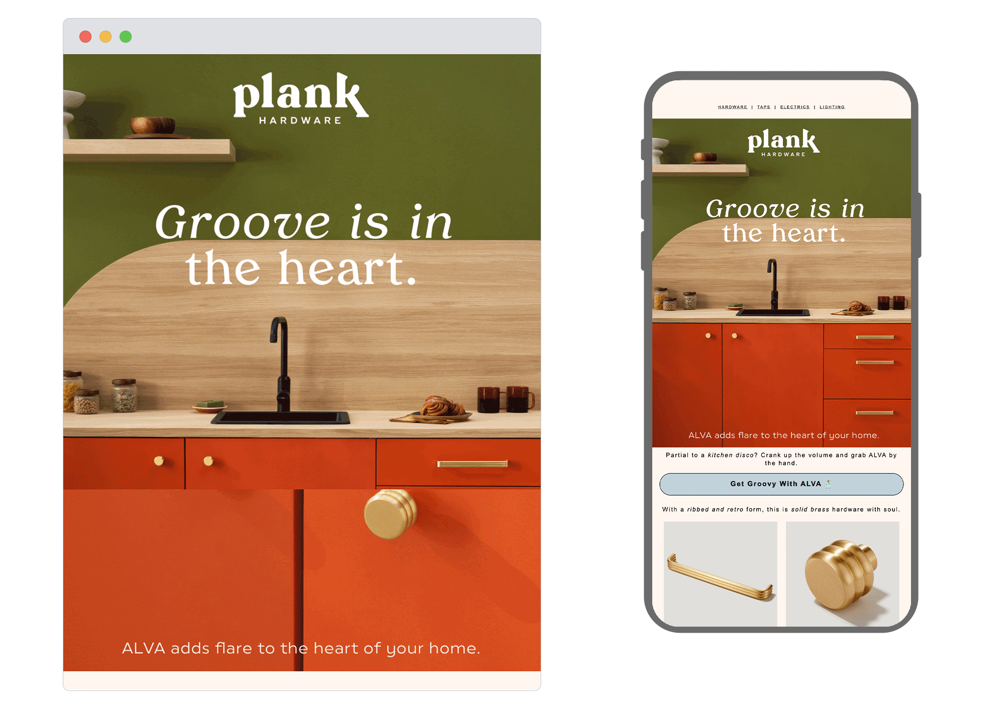
1. Plank Hardware
SL: Groove is in the heart (of the kitchen) 🪩
Chosen for: Fun theme and copy
If you ever doubted that cabinet handles could boogie, Blank Hardware just proved otherwise. Their ‘’kitchen disco’ email had us toe-tapping from subject line to sign-off. Full of witty, warm, and wonderfully human copy, it’s a great reminder that with the right words, even sockets can sizzle.
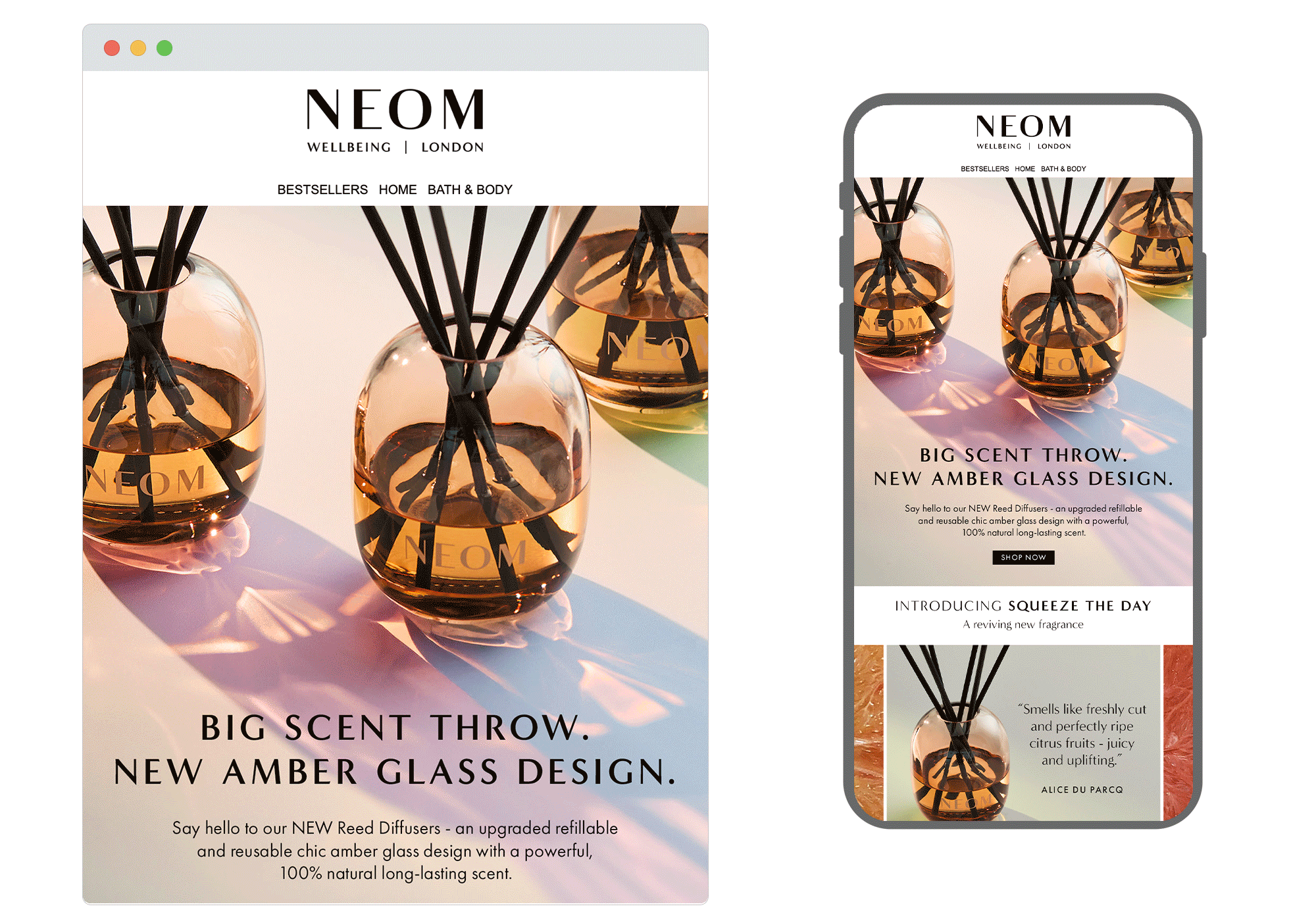
2. Neom
SL: Introducing NEW Reed Diffusers 🧡
Chosen for: Outstanding imagery
What a feast for the senses. Neom’s latest campaign for its new reed diffusers served up a masterclass in mood-setting. We especially loved the way shadows and reflections flowed through the design, giving it a luxurious, editorial feel without feeling overdone. It’s a perfect example of how thoughtful art direction can elevate products into moments to savour.
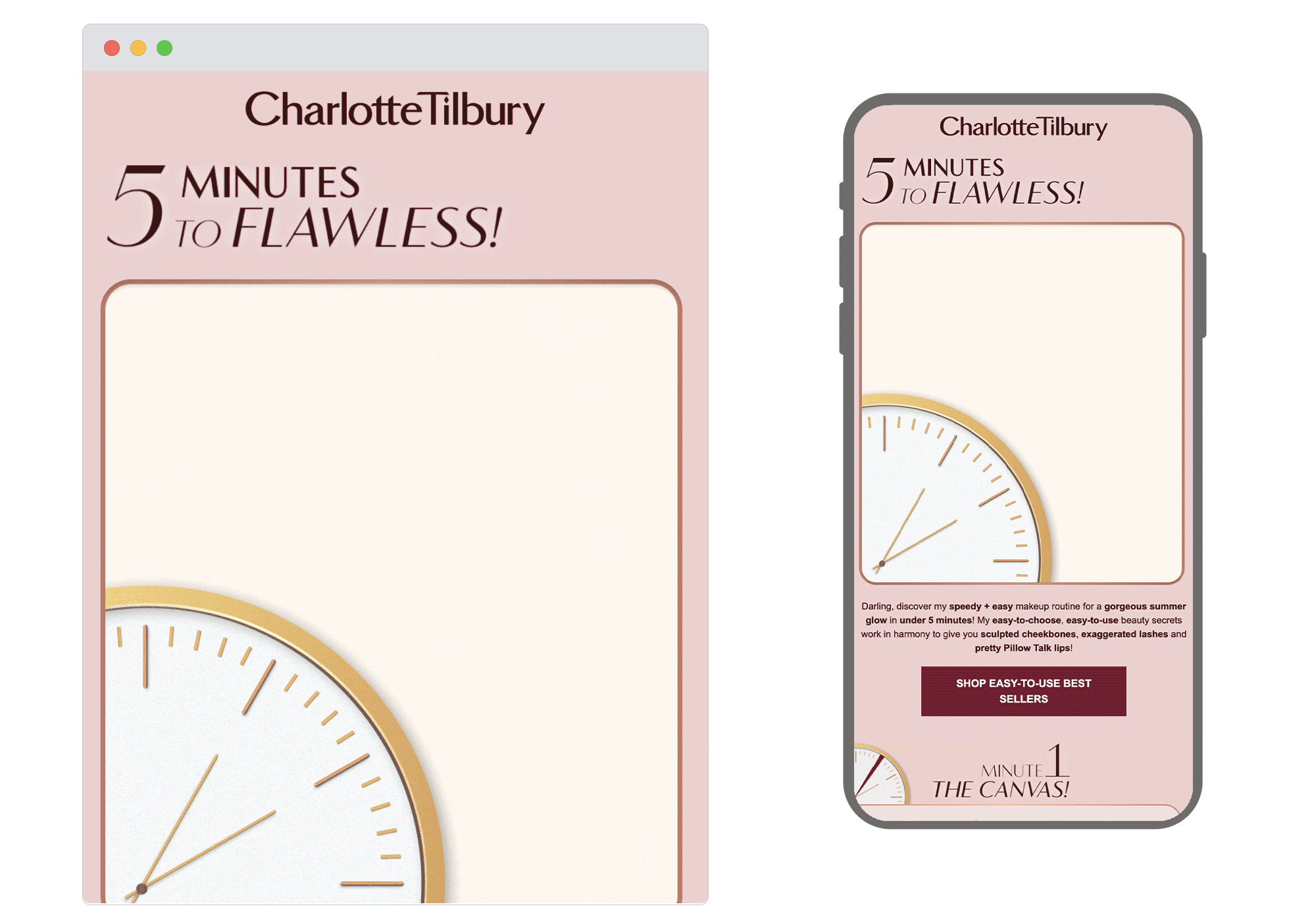
3. Charlotte Tilbury
SL: 5 Minutes To Flawless! ✨⏰
Chosen for: Smart animation and storytelling
The clock’s ticking, and this one came in hot with a clever hero animation that draws you straight in. The animation ties in with the ‘5 minutes’ to a flawless makeup promise that flows seamlessly through the rest of the email. This is smart storytelling with some relatable summer sparkle.
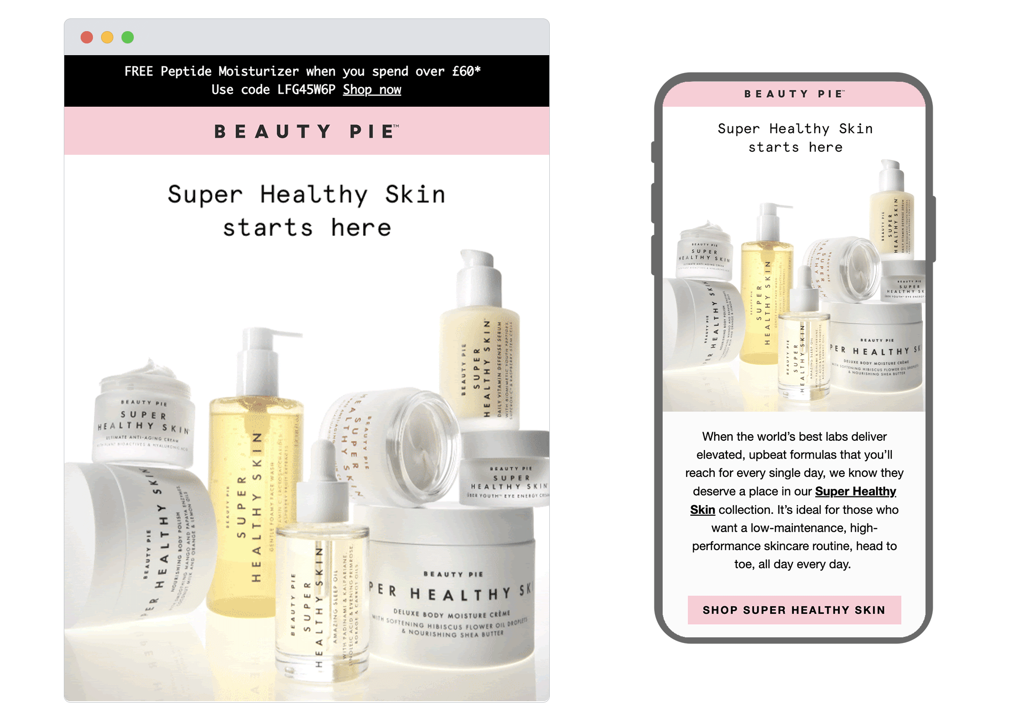
4. Beauty Pie
SL: Open for Super Healthy Skin 💫
Chosen for: Clever use of social proof
Reviews aren’t just a trust signal, they’re a creative opportunity and Beauty Pie proved that with an animated email that turned glowing customer feedback into a visual treat. Bright and simply on-brand, this design has brought real voices to life. A masterclass in making social proof feel anything but flat.
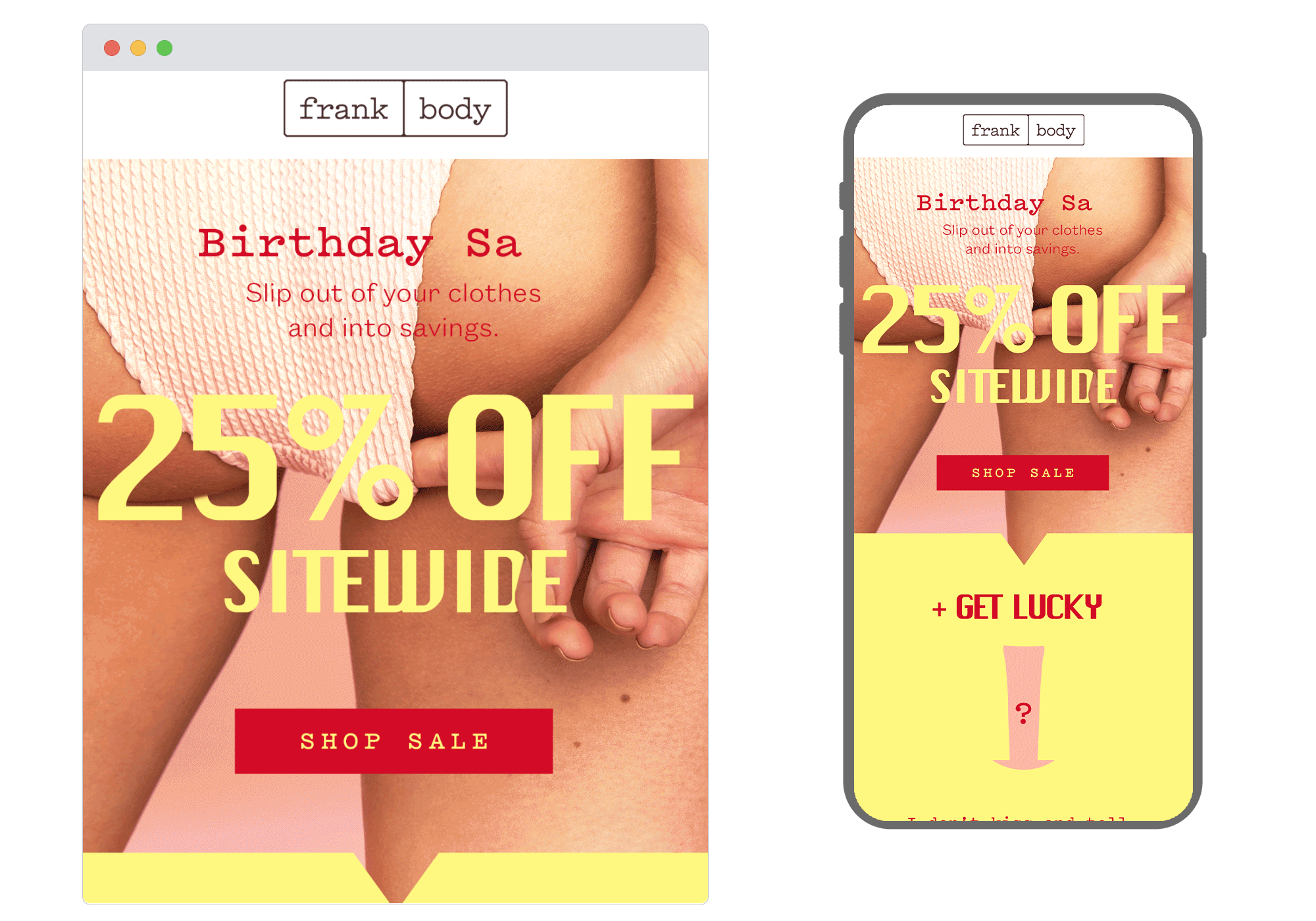
5.Frank Body
SL: 25% OFF: yep, even my Kits
Chosen for: Clever GIF design
Frank Body had us hooked from the hero. That typewriter-style headline, editing itself mid-sentence, was peak Frank – playful, and full of cheek. And it didn’t stop there. A bold secondary GIF kept the energy high and the attitude unmistakable. It’s a brilliant reminder that when copy and design are truly in sync, the result doesn’t just work… it winks.
Got some digital marketing ideas bubbling away but need the right team to bring them to life? Our strategists, designers, copywriters (and proud inbox nerds) are all ready to help you steal the spotlight – so get in touch
See more posts