
Spring is here, and our March top 5 is feeling it. From a welcome email that earns its place to a gut health brand that made us actually read every word, this month's picks span the full range of what great email can do: inform, delight, and stick with you long after you've scrolled on.
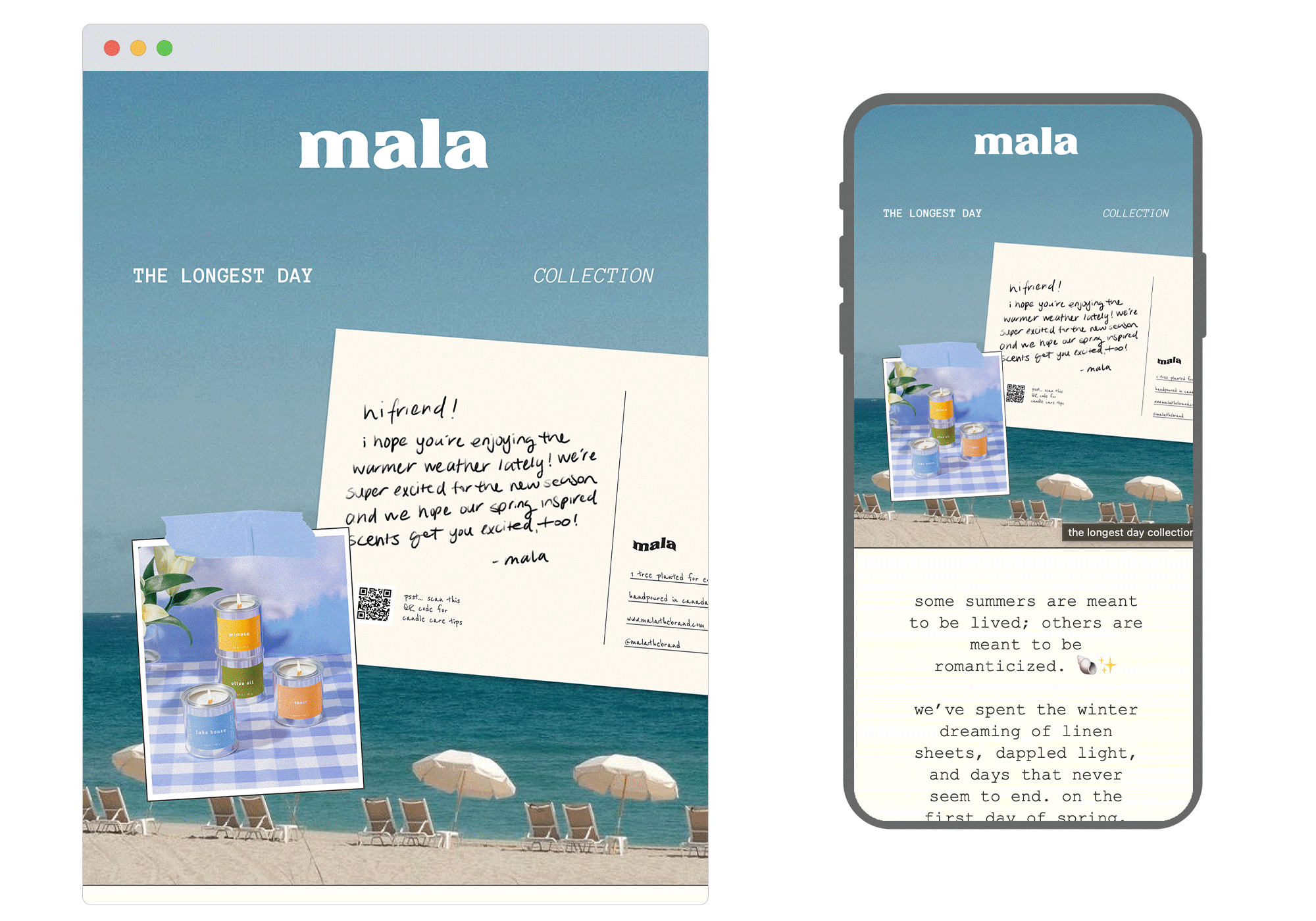
1. Mala
SL: a return to the light. 🐚
Chosen for: Creative concept
Mala leaned all the way into the season with this one. The hero image sets up a dreamy coastal world, beach chairs, sun-bleached tones, a handwritten postcard tucked in like a note from a friend and the body copy earns that atmosphere. Each scent in the Longest Day Collection is described with the kind of precision that makes you feel the moment it's evoking rather than just reading about a candle. "The sound of a screen door slamming" for Lake House. "The hours where time is a suggestion" for Mimosa. It's a collection launch that reads like a summer you haven't had yet
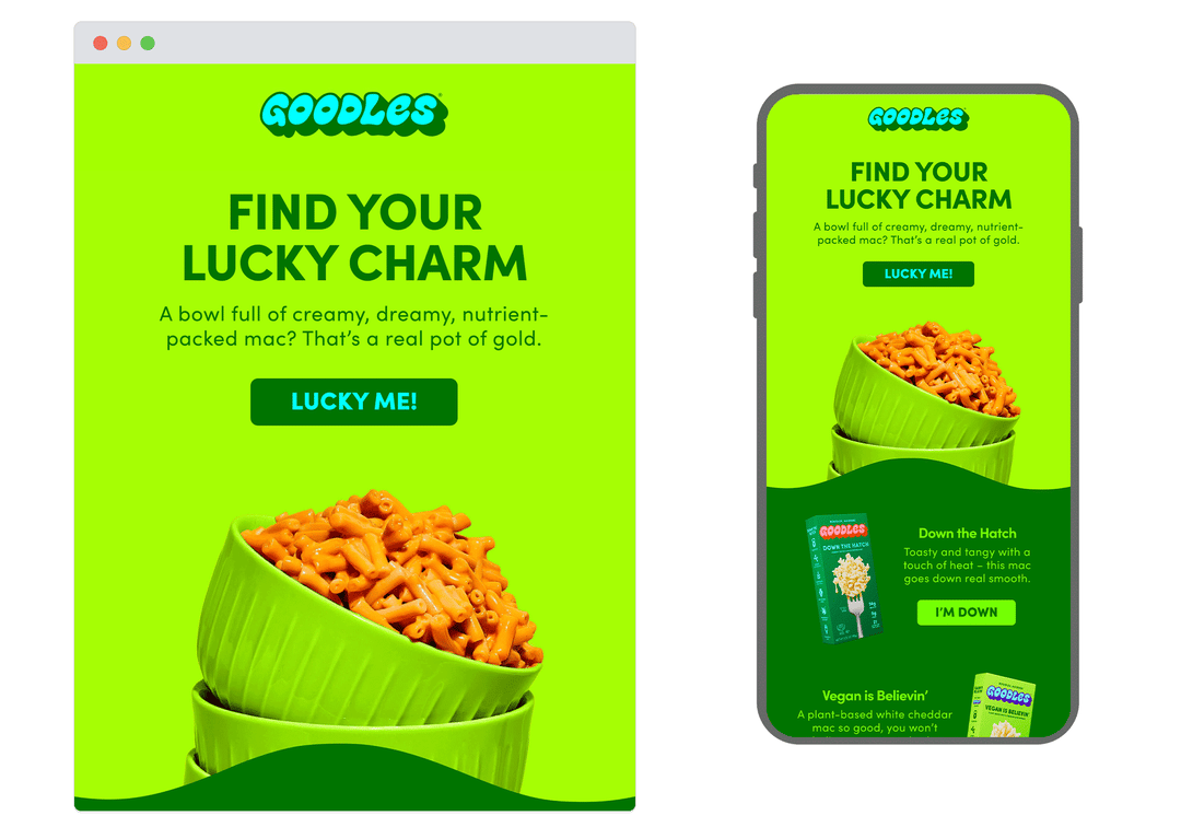
2. Goodles
SL: Feeling lucky? 🍀
Chosen for: Copy
St Patrick's Day, mac and cheese, and genuinely great CTA writing, not a combination you'd necessarily predict, but Goodles pulls it off. The lime green palette earns its seasonal moment without feeling forced, and the product copy for each flavour is punchy, personality-driven and actually useful. "Toasty and tangy with a touch of heat, this mac goes down real smooth." Then the CTA: I'm Down. It's a small detail, but it's the kind of copy that builds a brand. By the time you reach Let's Dance and My Hero, you're smiling, and probably adding something to your basket.
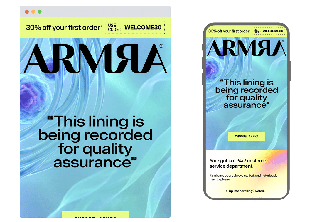
3. ARMRA Colostrum
SL: The Gut Sees All
Chosen for: Storytelling
ARMRA takes an unexpected angle with this one, and it works.The entire email runs on an extended office metaphor your gut as a 24/7 customer service department, logging your late nights, flagging your comfort food, filing complaints on behalf of every organ in your body. It's an unexpected frame for a health supplement, but it makes the science genuinely engaging. The education lands because it never feels like a lecture; it feels like a very well-written memo. By the footer, the product case has been made thoroughly and entertainingly, which is a harder thing to pull off than it looks.
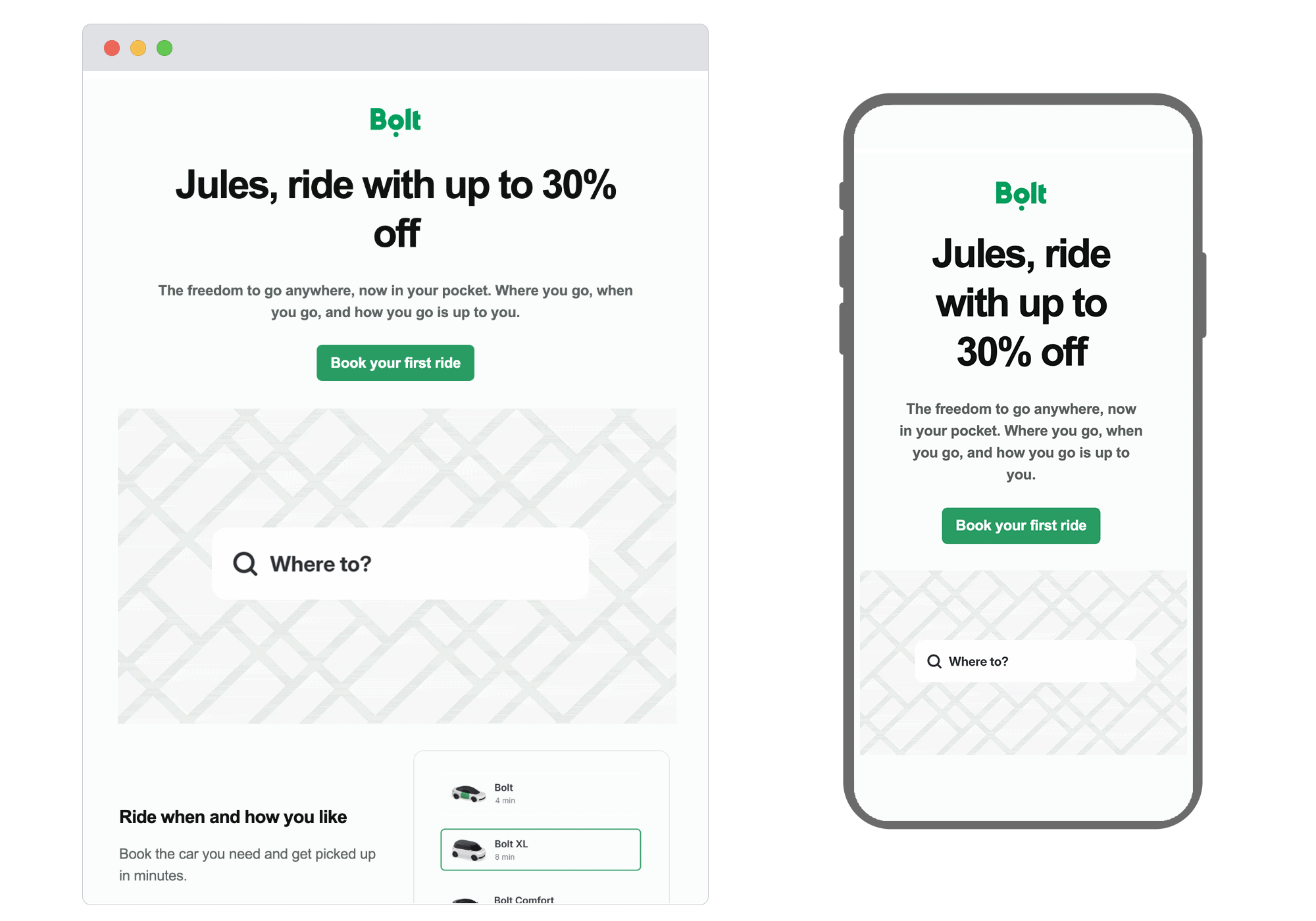
4. Bolt
SL: Welcome, here's your promo 💚
Chosen for: Design
Bolt's welcome email keeps things sharp. The personalised headline is a nice touch, the app UI mockup does the heavy lifting visually, and the copy stays out of its own way, short, benefit-led, and to the point. No promo code needed is exactly the kind of friction-removing detail that belongs in a welcome send, and the hierarchy across the email is clean enough that you never lose the thread. It's a confident, considered first impression from a brand that clearly knows its product.
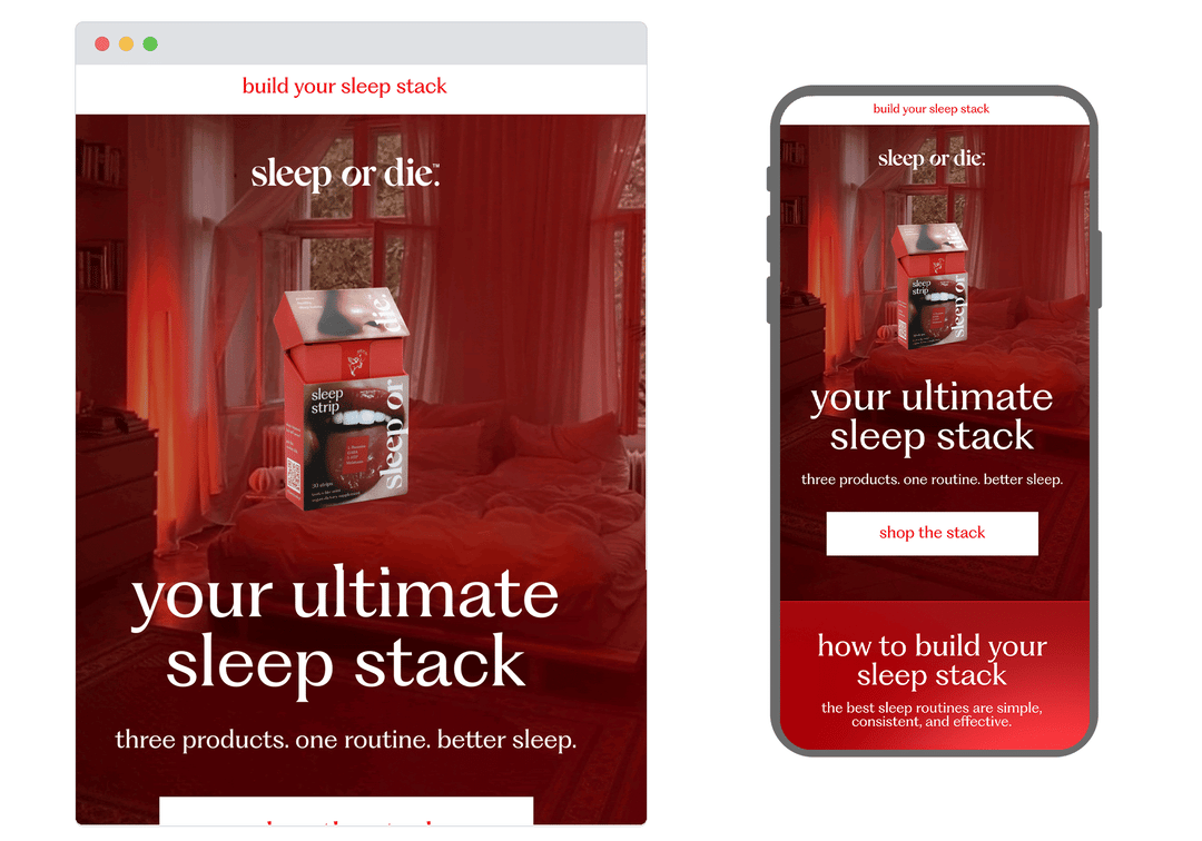
5. Sleep or Die
SL: Build your sleep stack
Chosen for: Messaging
We couldn't resist. Our own Valentine's Day send leaned into the occasion with an interactive love letter concept because if anyone's going to profess their devotion to great email, it should probably be us. The interactive element adds a moment of delight that feels relevant rather than gimmicky, and the overall design keeps the warmth of the occasion without losing the craft. A reminder that the best email experiences don't just communicate, they invite the reader in.
From welcome emails to wellness deep-dives, this month's picks are a reminder that there's no single formula for a great email, just a clear idea, executed well. That's what we do at Action Rocket. Let’s work together.
See more posts