
November brought a brilliant blend of creativity to our inboxes. From clever concepts to beautifully crafted visual storytelling.
This month’s picks highlight brands that know how to capture attention and create memorable email experiences. From tech-inspired error messages to co
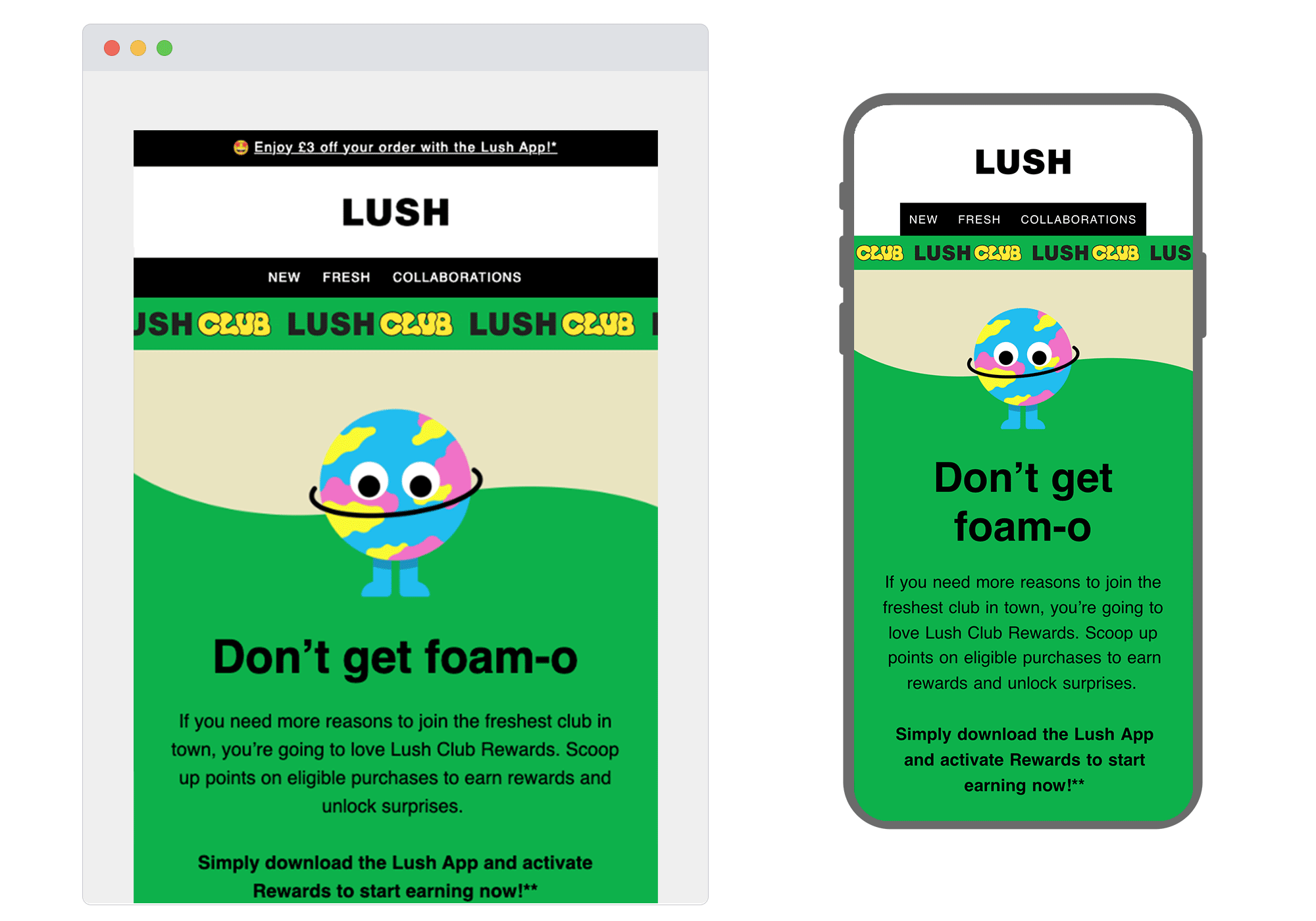
1. Lush
SL: Hi there, unlock Lush Club Rewards
Chosen for: Copy
A great example here of nailing the balance between fun and functional in this rewards program email. The playful 'Don't get foam-o' headline perfectly captures Lush's quirky tone, while the cute illustrated character adds personality without overwhelming the message. The real star is the instructional design: a clear five-step journey broken into simple icons and concise copy.
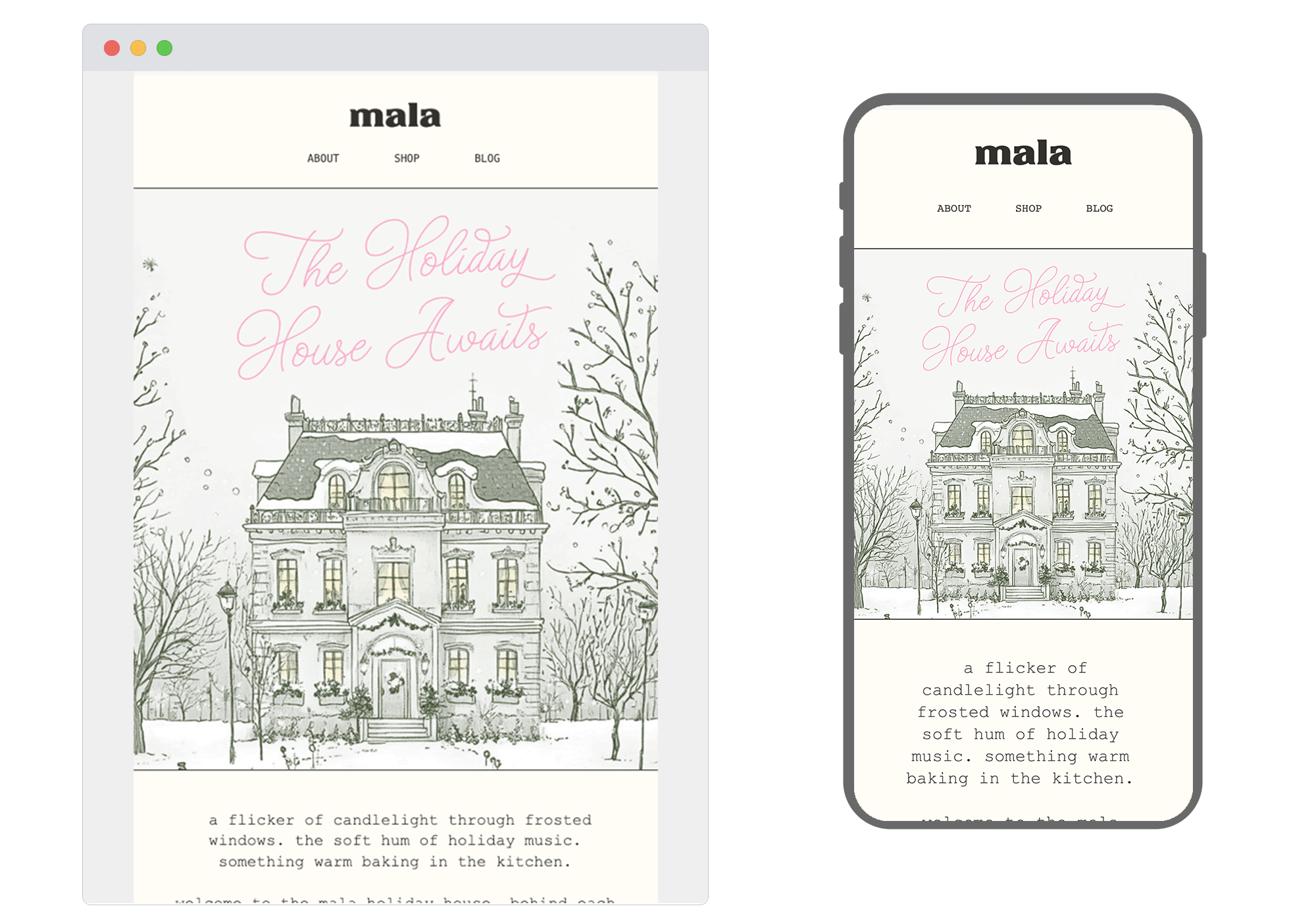
2. Mala
SL: the doors to our holiday house open soon…
Chosen for: Storytelling
There's something wonderfully nostalgic about this email from Mala. The beautiful hand-drawn illustration of a snow-dusted house instantly transports you somewhere cosy and inviting. The emails pushes readers to an 'RSVP' page which acts as a waitlist for their new holiday collection and limited-edition scents. The only thing bothering us is the big opportunity to add a flicker of candle light in the windows of the house through some micro-animations.
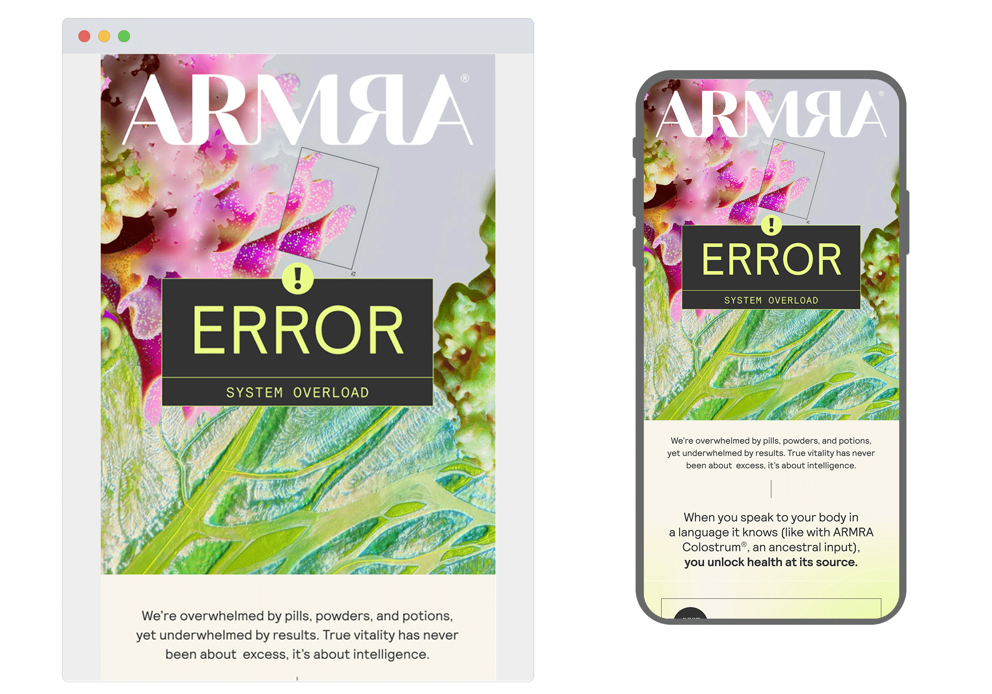
3. ARMRA
SL: ERROR: SYSTEM OVERLOAD
Chosen for: Content
ARMRA has taken a brilliant approach to promoting their new product. Using customer 'overwhelm' as a reason to take things back to basics and keep everything simple. The glitchy aesthetic with vibrant colours creates intrigue and clever copy maintains the 'system reboot' metaphor throughout. A great example that any brand can push creative boundaries and have fun with their messaging.
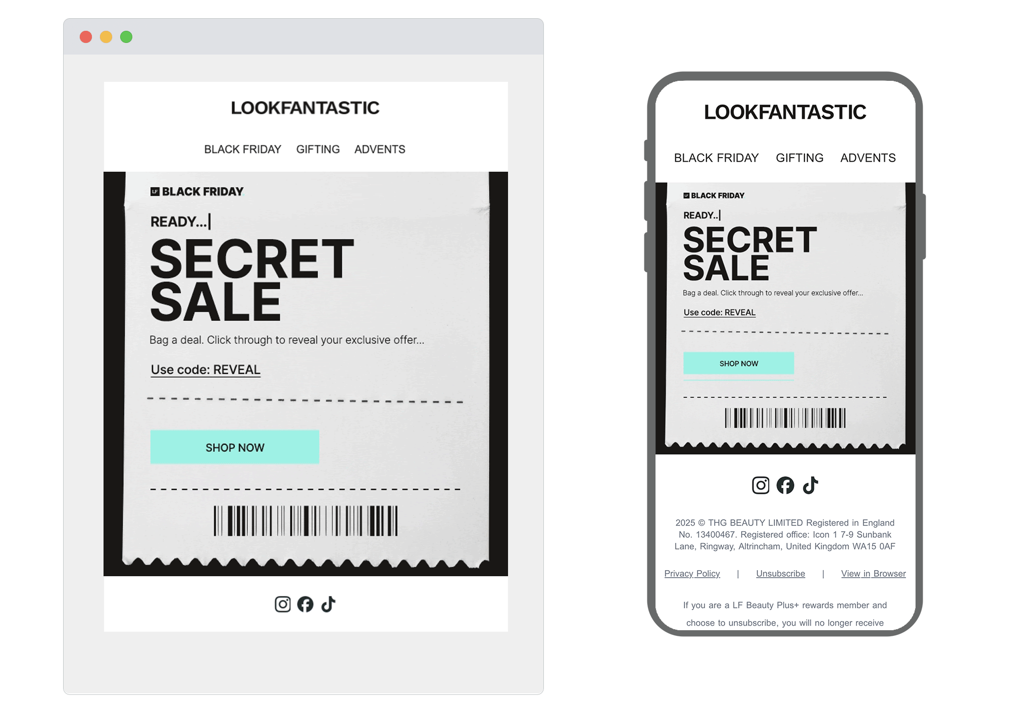
4. LOOKFANTASTIC
SL:Final Hours: Secret SALE
Chosen for: Design
The receipt design aesthetic here is pure genius. LOOKFANTASTIC has created something that feels tactile and authentic, like an actual shopping receipt. It's one of those design choices that's so simple you wonder why more brands aren't doing it. Hierarchy is also spot on: the offer takes centre stage, the reveal code follows, and an eye catching CTA pulls the eye exactly where it needs to go. Minimal copy lets the concept shine, resulting in an email you’d actually want to open and engage with.
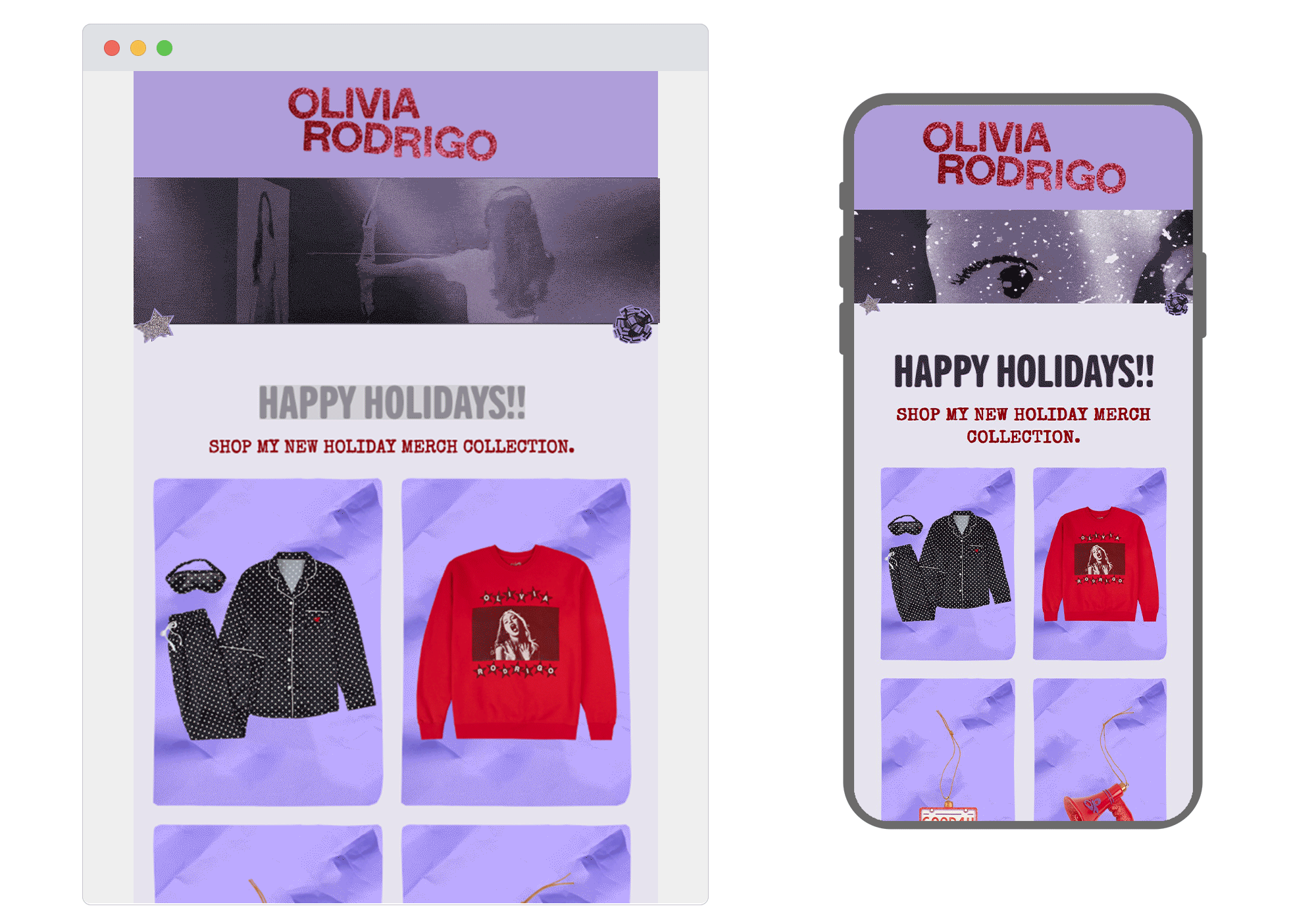
5. Olivia Rodrigo
SL: 'tis the HoLIVday season!!
Chosen for: Design
From the initial subject line, to the exciting animation upon open this whole email is whole heartedly themed well around Olivia Rodrigo. A nice nostalgic nod throughout the design leads nicely into multiple CTA's and a well put together footer.
At ActionRocket, we love celebrating the innovation happening across email design every month. Our expertise spans CRM strategy, creative, design, development, and accessibility. If you want to create emails that deserve a spot in next month’s round-up, get in touch.
See more posts