Are you Team Black or Team Fluro? We’ve got many colours of the spectrum represented in this month’s rundown, including green in between!
1. Lick
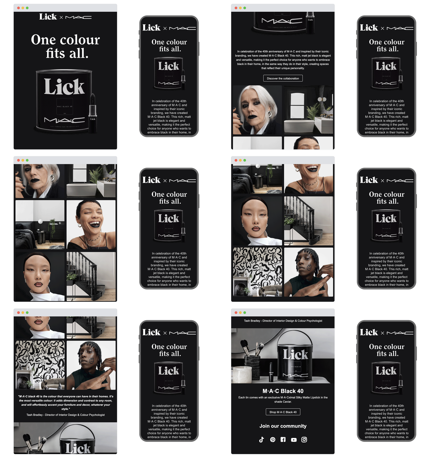
SL: Lick x M·A·C | One colour fits all 🖤
Chosen for: Content
When we first clocked the subject line this seemed an unlikely collab. But bravo to Lick and MAC because this campaign is a work of art. Black is celebrated as being for anyone, demonstrated by eclectic pairings of beauty and interior imagery that champion inclusivity. It’s chic, it’s effortlessly cool, and by the time we’ve scrolled down, we want the colour black in our homes and on our faces.
2. Our Place
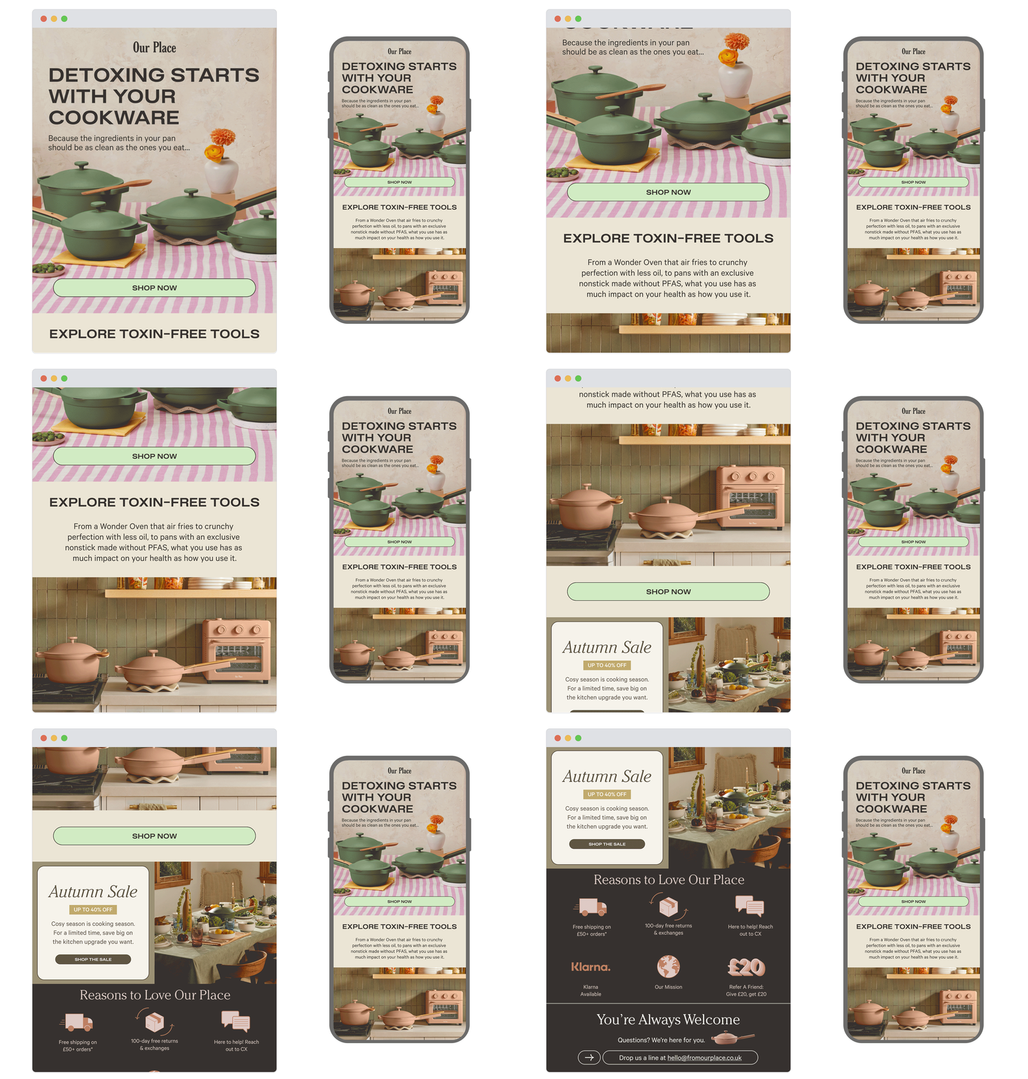
SL: Toxin-free all year > summer detox
Chosen for: Copy
This alternative take on clean eating is an interesting angle. Our Place has spun the summer detox message on its head, stating that it begins with cookware rather than the food cooked inside it. It’s an effective story arc that got us thinking about something rarely considered; a storytelling success that makes for powerful marketing.
3. P&Co
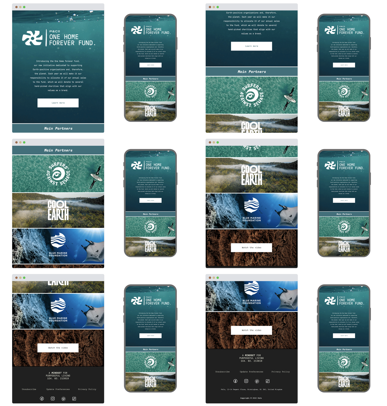
SL: Introducing the One Home Forever Fund 🌱
Chosen for: Content
This email was as refreshing to receive as its hero looks. Sustainability is a hot topic and consumers are becoming more aware of greenwashing than ever, so we love to highlight a brand that’s genuine and getting it right. P&Co’s pledge to donate to Earth-positive organisations aligns beautifully with their manifesto and the rest of their impressive CRM strategy, which you can read more about here.
4. Urban Outfitters
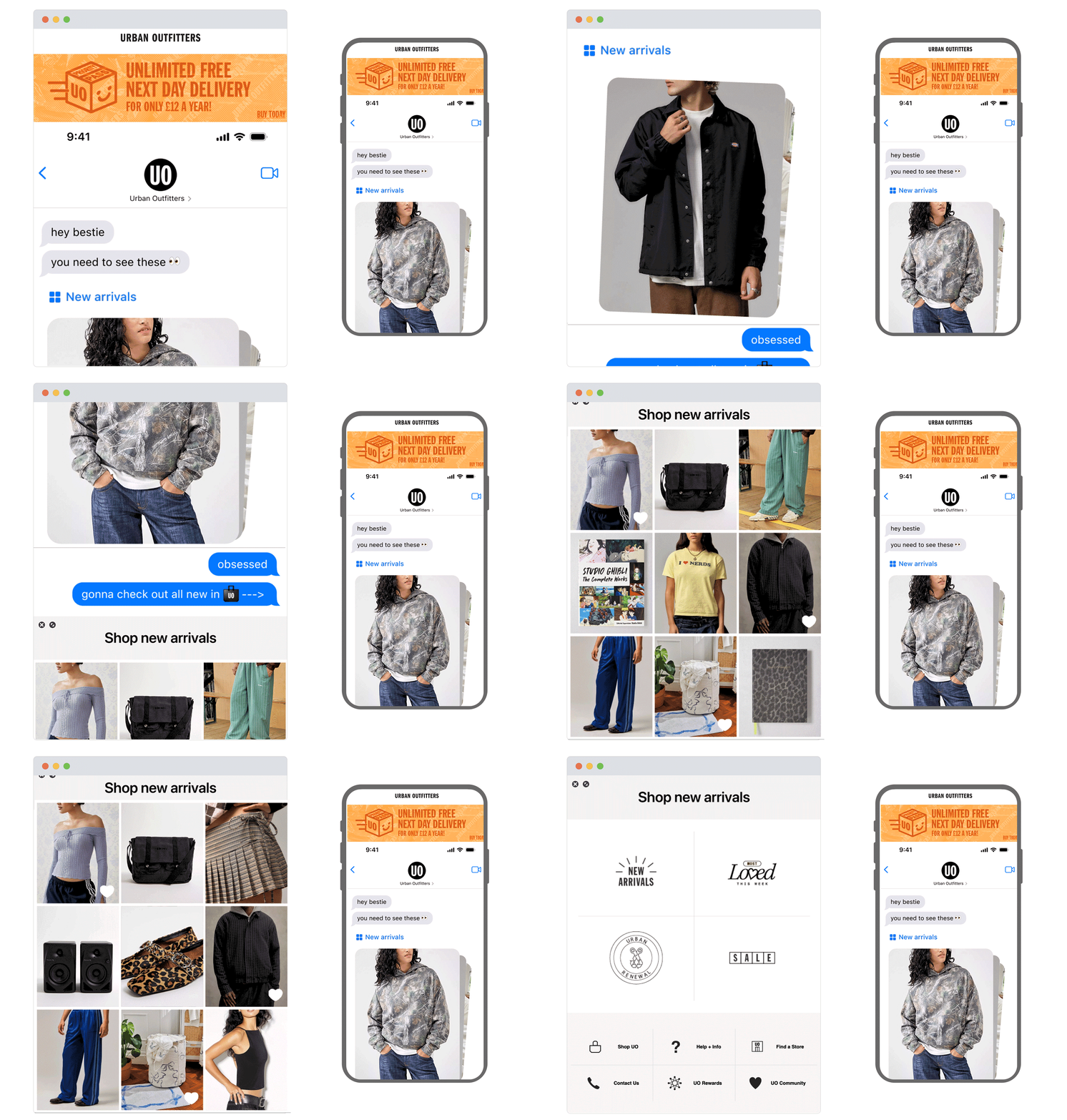
SL: IMPORTANT: Do not ignore ⚠️
Chosen for: Design and Content
Here’s a brand that knows its audience. The dynamic design from Urban Outfitters is engaging from the start, spurring on the scroll by letting us in on a private DM chat between two ‘besties’. It’s image-led with next to no copy - ideal for the shortening attention span. Very on trend, very chaotic-in-a-curated way, very brat. Very clever work.
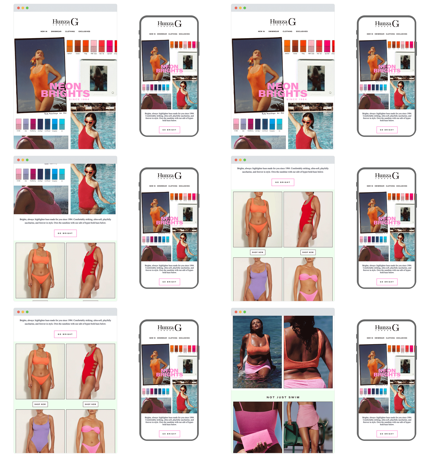
5. Hunza G
SL: That fluoro feeling
Chosen for: Design
This email from Hunza G complements the content with its design well. The colour swatch detail not only showcases the neon theme, but also the unique crinkle-stretch fabric this iconic brand is famous for. We love the retro imagery and editorial style, and the neon border on the ‘Go Bright’ CTA is a nice touch.
Our expertise in CRM and email marketing delivers the whole package: slick strategy, creative copy, dynamic design and clever code. Achieve results like the above gorgeous emails by dropping us a message today.
See more posts.png)
