.png)
The shift in seasons theme has certainly reached a few of our top 5 this September.
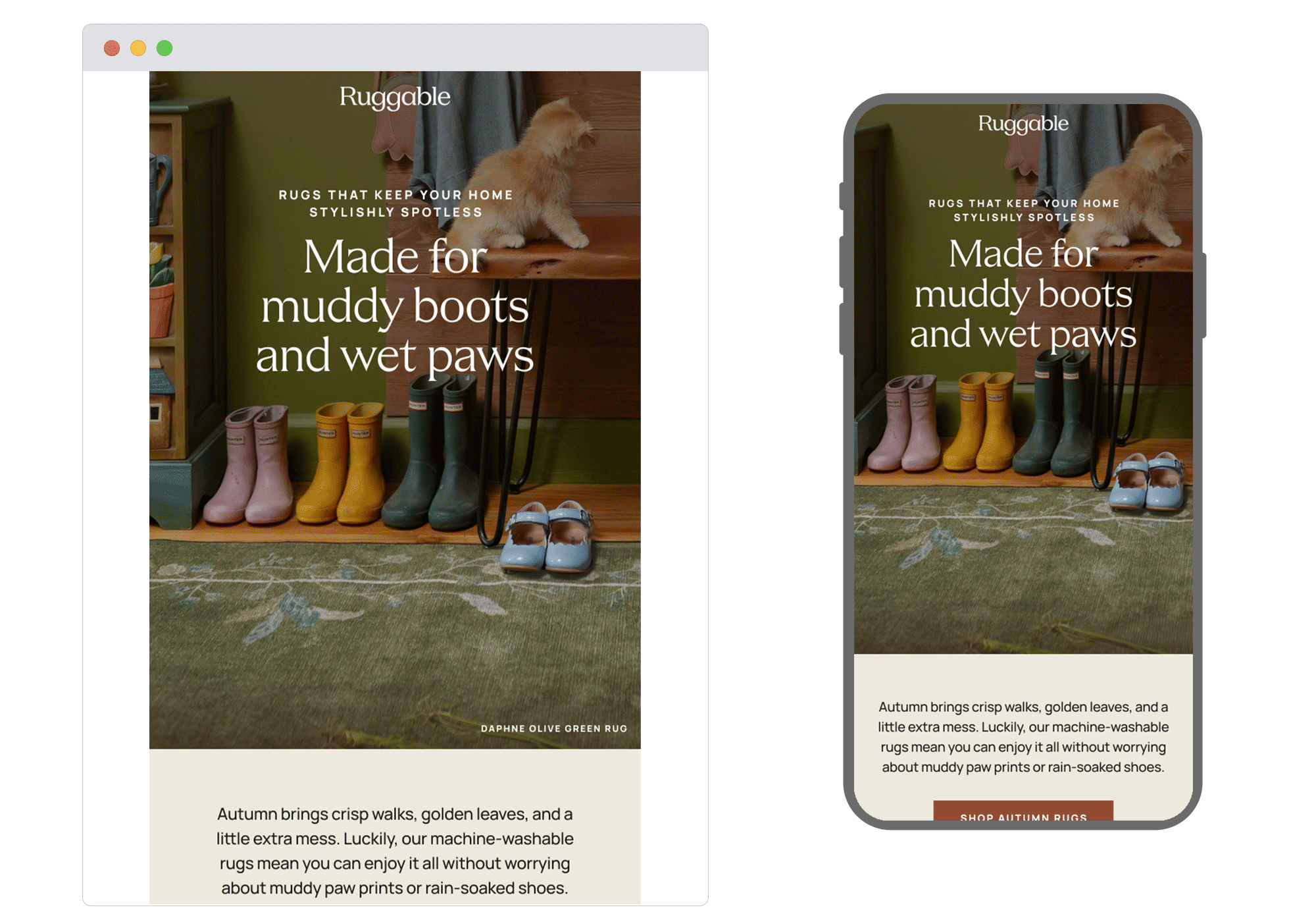
1. Ruggable
SL: Muddy autumn walks welcome
Chosen for: Storytelling
Ruggable has expertly leaned into autumn in this email’s narrative. The copy weaves in seasonal outdoor moments, autumn resets and indoor cosiness, gently projected across a range of audience demographics. With the images’ muted gradient and rich tones subtly bringing us into the darkening days of September – it’s safe to say, we’re definitely in Ruggable’s season.
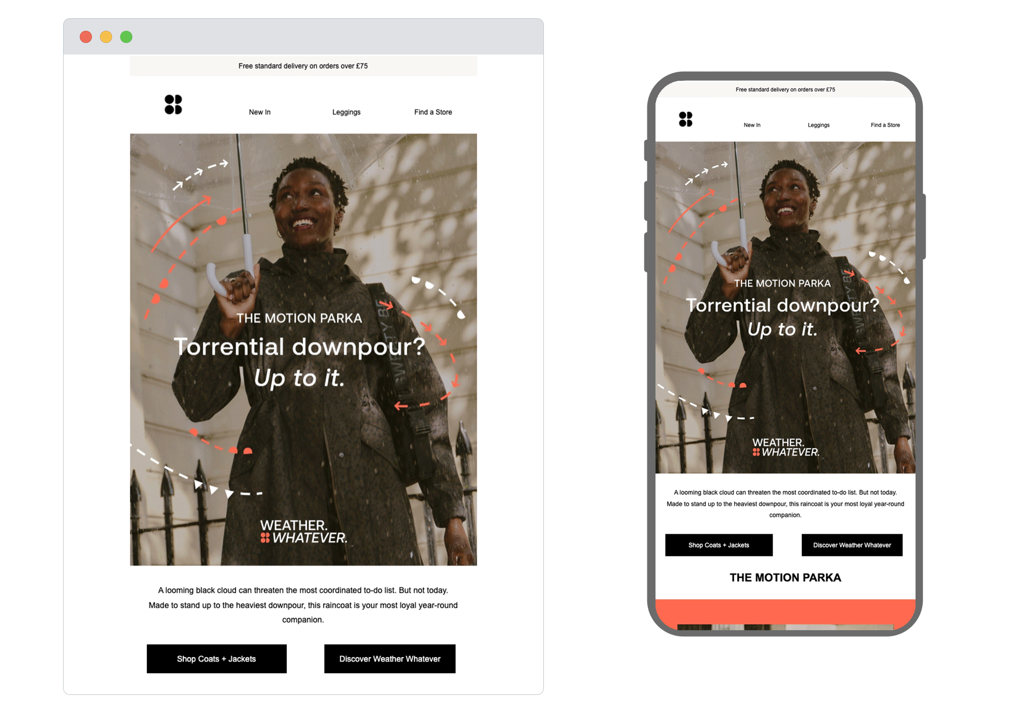
2. Sweatty Betty
SL: The Motion Parka is back 🌧️☂️
Chosen for: Design and Flow
We love the hero’s text over image for the headline, along with the slogan at the bottom. That, plus the dotted lines and arrows detail throughout creates a pleasing, cohesive flow, which the well-crafted copy strengthens further. With both USPs and UGC included, this product relaunch email from Sweaty Betty – much like the parka itself – covers everything.
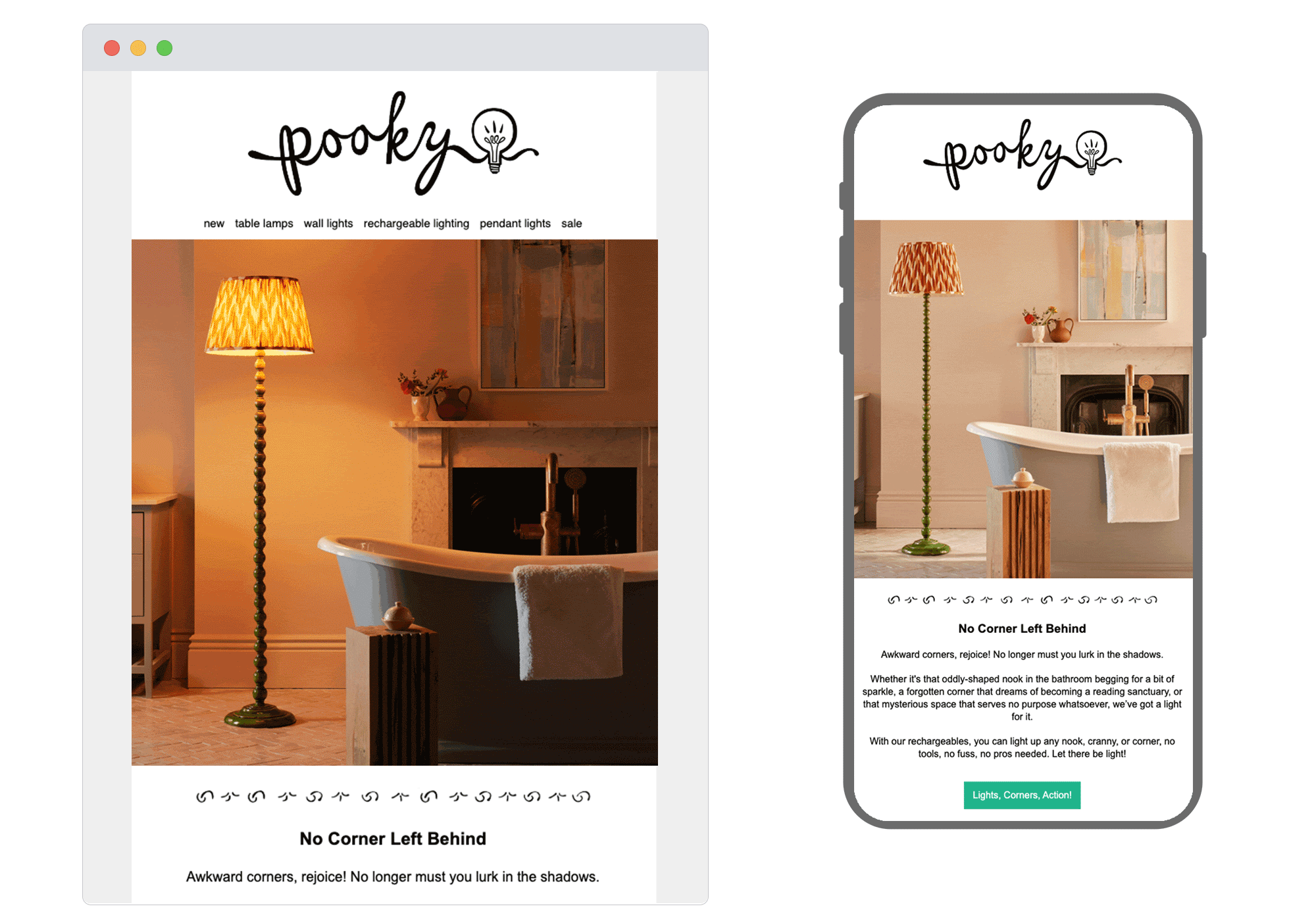
3. Pooky
SL: Let no corner be left behind!
Chosen for: Copy
This hero image features a simple yet effective animation, showcasing Pooky’s product in varying environments beautifully. Following that, the quirky copy encourages us to consider lamps for every scenario. Its quirkiness continues into the CTAs, which, whilst fun, isn’t the best option for accessibility. And with an email that shines this much, we’re all for making it accessible too.
Accessibility tip: Keep CTAs simple with strong action verbs. Need support on how to do this whilst keeping within your brand TOV? Contact us!
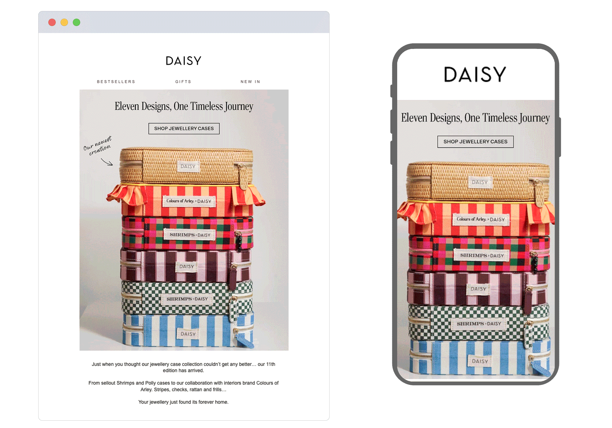
4. Daisy
SL: Your Jewellery, Our 11th Case
Chosen for: Animation
How to showcase multiple products? If in doubt, stack them up! We love Daisy’s hero GIF, especially the cute handwritten notes feature that’s used to highlight each case’s USP. The USPs continue seamlessly into the secondary blocks, and with a UGC element also tied in, the result is a very compelling email.
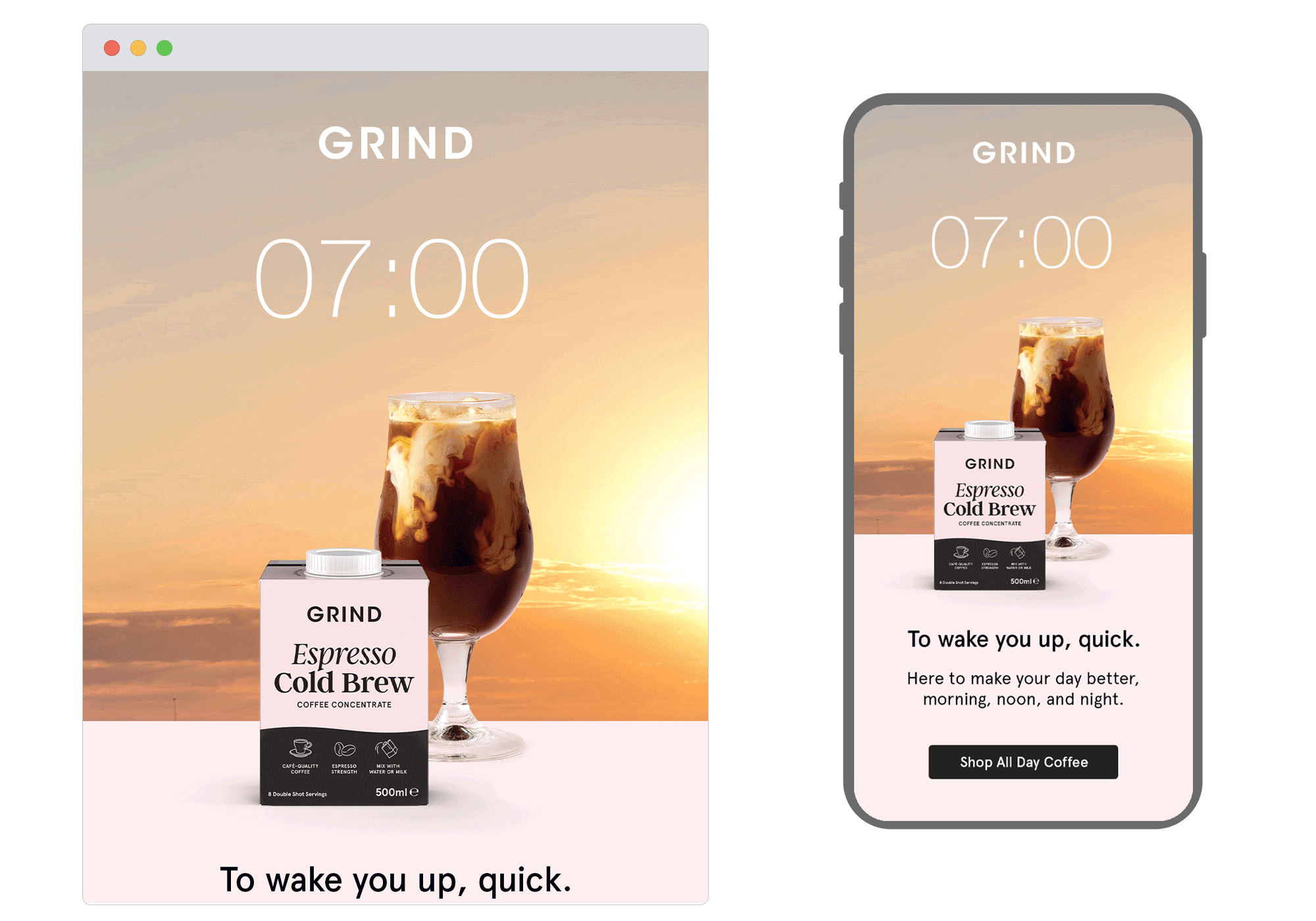
5.Grind
SL: ☀️From AM to PM 🌕
Chosen for: Design
Grind’s messaging is clear from the subject line through to the final CTA, with the audience barely needing to read a word. The copy and design excel in harmony, with the hero animation and shifting headlines always working with the static line of body copy. The emojis in the subject line need a small tweak to ensure accessibility, but in general, this email has the full wow-factor.
Accessibility tip: Use emojis at the end of the subject line only, ensuring they’re limited to one or two, to avoid overly-long descriptions from a screen reader.
Our expertise in CRM and email marketing delivers the whole package: slick strategy, creative copy, dynamic design and clever code – all whilst ensuring complete accessibility. Achieve results like the above emails by contacting us today.
See more posts