

Throughout Darktober we are looking at different ways brands should be thinking about dark mode, and the changes required to email templates. We’ve looked at how to create dark mode friendly logos, and how to set text colours in dark mode, so now we wanted to deep dive into understanding colours in dark mode. If you have looked at your email in any of the email clients currently supporting dark mode, you may have noticed that your colours are not appearing the same in all of them.
Dark mode UI design
We can gather some takeaways from email client design and the principles behind it.
Darken with Grey - not Black.
Grey can have a multitude of shades and different elements can have shadows added to appear like overlays. Testing the default dark mode background colours shows a range of dark greys, rather than black.
Default email client colors:
Outlook.com - #2d2d2d
Applemail - #221c1c
Outlook MacOS - #1c1c1c
iOS Mail app - #1c1c1e
Gmail app iOS - #141414
Outlook app iOS - #202124
As you can see above, there is a large range of grey shades that email clients are utilizing in the apps or on webmail.
Apply color sparingly
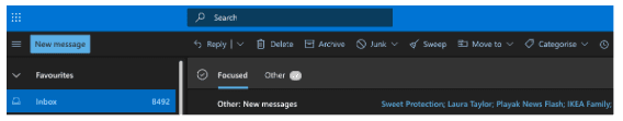
The second principle is to apply color sparingly and keep the majority of the UI dark themed. You can see this clearly in the Outlook.com dark theme - using it’s brand blue color to add highlights and important information, whilst keeping a majority dark theme.
MEET ACCESSIBILITY REQUIREMENTS
All dark themes strive to meet the accessibility requirements to ensure users with low vision or that rely on contrast can access the information. This means setting a minimum contrast of 4.5 to all text on color backgrounds. This is also implemented when changing an emails colours - Rémi Parmentier has shared Outlook.com dark mode handler and transform element handler - when examining closely it shows:
const VALID_CONTRAST_VALUE = 4.5;
Along with other UI design systems sharing that they should meet the WCAG (Web Content Accessibility Guidelines) AA contrast value of 4.5. Starting principles for Dark mode design from Googles open source material.io site:
Contrast: Dark surfaces and 100% white body text have a contrast level of at least 15.8:1
Depth: At higher levels of elevation, components express depth by displaying lighter surface colors
Desaturation: Primary colors are desaturated so they pass the Web Content Accessibility Guidelines’ (WCAG) AA standard of at least 4.5:1 (when used with body text) at all elevation levels
Limited color: Large surfaces use a dark surface color, with limited color accents (light, desaturated and bright, saturated colors)
Your colours in Email clients
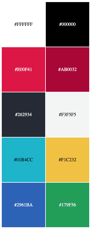
As you have probably guessed - all of the above means email clients do change your email colours in dark mode. Later we look at how we can use CSS to target some of them and work with them to show brand colours, but some we can’t target, such as Windows 10 mail app and Gmail apps, so it’s a good idea to test them. Creating a simple table with all of the Action Rockets brand colours gives us something we can test:
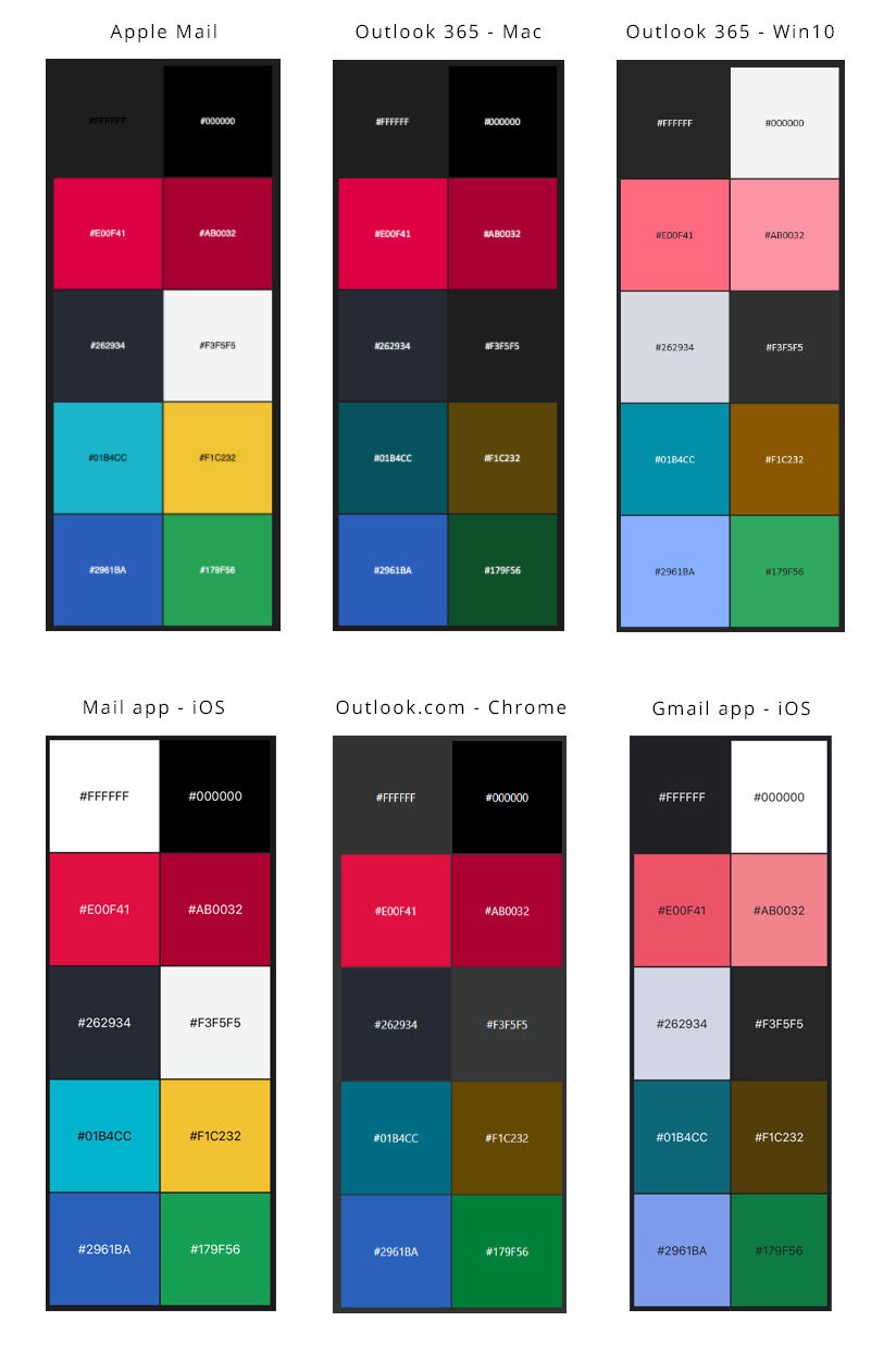
Below we’ve put together a bunch of email clients, all with the same starting colours. As you can see, if we don’t specifically set a dark mode colour, almost all will change them - losing our branding along the way.
We’d definitely recommend getting a full audit of your email design system or brand guidelines colours, as well as whole emails to see how dark mode affects them, something we can help you with at Action Rocket.
Testing your emails
There are two simple ways to test your email in Dark mode and see any color changes and to give you a starting point to discuss with your team how much emphasis you should put on updating your emails to support dark mode.
Use Chrome
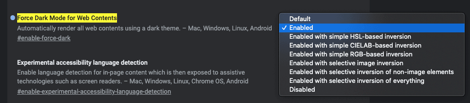
Chrome has experimental flags set up to try out new features, and one which replicates quite closely how Gmail app changes your emails colors is the #enable-force-dark flag.
In Chrome if you type into the URL bar - chrome://flags/#enable-force-dark - you can then enable this experimental feature:
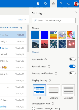
OUTLOOK.COM
You can sign up for a free Outlook email address or use an already registered address with Microsoft. Within the settings, you can choose to switch on dark mode. Then send yourself a test email!
Controlling colors in Dark Mode (mostly)
You will be glad to hear that in most cases there is a way to choose how your email colors look in dark mode. Using the prefers-color-scheme media query:
@media (prefers-color-scheme: dark) { … }
Or the attribute selectors:
[data-ogsc] - element targeting
[data-ogsb] - color targeting
Then by setting colors using rgb - the main color type used in the email clients supporting these methods:
Text color:
color: rgb(255, 255, 255) !important;
-webkit-text-fill-color: rgb(255, 255, 255) !important;
Background color:
background-color: rgb(109,109,109) !important;
background-image: linear-gradient(rgb(109,109,109),rgb(109,109,109)) !important;
Within your email you can control the color on a range of email clients:
Apple Mail
iOS Mail app
Outlook.com webmail
Outlook app iOS
But two email clients with a large market share, Windows 10 mail and Gmail app both have the ability to change your email in dark mode, and currently email developers have no way to target them and control the changes. Another important aspect to remember is that users that have chosen to receive emails in dark mode don’t want bright white backgrounds - and email clients, even if targeted will not show pure white #ffffff backgrounds and other light colors, so the dark mode design principles of greys should be applied to help design your email in dark mode.
Each email client uses its own algorithm to choose how your colors are interpreted and displayed to recipients. We don’t have access to these, but we can understand a bit more about what they are trying to achieve.
If we take the same principles into consideration when designing emails and test where we can, choose colours that work well in email clients we can’t target, such as Gmail app and Windows 10 - then apply thought out design practices when controlling layout and color using CSS to target clients we can manage, support should continue to grow and we can create the best experience for the people receiving our emails.
How can we help?
Throughout Darktober and into 2021 our aim is to get every brand dark mode ready. We are helping brands review how dark mode affects them from a quick review, to in depth audits. As well as supporting updating your email design systems and bespoke templates, we have you covered. Just email hello@actionrocket.co and we will be in touch.
See more posts