

Hanging around in #EmailGeeks slack and on Twitter you pick up on some things. One is that we all have a theory of a good email’s hierarchy and what works. But what do we mean by hierarchy and how can we define what works, how it is successful and how to apply these learnings throughout all of our email designs?
One thing up front - I’m not a designer! UX in email looks at the way a user interacts with elements and has a good experience. Not how it looks - although we will investigate some design elements, these fundamentals should help in all different designs.
I’m going to be super critical of everything and ask questions, try to relate to why a designer has created an email in that way - but I have no way of knowing why decisions were made in that case. I will be breaking down some of my decisions, the data and the reasons behind them, but I’m trying to illustrate points to help you think about your own emails, not to put down other’s work.
Hierarchy is a visual design principle which designers use to show the importance of each page's contents by manipulating these characteristics.
We are looking at what order elements could appear in an email and the effect this will have on the user’s experience and ultimately will it still achieve the goal of the email? In this post I’m looking at the ‘Inverted pyramid’ and discussing the different elements and how they affect the UX.
Inverted pyramid
A classic example of visual hierarchy is having an attention grabbing image/offer, some text to build anticipation, followed by a Call to action.
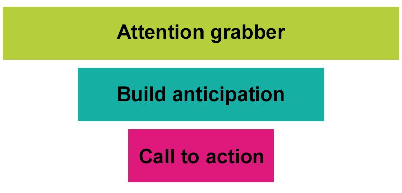
A pattern that has been repeated non-stop and is still seen in a lot of emails. What if we were to throw this on its head? Let’s take a look at these elements more closely.
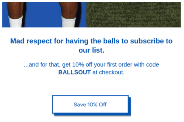
Attention grabbing image -
Design wise this is what draws a user in to entice them to look further into the email, so this can achieve more engagement in an email. However, a lot of emails are not really looking for engagement, they want recipients to click through and as a user, I may have clicked on a specific email from the inbox, without seeing this image, why do you then need to grab my attention again?
For example: Rout
Subject line: Get ✨Deep✨ About Skincare 👀
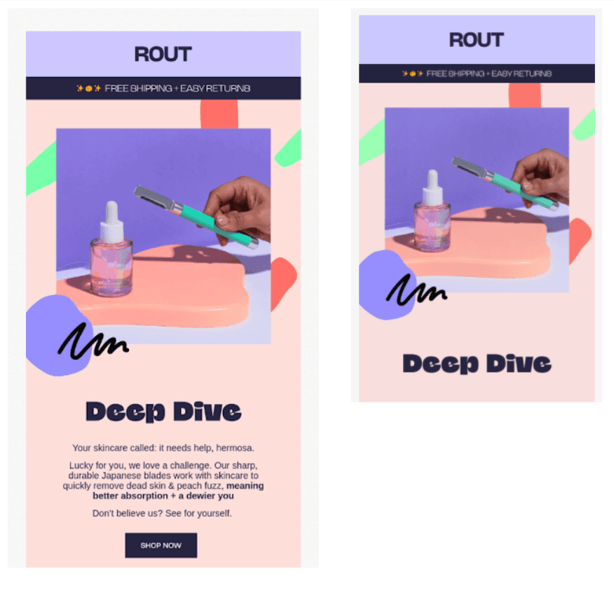
The design of this email is beautiful, but as a user all I want to do is shop for make-up and on desktop the image takes up a large amount of real estate, before getting to the information and CTA. On mobile all of that is hidden and you need to scroll.
We did an experiment to find out where the fold was and the answer is no one can 100% say where it is. But the idea behind ‘above the fold’ is to put important information as close to the top as possible to gain attention or have an action taken. In the above example, on smaller screens, only the large image will be seen - has that hidden the important information?
The large image is also clickable - but without any indication of where it goes to a user. If I am scrolling through my emails, open this one on mobile and accidentally whilst trying to scroll end up clicking through to a website 😬 it’s not what I was expecting!
If we also take into account someone opening the email without the images working:
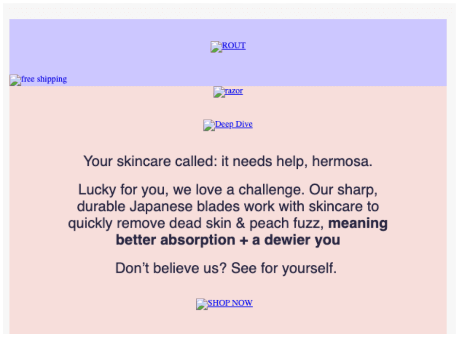
The alt text provided doesn’t give me any indication of what the image is trying to show, what is in it and why I should click on it as a link.
Accessibility is something that should be taken into consideration at every stage of an email, design, code, UX, copy. If you are interested in learning more about accessibility, check out the Email For All report and what it found.
Some testing that could be done with an attention grabbing image:
Height: would a smaller image allow more information to be shown higher in the email?
Animation/no animation: Does using animation attract more clicks from your recipients or less.
If you do test animation, are you including important info in that animation or is it just for the design, just to grab attention?
Swapping the image on smaller screens: Optimising the image may get better results, maybe making it smaller to move information under it further up?
What about no image?
Not linking the image: Maybe you drop in click throughs on an image, but when someone does click through do they take an action. Maybe see if the bounce rate decreases?
Further examples of large images:
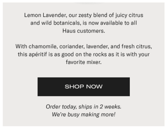
Anticipation text
Including copy in an email, as an email developer and working with designers always gets inflated. Everyone preaches, “Short sharp punchy copy”, yet how many times have you opened an email to find a mini essay!?
Do we need this text at all? Would the recipient be able to get the information, find the correct call to action, head to the web page we are highlighting without it?
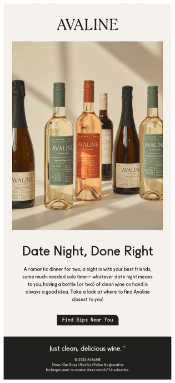
If we take a look at the example above, does the copy encourage us to ‘Shop Now’ or is it actually talking about the rest of the content in the email or on a web page. If that copy wasn’t there, would it make a difference?
Testing text:
Vary the length of the text: shorter sentences, more text.
Bullet points or numbered steps
Centering copy, left aligned copy
Changing the text on smaller screens
Different fonts: Is one font easier to read?
No text 😱
Shorter text and a more concise CTA:
Call to action
Arguably the most important element, this is often the only reason for an email, to get the user to take that action.
In the above example, the call to action is an image, but there is no reason code support wise it couldn’t be made with live text. The wording also ‘Shop now’ all in uppercase, is not very accessible, and not descriptive. When clicking on shop now, I have no idea what page I am going to. The image above, the copy, none mention where the button will take me? Above all the information is pointing to learning more, not shopping.
Testing a call to action:
The text on the button: more descriptive vs. less descriptive.
Coded button vs. image
What if the button was further up the email, what if it came first?
In relation to all the other links in the email, below and including the logo and main image, what percentage of clicks does it receive and do they convert?
In the below example, everything is actually one big link, no live text at all. The text in the CTA is vague- but this email actually only had one product, so ‘shop now’ was possibly a good choice?
An example by ActionRocket:
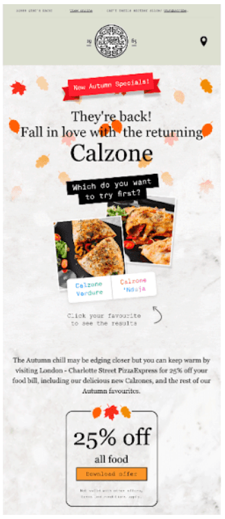
A lot of the real estate in this Pizza Express email is given to the logo. We worked with Pizza Express to test smaller logos, hiding the preheader bar and the location icon - but found that a large amount of the audience clicked on these elements. With the logo having a high number of clicks just going to the homepage of the website.
As a chain restaurant in the UK - we assume and from talking to recipients, the main things they open Pizza Express emails for was to find a good deal or get to the website quickly to book a table or order food, so the logo and location finder icon were important.
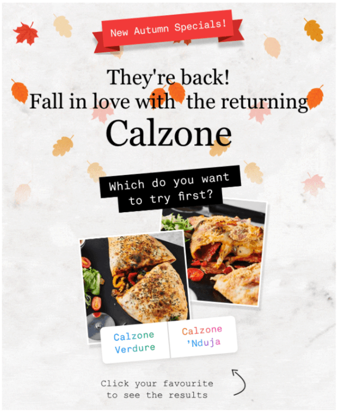
The aim of the above email wasn’t mainly to get users into Pizza Express right away - but to highlight the return of their calzones to the menu and increase engagement within the email. Therefore making an interactive/large image the first thing in the email, with live text explaining their return, was right in this instance - notice how the first CTA is actually a long way down the email!
The image and text were also optimised for mobile as we knew the audience breakdown was mainly mobile opens:
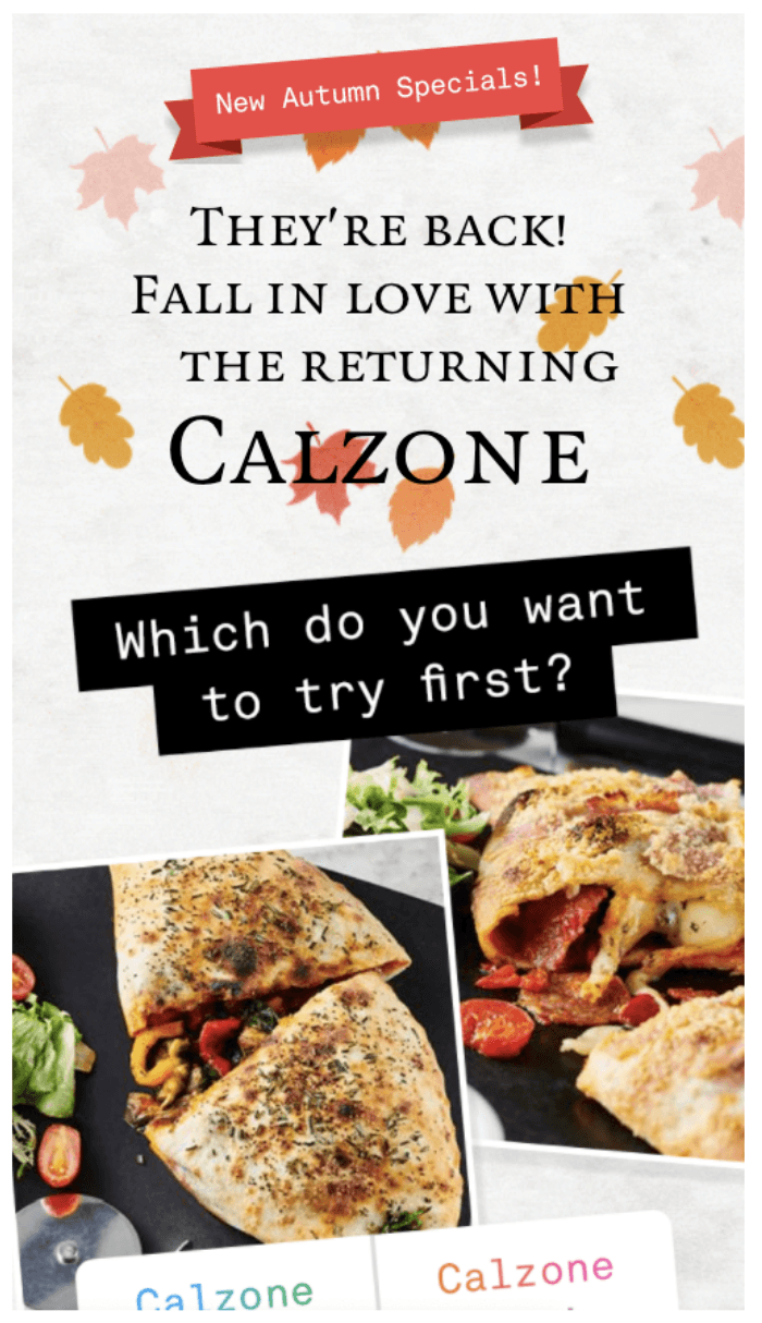
We also ensured that as much as possible was not images, by live coding the text and call to action it was more accessible and if images were off, all the important information was there. By indicating the CTA’s destination and making it clear in the text both above, and on the CTA users knew exactly what they would get when clicking through.
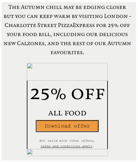
There is a lot more to this email and Pizza Express have always had issues balancing what to include in an email, and the data showed almost all of the clicks were in this top section, so they could draw from this that sending more succinct emails with one defined purpose would cut down on production time, increase click through rate and lead to higher engagement. Which is something that we are currently working with them on, along with a lot of other things!
Final thoughts
Studying the inverted pyramid alone allows us to ask a lot of questions, test a lot of different configurations and bring up a list of UX principles to learn more about as long as your arm!
From CTA’s, images, text, menus, logos, preheaders, view online links and the placement of unsubscribe links - just looking at the top of an email inspires me to look more closely at UX in email.
Do you have an opinion on UX in email or would you like some more information on how we at ActionRocket could help you and you team? Reach out to us at hello@actionrocket.co or tag us on Twitter @ActionRocket.