With email, much like editorial design, type and font play a big role in how the overall message is received.
Which typeface you use controls how the reader reacts to what you’re saying. Brands throughout the world use this to establish themselves as modern or classic, innovative or traditional, light and casual or luxurious and tailored. A simple change of font changes everything.
Font VS. Typeface
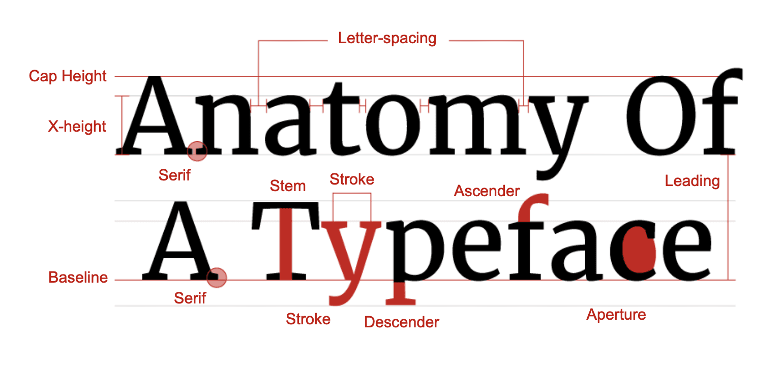
Commonly confused, a typeface is the collective name given to a group of fonts, whereas a font describes the different weights, widths and styles that constitute that typeface. The characteristics of a typeface can be seen in this diagram, showing how much a typeface can be changed by simply altering one of these key features.
The History
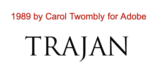
Arguably the first typefaces came from the Roman Empire, seen engraved into the Trajan column in 107 AD. The letters were since cleared up and modernised but the effect and overall style remains the same, showing how timeless a typeface first seen over 1000 years ago can be.
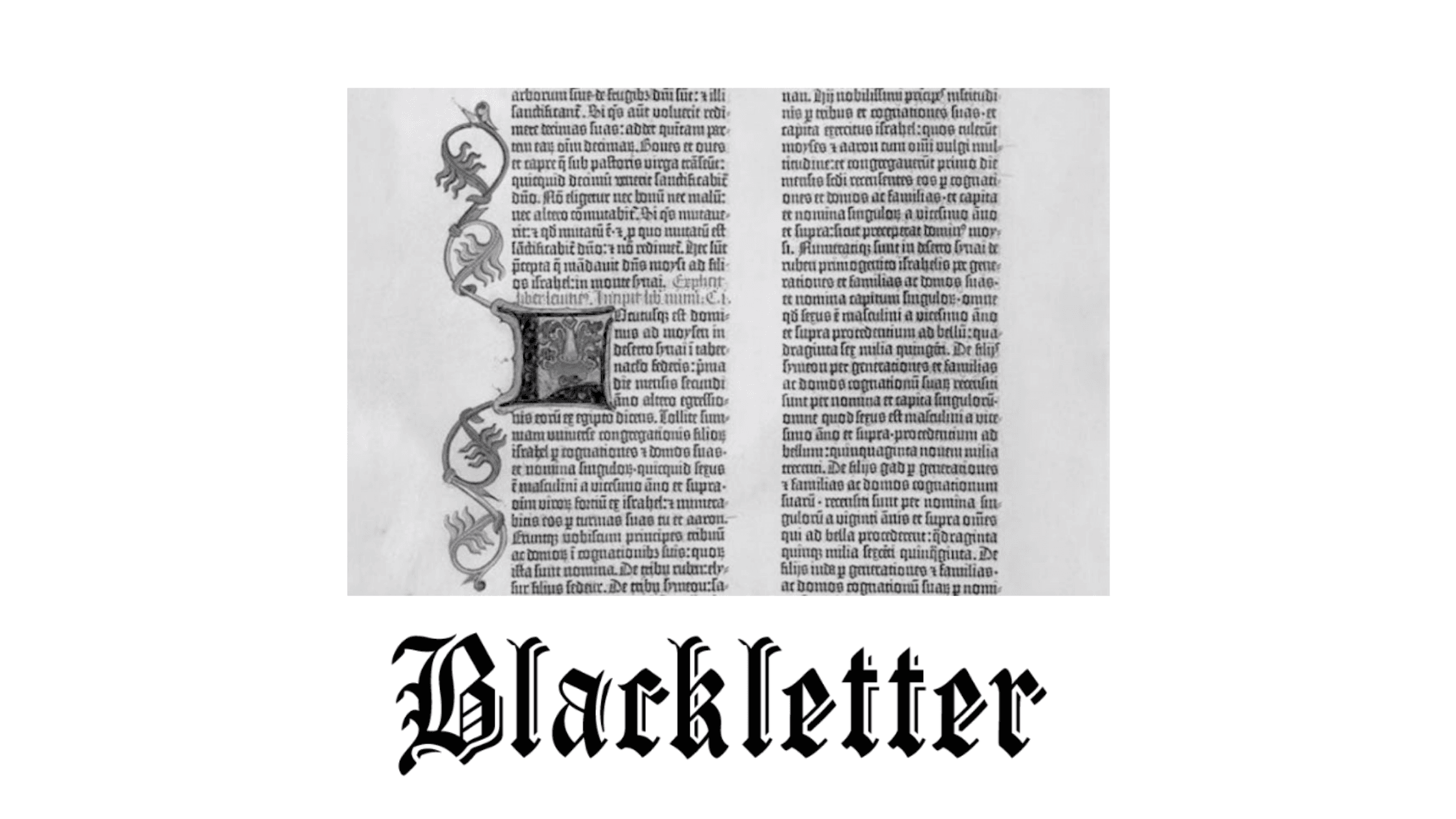
The first official typeface on record came from Guttenberg in 1440. He was the first to use moving metal and wooden stamps set in to a press to print his edition of the Bible. A labour of love and years of dedication was all it took to create using his creation: Blackletter. As seen here the typeface wasn’t the most legible or practical for a large body of text, but it did mirror the gothic design ideals of the period and the Blackletter typeface remains present today.
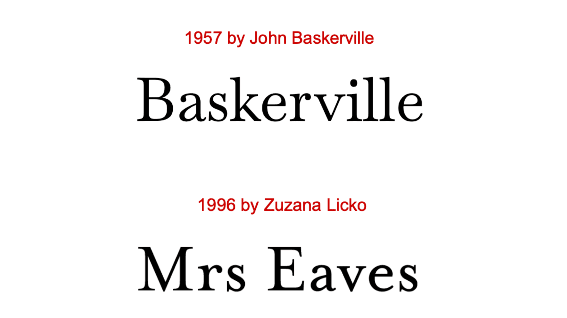
Another significant typeface is Baskerville which is still a Serif Typeface but with the charm and modernity of a Sans Serif. Mrs Eaves takes the traditional design of Baskerville but leaves behind the rigid conformity, replacing it instead with thicker stems and smoother flourishes.
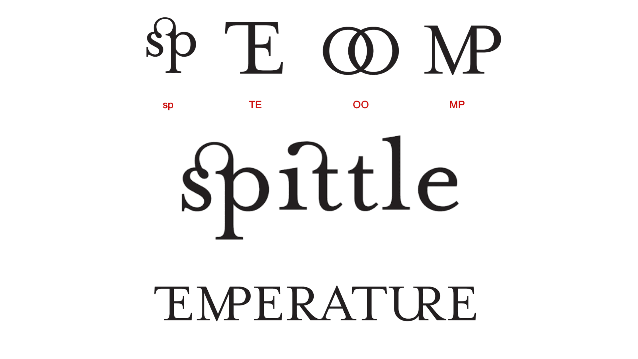
Another interesting feature of the Mrs Eaves design is the use of ligatures. These feature across many different typefaces and are used to join two neighbouring letters for ease of legibility and to avoid the squashing of letters. Seen here both in lower case and upper case use, Mrs. Eaves contains many ligatures that really provide a personality to the typeface.
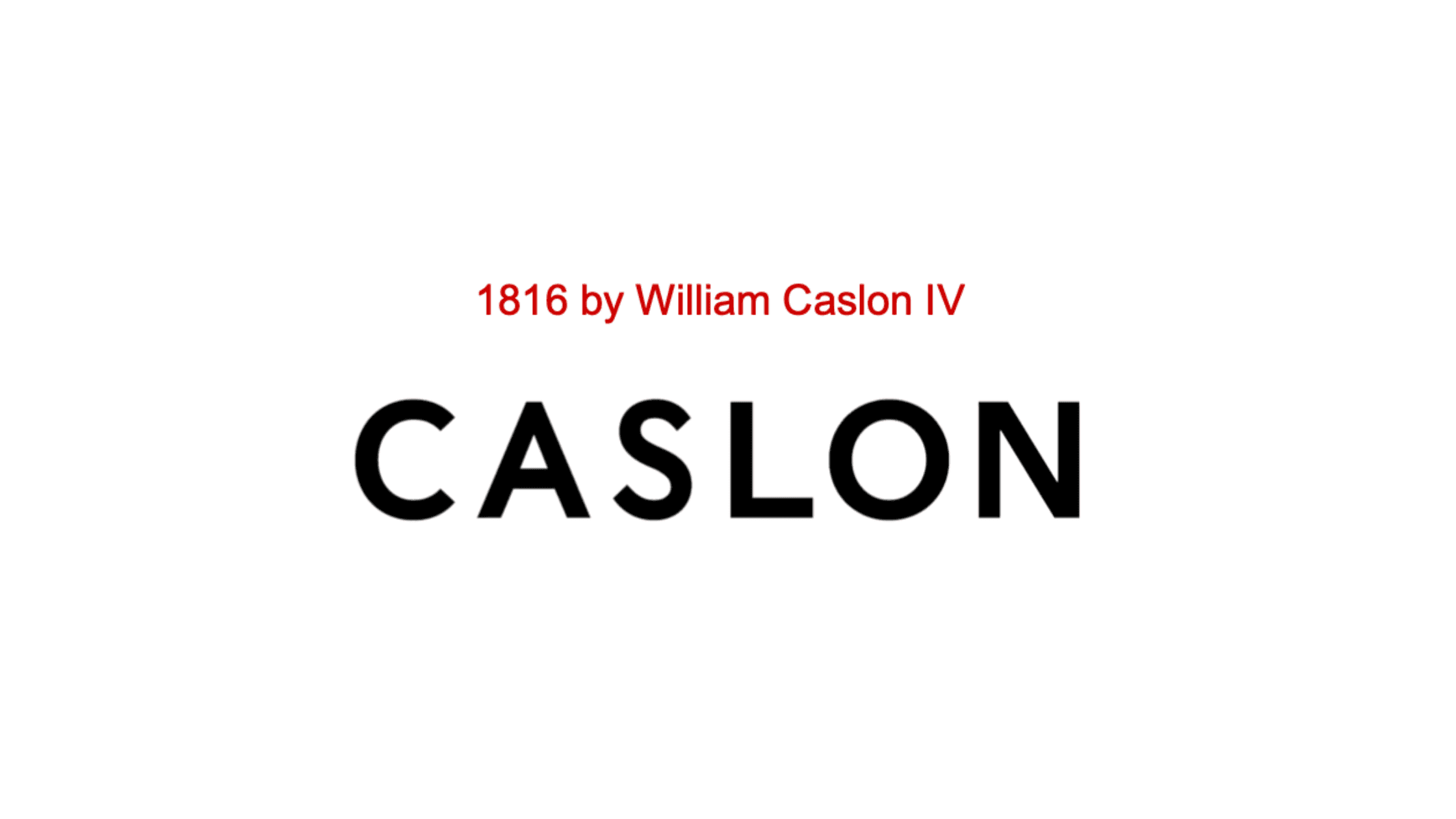
San Serif typefaces take on a different design and thereby a different message. Considered the first official Sans Serif typeface, Caslon is responsible for a lot of the modern typefaces we see today.
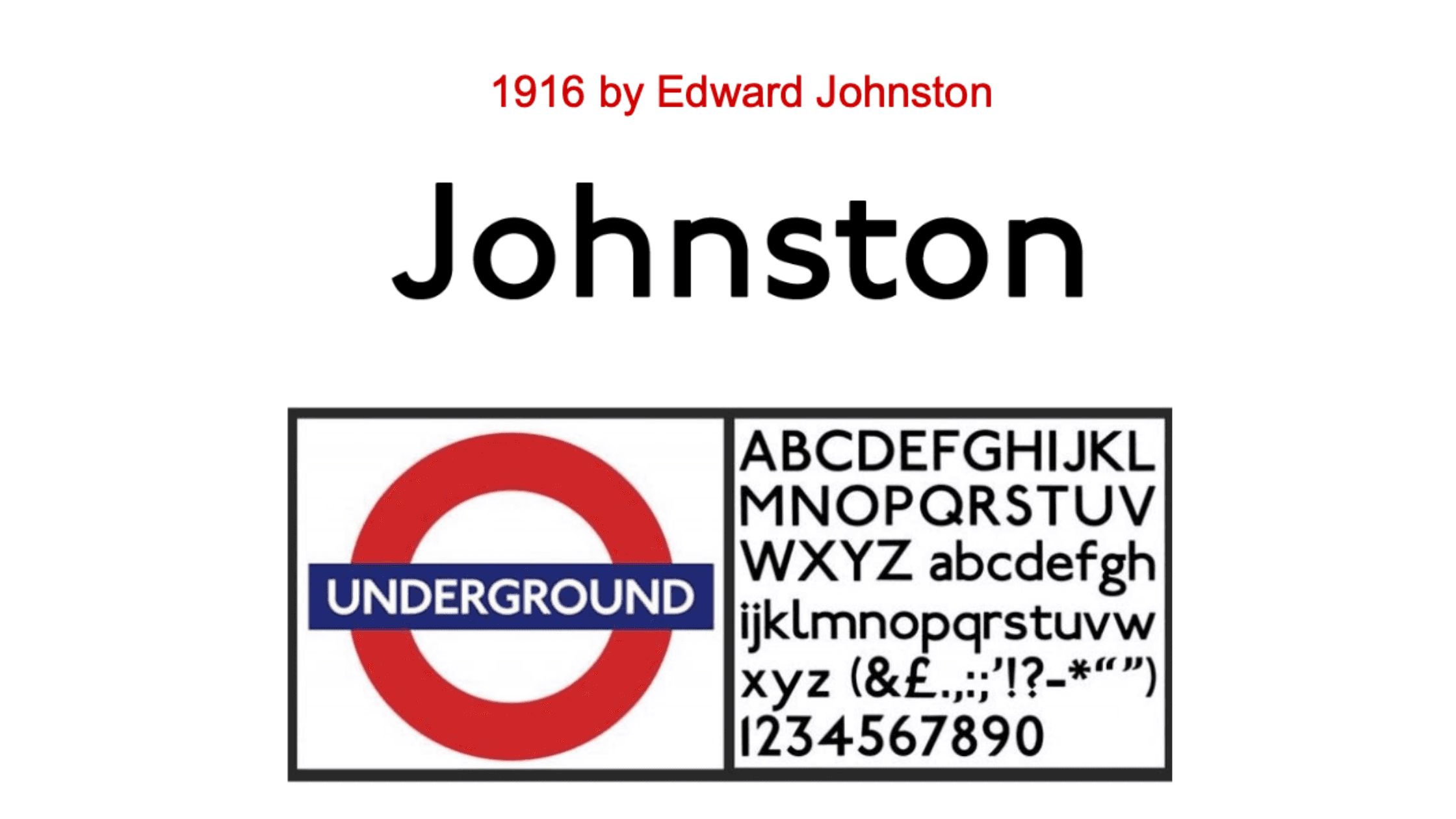
Sans Serif typefaces that followed were lead by Caslon’s example. One of the most famous and present of these is the Johnston typeface designed for the London Underground transport system in 1916 by Edward Johnston. The angular edges of the letterforms coupled with the curved angles of the Os and Cs leant this design to a legible and attractive typeface, ideal for information and signage. The unique use of a diamond shaped dot for the lower case “i” stands out as a design staple.
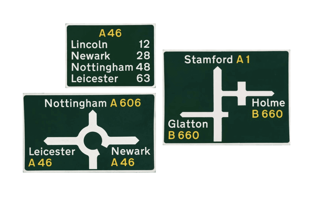
Inspirations from Johnston lead to future memorable typefaces. Eric Gill designed Gill Sans in 1926 and inspired by its use as informative type, Transport was designed which is still used to this day on all our road signs.
Serif VS. Sans Serif
The difference between Serif and Sans Serif could be considered as the two ends of the spectrum in terms of message and communication. Widely seen as giving the impression of class and tradition, a Serif typeface is used amongst the world’s luxury brands to denote ideas of value. The old adage that you can’t improve on a classic cements its use as conforming to a set of rules and heritage. Opposingly, a Sans Serif typeface is often paired with modern ideas. It’s ability to be used in multiple weights without looking too distorted can be seen across many different outlets. This combined with use of colour, letter-spacing and effectively the throwing out of traditions and rules allows the designer to portray messages of fun, freedom and innovation.
This is not to say that there is mixing of the two camps. Luxury brands have been known to use Sans Serif typefaces and the use of Serif has been seen amongst products or editorials that aren’t usually associated with luxury.
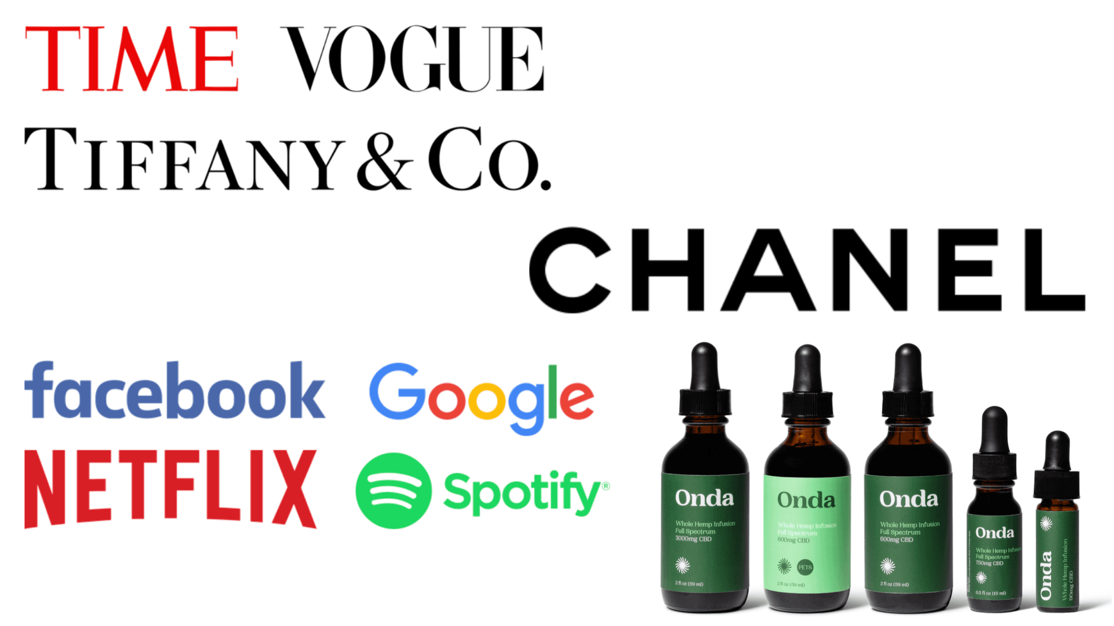
Using typefaces in context allows true creativity to come through. Using increased line spacing here has given a minimalist edge to a standard Sans Serif design. The negative space surrounding each letter allows it to breathe and propels it to the top of the visual hierarchy whilst not being overshadowed by the image.
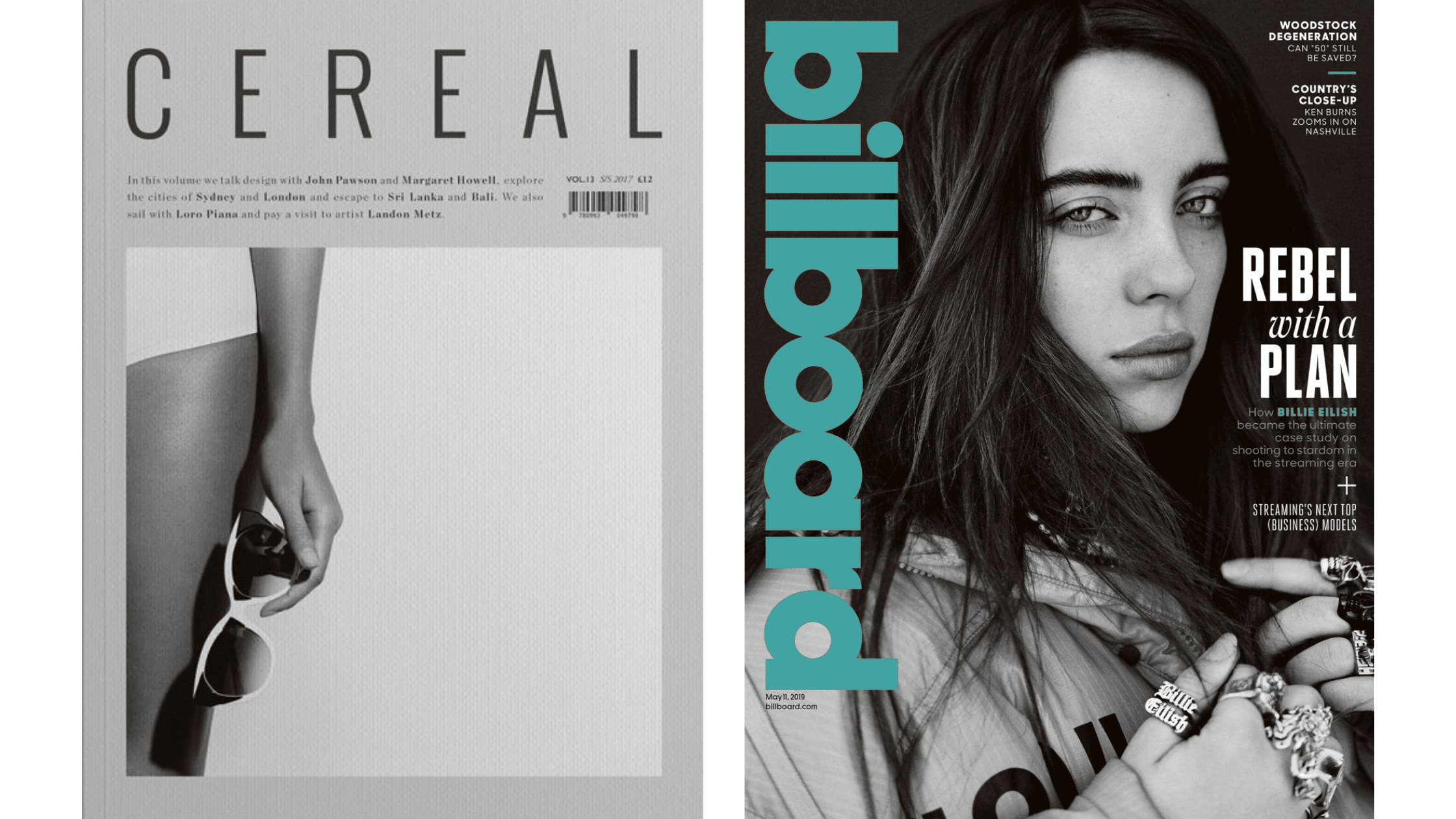
Vogue’s Serif logotype is pride of place but due to years of status it doesn’t demand any attention. It’s complimented by accompanying Sans Serif typefaces which if anything bring more attention to the artistic letterforms of the logo, mirroring the glamour of the magazine.
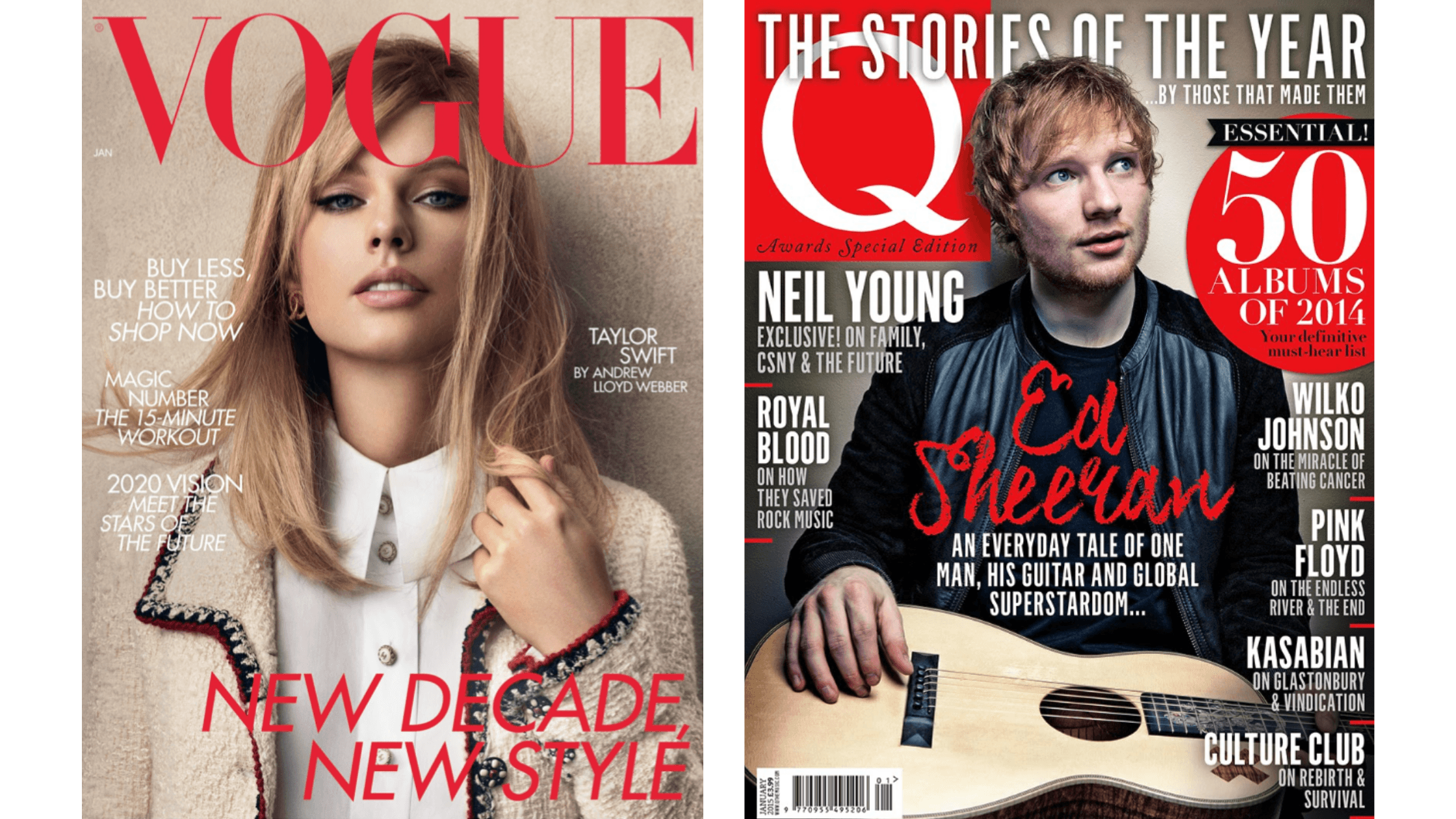
As a rule of thumb, 3 typefaces is the maximum when designing. Here on the cover of Q magazine they take full advantage of this. The different typefaces are used well to depict the conflicting characters, the busy-ness and the excitement of the content inside. “Ed Sheeran” is printed in a handwritten typeface to symbolise the artist’s homemade and authentic style. The announcement of a “Top Album” shortlist is presented in a flourishing Serif, imitating a style of significance.
Top Tips
As an email designer I do come across a lot of limitations. Within the boundaries that are in place however there is scope to be creative with something as unassuming as type. A simple change in line-spacing or tracking, combined with padding alterations can take a relatively simple piece of text and turn it into an engaging message.
There are so many typefaces available to us as designers it can be daunting to stray too far from the safe comfort of Times New Roman or Gill Sans. But experimenting with what the world has to offer opens you up to be inspired and to create compositions you may never have thought of before.
Here are my top tips to ensure you’re making the most out of the many typefaces out there, remember to experiment and have fun with it!
-
Mirror your message in the typeface you use
-
Use leading and kerning to your advantage to create drastically different tones of voice with minimal adjustment
-
Colour is key. Make it unique but make it legible. Good suggestion is to use one accent colour to portray emphasis
-
Use different typefaces in the same design
-
A typeface can look good as a title but won’t always work as body
-
Treat a header as the hero image - make it art
-
Further reading:
-
Just My Type by Simon Garfield
-
Season 2 Episode 6 of Abstract on Netflix: Jonathan Hoefler: Typeface Design

