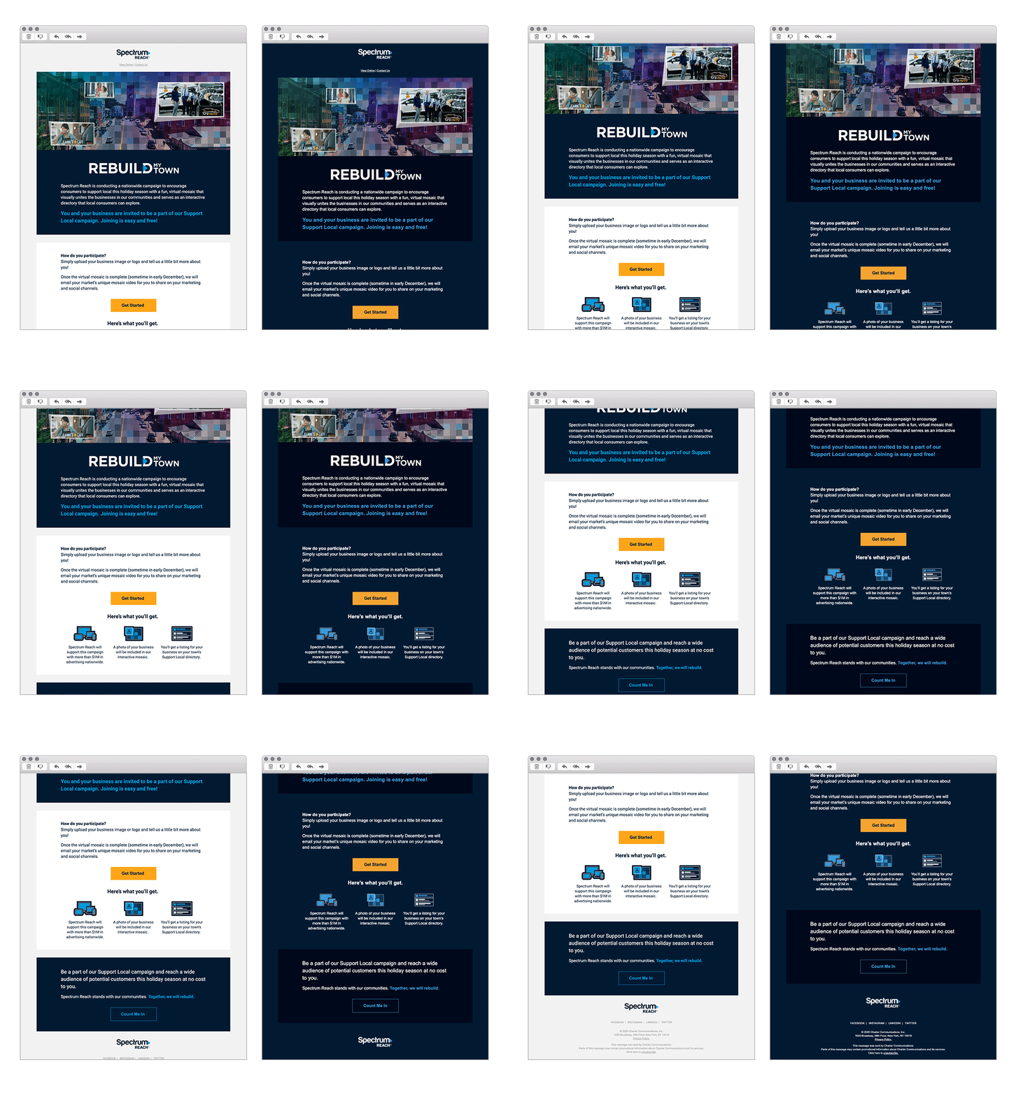
Throughout October we worked with some of our awesome friends from across the email community to launch a month's worth of Dark Mode content, which we called Darktober. A deep dive into how an important digital design trend is impacting email marketing. As part of the campaign we ran a Twitter chat with Email on Acid, and asked for people to send in their best Dark Mode inspired designs. We wanted to take a closer look at how these emails were looking live in the inbox. In this blog post we speak to our winner Andrea Davidson, Creative Designer at Kernel, and look closer at her Dark Mode winning entry.

We’d love to learn a little bit more about you Andrea. What’s your background and how did you end up working in the email channel?
My background is in Graphic Design. My transition into email was gradual, starting with one freelance client. I gained more exposure to email design and development through my previous experiences. My current position at Spectrum Reach is my first full-time email development role.
What inspired you to look into Dark Mode a little more, and want to implement it into your email designs?
I was inspired to take a look into dark mode after a co-worker told me about Apple’s plans to make Dark Mode available as a user setting last year. I knew Android wouldn’t be too far behind in rolling out the Dark Mode option as well. Based on that, I had a feeling it would become something that we would need to make accommodations for. As a graphic designer, I want to ensure whatever I create looks great everywhere. Seeing how our emails were rendering on devices that already had dark mode enabled led me to begin developing for those users.
So your first hurdle, how did you get buy in from management and/or your client to create a Dark Mode email template?
Getting buy in from management was actually very easy for me. I presented the information available at the time about the number of devices that were expected to start offering dark mode. I also provided examples of how our emails were currently rendering on devices that already had dark mode enabled.
What are the specific changes you made to the email to make it Dark Mode friendly?
I utilized meta tags and media queries to target dark mode users. I created multiple classes that target iOS devices and managed to get some control in Gmail and Outlook.
How did you manage the colour changes within the code?
I created a class for the background color and many additional classes with different background color and text color options. Since the dark mode styling is baked into the template, troubleshooting becomes a matter of adding or removing a class.
Did you face any challenges and if so how did you overcome them?
I encountered a few challenges, primarily with targeting specific elements or sections for iOS devices. Through some guessing, testing, and reading the solutions that other #emailgeeks had found, I was able to get everything running smoothly.
One of my main challenges was working out how to maintain brand integrity with my company’s logo. Our brand standards do not allow for outlines or glows on the logo, so I had to research how to make a different version of our logo populate in dark mode.
Will you be looking to implement further Dark Mode elements into your email templates?
We are always looking for ways to improve our templates. One of our next challenges is to ensure our graphics and illustrations work in dark and light mode.
Finally, what inspires you and where do you look for inspiration?
I gain a lot of inspiration by looking into my own inbox. I’m also a big fan of Really Good Emails and blogs posted by Litmus and Email on Acid.
See more posts
